
New Year's resolutions are everyone’s favourite thing, I’m sure. However, researching and knowing where to take a product’s creative direction should be on a to-do list before just going ahead and doing solely what has been done so far.
Trends take new turns often enough that a product can be rendered outdated pretty soon, and this is why we at Imaginary Cloud decided to go ahead and make a list. Yes, another one, but stick with us on this: we’ve selected only the most visually relevant and summed it down to the top 7 UI trends you need to watch in 2024.
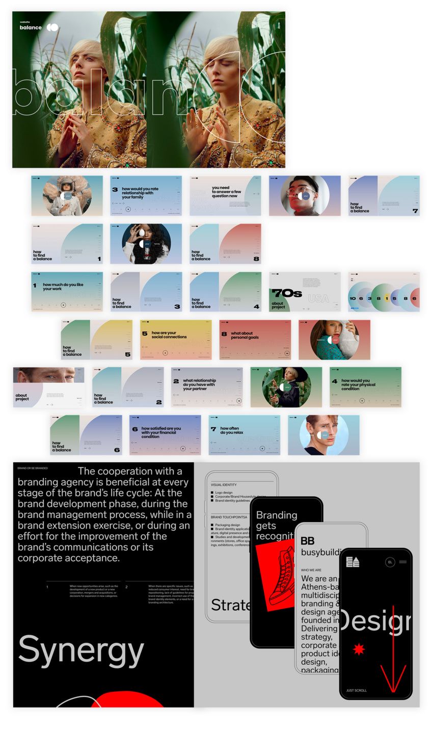
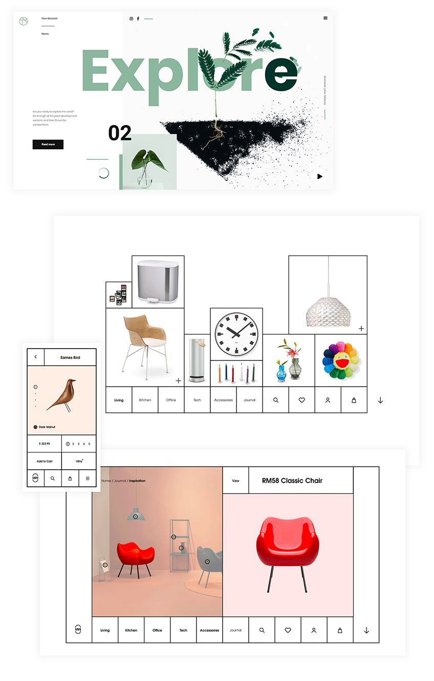
1. 2D & 3D illustration
As a previous blog post mentioned, illustration acquired a new weight in our digital products. Even the best-looking stock photos won’t do anymore, and flat animations are counting their days too. This doesn’t mean one should go super complex to make it work, but consider all the incredible stylistic references an illustrator/designer has on their display. Hand-drawn, 2D, or even 3D styles are viable today. As you can see from the website examples below, creatives had no fears when adopting styles that have steered out of the normal day-to-day UI illustration, which went very well for them.
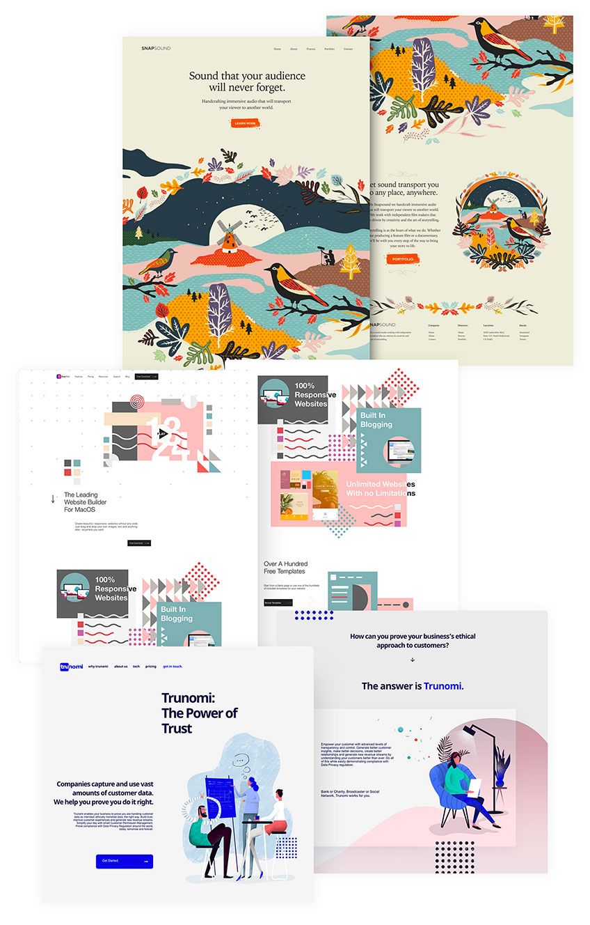
We should also consider that illustration is entering a period where the demand is high enough to the point where stock vector illustration is the fastest solution to an urgent design. But that, too, is falling into the same stylistic choices everyone else is making, meaning stock vector illustration’s most common style’s days are counted, and it’s definitely not a longer-term solution. Thinking outside the box is pretty much always the way to go, just notice how much of a difference it makes.
2. Animation
If you wish to take it one step further, animating those same illustrations will take you a long way too. It feels less like a placed “stamp” when even idle illustrations have their own flair of movement, nothing too major.
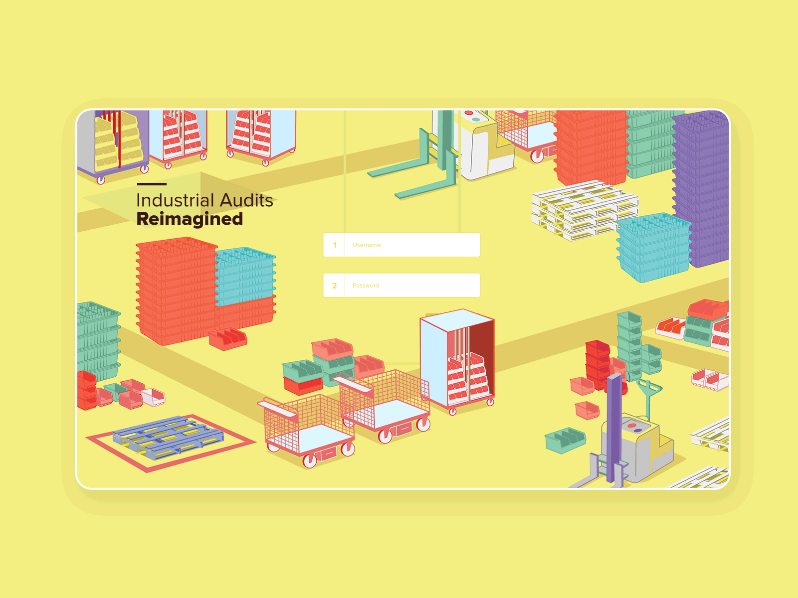
Of course, nothing should stop a design from going all out when trying out something more dynamic, as the above examples have done very well. But it should consider the noise it might create that can distract the user from more important information, especially when talking about text-dense pages.
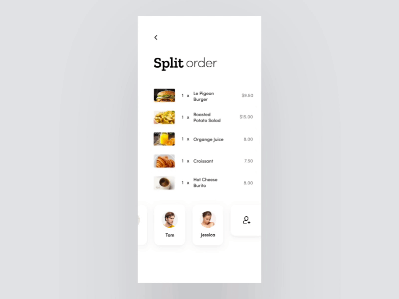
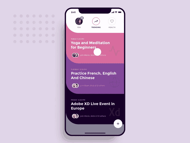
3. Fullscreen smartphones & mobile first
System and hardware changes on both iPhone and Android resulted in the disappearance of both on-screen buttons and screen borders.
Apps go all the way to the sides, top and bottom edges of the screen, considerably increasing the size of the interface.
The industry is so obsessed with it that new frontal cameras are pretty much obliged to disappear or be placed somewhere else, just not on the screen! And designers have been using that space in more interesting ways, both on a UI and UX level. Take a look at the following images.

Interesting, right? Thanks to this absence of buttons that take away screen space, gestures became crucial for navigation within and outside our mobile apps. So consider having shorter on-boardings that won’t bore new users and force them to skip, so you can easily let them know where the hell they should swipe to get where they need to.
4. Longer color palettes
Your brand doesn’t need to be so restrictive concerning colour palettes anymore. Two to three colours will prove to be too repetitive for the current taste. Dropbox, as you can see, for instance, has been doing it for a while, and Figma follow too.
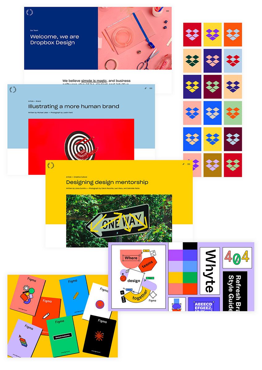
Of course, there is a system and style guide to it, the colours are not picked at random. It’s just that now, what used to be a 4 or 5 colour palette, will give place to much more diverse colour palettes that make sense and represent your brand in an established and harmonious way fashion. Different colours taken from that big palette will be used depending on the subject or environment a specific screen tries to convey.
5. Oversized fonts
Make it efficient - bold and huge text will go a long way when creating the first impact of a product, depending on how relevant the sentence is. And it doesn’t need to look aggressive or be used solely for landing pages. One can go the extra mile and use it for menus, too, if that’s a viable choice.
As you can see from the following examples, adopting huge font sizes gave them the graphical impact of urgent-looking posters.
Once again, though, the pitfall is having so large text that it obfuscates any other elements that guide the user deeper into the experience, and we don’t want that.
6. “Broken grid”, asymmetrical layouts
Remember how brutalism became a viable style even for more commercial and established brands? This style has come to stay, at least for a while. Grids are flexible and don’t need to be super rigid as the user has become more and more proficient with the ins and outs of digital products. The truth is that pages become a bit less predictable and more interesting to read, as the following concepts exemplify.
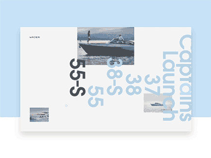
The key is taking from the more “extreme” examples and adapting them to the product's needs, when possible, unless the product is establishing itself as cutting edge - in which case, experiment and test - we don’t want anyone getting (too) lost.
7. Neuomorphism design
Material Design came along, and brutalism was its counter-reaction. But those material design principles were also taken to the next level by pushing graphical objects to a whole other ambition of realism.
A button looks like a real-life button and minimalism helps to an aesthetic that is actually new and usable.
It’s not an easy style and benefits from some spatial notions, but it doesn’t require the designer to know 3D modelling.
The following artists decided to explore the comeback of skeuomorphism whilst fitting the current colours and ambience that are expected from certain types of products. The results were incredible.
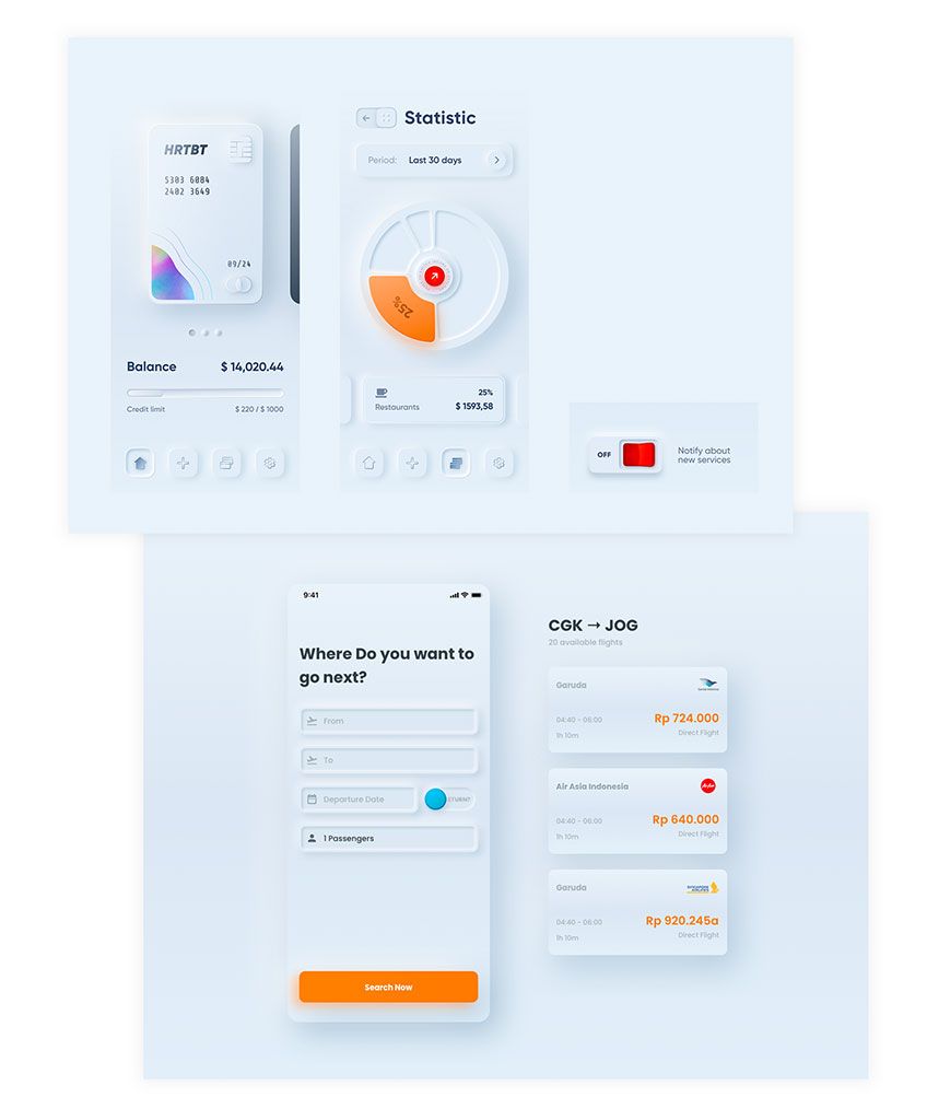
Let's address something, though: this is not a quick style to make. Highlights and shadows have to be on-point so that the elements actually look like how they'd be in real life. And it's hardly one of those situations where one design element fits all, but surely designers will come up with quicker ways to achieve these effects.
To wrap things up
At Imaginary Cloud, there’s plenty of new stuff to be excited about this coming year. Designers and product owners alike can start looking at their work with a new spirit of trying something new that stands out in the market, as new UI trends should always motivate them to go further in stylistic choices. Who knows, maybe our explorations will build upon what’s being done and set the new trends for 2024. One can dream.
Found this article useful? You might like these ones too!