

In a recent post on the Imaginary Cloud blog, Tiago talked about Pagy, the new highly performant kid on the block when it comes to pagination in Rails (or really any Rack based Ruby framework).
This follow up is a how-to guide, using the built-in undefined extra that offers a new kind of UI through the undefined helper, adapting it a little bit to our needs.
I'll use a small sample app with some test data generated with the Faker gem to demonstrate Pagy's abilities. You can see what we'll build and inspect the code on GitHub.
Besides the default frontend helper undefined, which will generate very basic pagination, there are two others (undefined, undefined), so if you want to use a different kind of pagination or go without Bootstrap, that's perfectly fine too.
First, add Pagy to your Gemfile and run undefined:
Add the application's data to the database:
Create the undefined initializer for the app:
undefined
undefined
Include the Pagy backend in a controller to make it available just there or inside undefined to make it available globally:
Now you are set up to paginate you ActiveRecord collections inside controllers which include the Pagy backend, which would be all controllers that inherit from your undefined if you included it there. Let's say you have an index action that shows some space nebulæ which you want to paginate, you could do it this way:
Include the frontend in a helper or in undefined to make it available globally:
To render your paginated nebulæ, you can now use one of Pagys frontend helpers, like so:
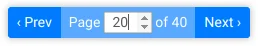
By default, undefined will render something like this:
You can adapt the text labels if you undefined in an initializer, copy the standard Pagy dictionary to your undefined and change or translate the labels however you want.
Via the initializer, you can also set options like the number of items per page and much more.
To adapt the styling we can use a bit of SASS:
undefined
This will undefined Bootstraps undefined style, replace the prev/next buttons text with arrow icons and style the undefined.
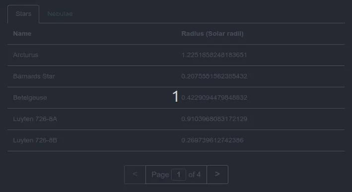
Sometimes it's necessary to paginate multiple collections per controller action.
In the following example I'll render two collections, Stars & Nebulae, on one page inside two Bootstrap tabs.
With Pagy it's easy to paginate and navigate each of them separately.
Inside the controller action where I define the Pagy collections, all that's needed is the addition of a undefined with a symbol of my choice to each collection:
undefined
Now Pagy will automatically prepend that param to the navigation links as well as extract them from a URL when rendering a view. Extremely easy and convenient!
To also maintain the state currently active tab, we can use Pagy's option to add arbitrary parameters:
undefined
This param can be used for Bootstraps tabs undefineds and undefined by setting their active state with a conditional:
undefined
We can now not only link to certain pages for each tab, but also maintain the currently open tab even when visitors copy and paste links to our website. Neat!
As I hope this article helps to highlight, Pagy is not only very performant (see previous post about Pagy) but also very comfortable to use and easy to customise.
Things like renaming the page parameter are in my opinion even more straightforward to do with Pagy then with will_paginate or Kaminari.
Time will tell if Pagy will become the go-to gem for Rails when it comes to pagination, I certainly think it has to potential to become just that.
At Imaginary Cloud we work with a wide tech stack, including Ruby on Rails. If you need help with this tech or similar ones in your software development project, we have a team of experts waiting for you! Drop us a line here!
Found this article useful? You might like these ones too!

An entrepreneur from Bavaria, currently working on web and mobile app based software for quality management. Really fond of Ruby on Rails and React Native.
People who read this post, also found these interesting:


.webp)