Written by:


Last Published:
29 juni 2026
•
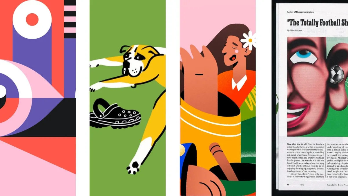
Illustrationsstilar är distinkta visuella uttryck som används för att förmedla en idé, där varje stil definieras av sina former, färger, detaljer och tekniker. De nio du kommer att stöta på oftast är flat design, line art, handritat, 3D, tecknat, realistiskt, abstrakt, retro och isometriskt. Väljer du fel stil blir det kostsamt. Väljer du rätt märker ingen det, vilket är själva poängen.
De flesta artiklar stannar vid listan och lämnar dig där. Det svåra har aldrig varit att namnge stilarna. Det svåra är beslutet: vilken stil förblir prisvärd när din produkt lanserar sin fyrtionde funktion, vilken håller ihop när tre designers blir nio, och vilken uppfattas som "seriös" snarare än "leksak" av en försiktig företagskund?
Därför har vi byggt upp detta i omvänd ordning. Utgå från beslutet och använd sedan de nio stilarna som en referenshylla du vänder dig till när du vet vad du försöker lösa. Varför bry sig? För att en stil som skär sig mot din produkt inte bara är en ögonbrynshöjare. När en lättsam, platt illustration döljer hur mycket konfiguration en produkt faktiskt kräver, stöter användarna på patrull efter att de registrerat sig. I våra UX-revisioner brukar det hindret visa sig på två sätt: som avhopp under onboarding och som supportärenden.
Kort sagt:
En illustrationsstil är helhetsintrycket av en bild: dess former, färg, detaljer och komposition. En teknik är hur du skapar det uttrycket, vare sig det handlar om vektorgrafik, digitalt måleri eller 3D-rendering. Se stilen som den dialekt en produkt talar med, och tekniken som stämbanden som utför arbetet. Du kan bestämma dig för dialekten långt innan du väljer vem som ska tala, och det är i det senare valet som kostnad och leveranstid avgörs.
Illustration är gammalt. På riktigt gammalt. De figurativa teckningarna i Frankrikes Chauvet-grotta är de tidigaste kända exemplen, där de äldsta beräknas vara omkring 36 000 år gamla. Själva hantverket har inte förändrats mycket sedan dess; bara väggen har gjort det. Idag är det webbplatser och produktskärmar som förlitar sig på illustrationer för att förklara en funktion, sätta en stämning och göra något abstrakt begripligt.
Den nyttan kommer med ett villkor. Nielsen Norman Groups eyetracking-studier visar att människor tittar mer noggrant på bilder som förstärker texten omkring dem, medan en bild som inte tillför något är ett slöseri med utrymme som kan försämra minnesvärdheten i ditt budskap. En stil gör alltså bara skäl för sig när den förtjänar den uppmärksamhet den tar.
Vi fördjupar oss i detta i vår artikel om varför bra illustrationer spelar roll: en stark illustration måste bära på en berättelse och sätta en stämning, inte bara finnas där och se snygg ut. De nio stilarna nedan kan alla göra det. De gör det bara för olika läsare, till olika priser och med väldigt olika förutsättningar att hålla över tid när ni växer.
Innan du förälskar dig i en enskild stil bör du besvara de ekonomiska och mänskliga frågorna. För ett produktbolag är en illustrationsstil inte något man köper en gång. Det är en löpande kostnad och ett löfte om att hålla en konsekvent linje, och vårt Fit-First-ramverk väger tre av dessa påfrestningar i följande ordning: kostnad, konsekvens och trovärdighet.
Kärnan i idén: en stil är en löpande kostnad, inte ett engångsköp. Du köper den inte bara en gång. Du betalar för den varje gång du skapar en ny tillgång, så länge produkten lever.
En 3D- eller fotorealistisk illustration kan se fantastisk ut. Problemet är nästa, och den därefter, som alla kräver specialverktyg och timmar av arbete. För en produkt som levererar funktioner varje sprint blir den där kostnaden per tillgång snabbt en post i budgeten som du aldrig slutar betala.
Platta stilar, linjekonst och abstrakta stilar fungerar mer som en uppsättning formar. Du betalar i förskott för att ta fram former, färger och regler, och därefter är varje ny illustration en billig gjutning från en form du redan äger. Så ställ den raka frågan: hur många illustrationer kommer den här produkten att behöva varje kvartal, och vem ska rita dem? Om det ärliga svaret är "många, av en roterande grupp designers och frilansare", kommer en tung stil antingen att spräcka budgeten eller leda till ojämn kvalitet. Oftast båda.
Vill du ha det i kronor och ören? Om en dåligt anpassad stil leder till bara ett extra supportärende per femtio nya användare, innebär det för en produkt med 20 000 nya användare per år cirka 400 onödiga ärenden. Den kostnaden återkommer. Varje år, tills någon fixar det visuella språket. Det är så det till synes billiga valet visar sig bli det dyraste.
Den dyra illustrationen är aldrig den första. Det är den femtionde, ritad av någon som aldrig såg den första. Uttrycksfulla stilar som handritat och realistiskt är svåra att definiera, och när de spretar i en växande produkt tolkar användarna det som slarv, vilket i tysthet urholkar deras förtroende för själva produkten.
Tänk dig en kör. Ge alla samma noter så låter nio röster som en; ge dem ingenting så får du nio personer som improviserar i samma rum. Ett designsystem är de där gemensamma noterna: biblioteket av komponenter, regler och tillgångar som ett team återanvänder i en produkt, sammanhållet av designtokens – de namngivna, återanvändbara värdena (färger, avstånd, storlekar) som håller allt i samklang. Att bygga den grunden väl är kärnan i digital produktdesign.
Kan en uttrycksfull stil fortfarande skalas? Ja, med en stadig hand. Mailchimp är beviset. Deras bläckiga, surrealistiska illustrationssystem, som introducerades under omprofileringen av byrån Collins och beskrevs av Mailchimp som "personligt uttryck framför realistisk exakthet", hålls samman bara för att en enda art director håller stilen konsekvent. Art direction innebär helt enkelt en vägledande hand, eller en uppsättning regler, som ser till att de visuella valen förblir sammanhängande. Ta bort det och samma stil faller samman.
Stil är en signal, och olika köpare läser av den på olika sätt. En tecknad maskot som charmar konsumenter kan i tysthet motarbeta dig i en företagsaffär, där den som skriver under väger risk, regelefterlevnad och om ni fortfarande finns kvar om tre år. Vänd på det, så kan en kallt realistisk stil kännas stel och korporativ i en lekfull konsumentapp.
Frågan är inte "vad ser bra ut". Det är "vad uppfattar just den här köparen som kompetent". Det finns ett dokumenterat sätt att göra fel på: Nielsen Norman Group flaggade för en illustration som var så abstrakt att användarna inte kunde ta till sig den snabbt, en som krävde för mycket ansträngning att tolka. En smart visuell lösning som misslyckas med att kommunicera är sämre än en enkel som når fram. Stora dekorativa bilder medför samma skatt, och NN/g har visat att det kan tränga undan det funktionella innehållet som folk faktiskt kom för att se.
Har du vägt kostnad, konsekvens och trovärdighet mot varandra? Bra. Här är fyra snabba frågor för att ringa in valet:
Välj utifrån vad som passar, inte vad du gillar bäst. Gör du rätt val betalar sig arbetet: mindre supportbehov, snabbare onboarding och en visuell berättelse som stämmer överens med den du redan förmedlar på alla andra ställen.
Använd dessa när Fit-First Framework har snävat in dina alternativ. Varje post täcker vad stilen innebär, när den bör användas och vilken avvägning du gör, med ett exempel på ett varumärke som gör det bra.
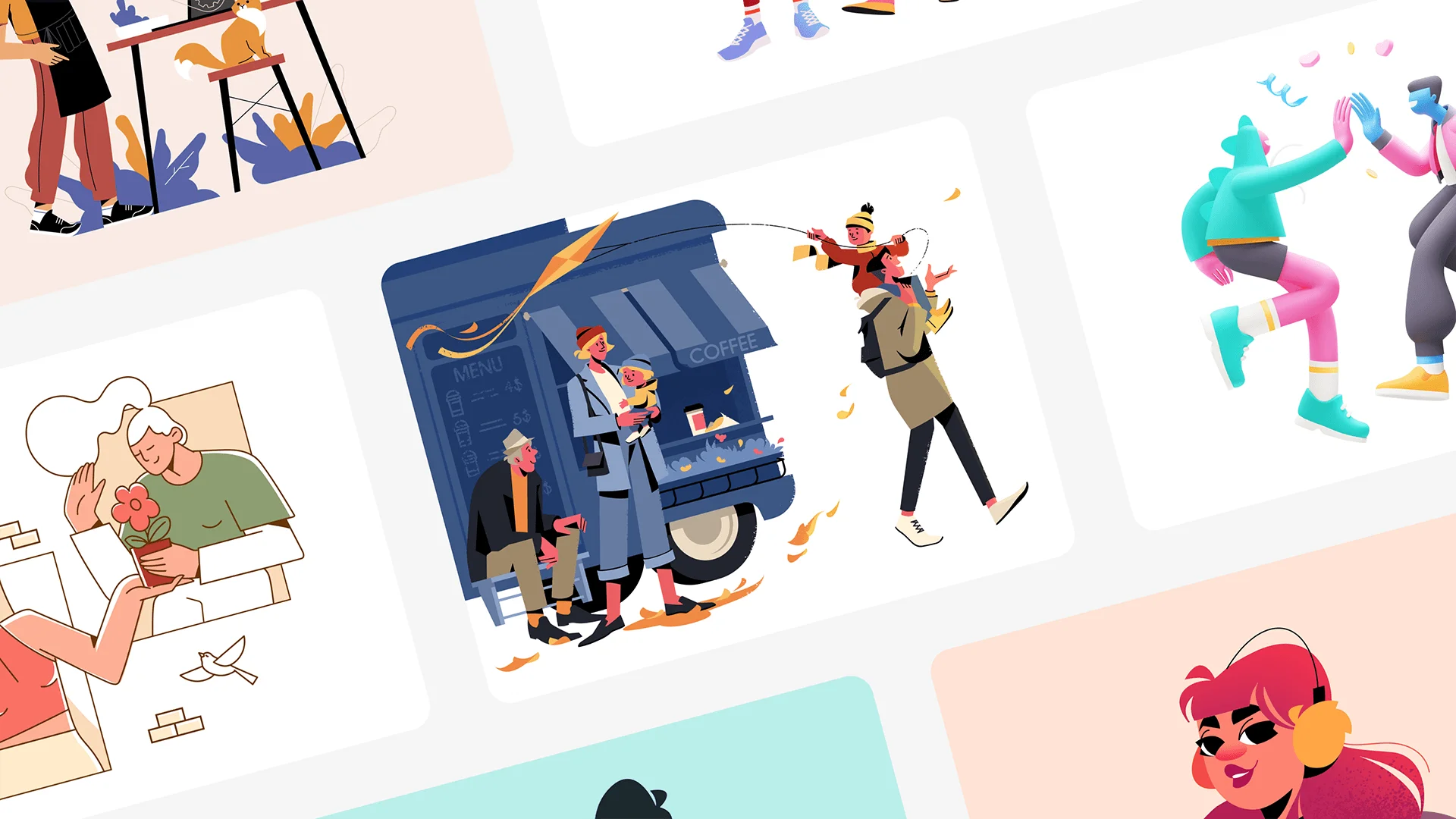
Flat illustration håller det enkelt: starka färger, rena former, inga gradienter eller krångliga texturer. Det enkla är själva poängen, vilket är anledningen till att den dominerar SaaS-gränssnitt, instrumentpaneler och mobilappar. Den skalar bra över olika skärmstorlekar och fungerar utmärkt inom ett designsystem. Slack och Dropbox har båda använt sig av flat-system i sin produktmarknadsföring av just den anledningen.
När ska man använda flat illustration:
Fördelarna är uppenbara: snabb att skapa, billig att underhålla i ett system och extremt responsiv. Nackdelen smyger sig på vid överanvändning, när flat börjar kännas som alla andras flat, och på grund av det begränsade djupet blir den aldrig lika uttrycksfull som handritat eller 3D. Den största risken är ärligheten. Om du får en komplicerad produkt att se enkel ut har du lovat mer än vad gränssnittet kan hålla.
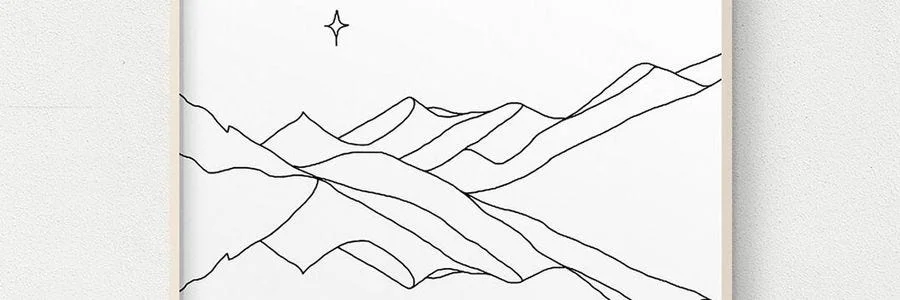
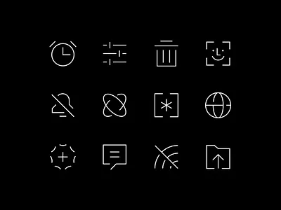

Line art handlar om konturer och återhållsamhet: rena linjer, lite eller ingen fyllning, nästan ingen skuggning. Den enkelheten gör det till en av de mest mångsidiga stilarna, som passar lika bra i en appikon, ett redaktionellt uppslag eller för ett minimalistiskt varumärke. Den är dessutom lätt på sidan, vilket dina laddningstider kommer att tacka dig för.
När ska man använda line art:
Det anpassar sig till nästan vilket format som helst, är lätt att systematisera och fungerar oavsett om du har en färg eller en hel palett. Haken är att det är så tunt. Med så lite att arbeta med syns en svag komposition omedelbart, och det kommer aldrig att kunna bära samma personlighet som en tecknad serie eller en handritad illustration.

Handritade illustrationer visar sina imperfektioner med flit: organiska linjer, synlig textur och darrningen från en mänsklig hand. Det uppfattas som varmt och genuint, vilket är guld värt för storytelling och för varumärken som inte vill låta som ett styrelserum. Mailchimp är ett bra exempel här; deras bläckiga, surrealistiska system ger ett massmarknadsverktyg en röst som konkurrenter inte enkelt kan kopiera.
När ska man använda handritade illustrationer:
Inget annat är lika distinkt eller lika svårt att kopiera, och det väcker känslor på ett sätt som rena vektorer inte kan. Det är också det mest tidskrävande att hålla samman: långsamt att producera, svårt att standardisera och lätt att tappa stilen i ett stort system så fort art direction sviktar.

3D-illustrationer ger djup, ljus och verklig textur, och skapar bilder som man nästan kan ta på. Det fångar uppmärksamhet och får komplexa idéer att kännas konkreta, vilket är anledningen till att produktmarknadsföring, hero-sektioner samt teknik- och spelvarumärken väljer detta. Apples produktrenderingar ligger i toppskiktet: precisa, vackert ljussatta och omisskännligt premium.
När ska man använda 3D-illustrationer:
När det gäller genomslagskraft och djupkänsla är det oöverträffat, och det fungerar utmärkt för animering när behovet finns. Problemet är kostnaden. Det kräver specialverktyg och specialister, filerna är tunga nog att påverka prestandan om de inte optimeras, och det är precis här ramverkets kostnadsfråga blir kännbar. 3D är sällan billigt att underhålla.
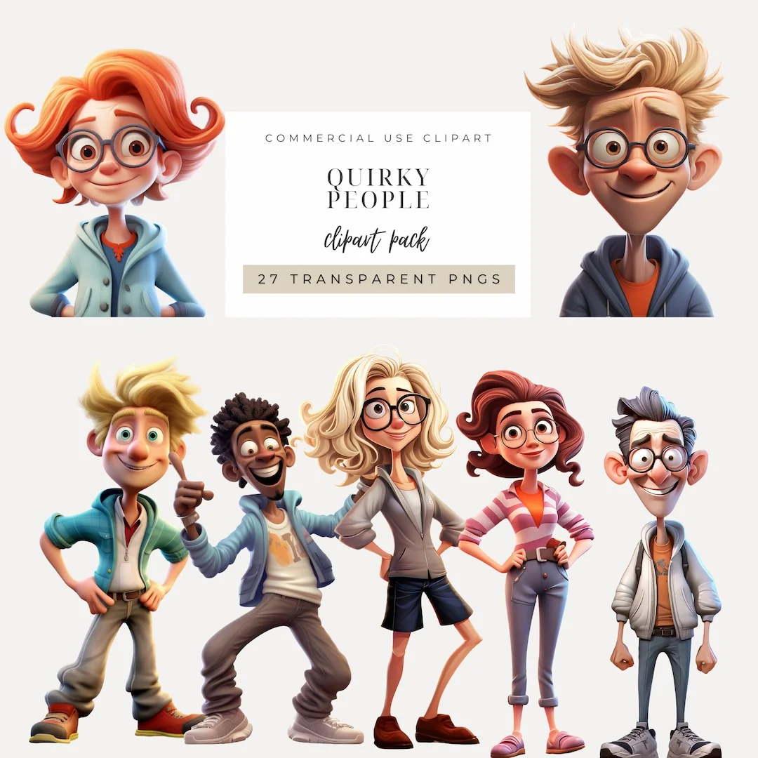
Tecknade illustrationer bygger på överdrift: förstorade drag, förenklade former och karaktärer med tydlig personlighet. Det är vänligt och minnesvärt, vilket passar perfekt för maskotar, utbildningsmaterial och kampanjer som vill sprida glädje. Duolingos Duo, en uggla som blivit ett marknadsföringsfenomen i sig, visar hur en enda karaktär kan bära ett helt varumärkes röst.
När ska man använda tecknade illustrationer:
Det är uttrycksfullt, minnesvärt och briljant för att ge en produkt en mänsklig känsla. Det finns dock en begränsning: i formella eller professionella sammanhang kan det uppfattas som oseriöst, och det fungerar bara som en långsiktig tillgång om karaktären förblir konsekvent. Välj detta för köpare som söker värme, inte för dem som granskar dig utifrån risk.
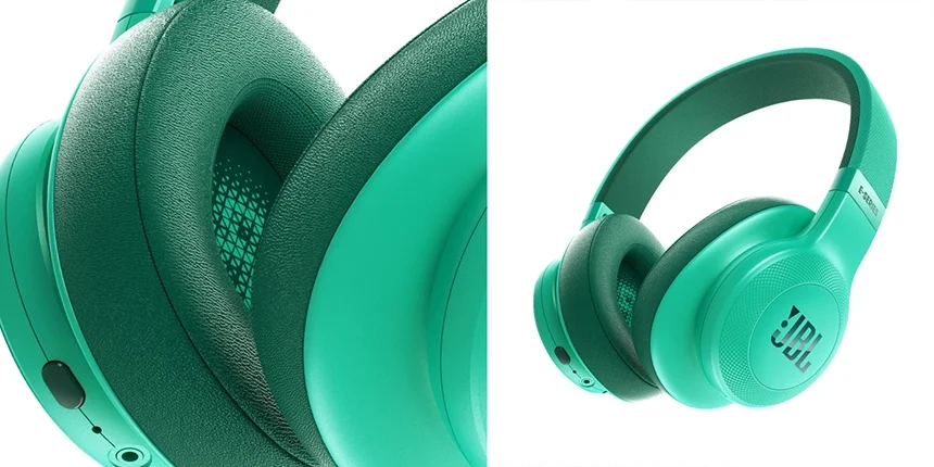
Realistiska illustrationer strävar efter exakthet: korrekta proportioner, verklighetstrogna texturer samt noggrann ljussättning och skuggning. Du väljer detta när trovärdighet är ett absolut krav, vilket är anledningen till att det används inom medicinska och vetenskapliga sammanhang, exklusiv reklam och produktvisualisering där detaljrikedom är själva kärnan. Det befinner sig i gränslandet mellan fotografi och illustration, vilket ger dig en kontroll som en kamera inte kan erbjuda.
När ska man använda realistiska illustrationer:
Detaljrikedomen ger dig verklig auktoritet, särskilt inom tekniska områden, och visar upp en produkt på ett sätt som få andra stilar kan. Men det är tidskrävande och dyrt att producera, svårt att revidera och kan, märkligt nog, upplevas som mindre unikt än ett djärvare och mer stiliserat val.
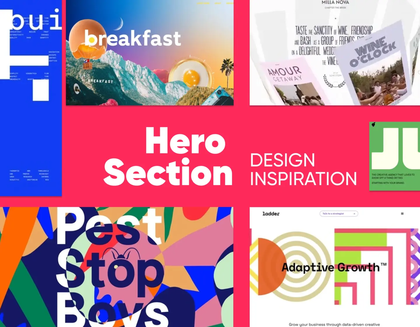
Abstrakt illustration arbetar med form, färg och komposition snarare än bokstavliga avbildningar. Den eftersträvar stämning och idé, vilket gör den till en naturlig matchning för det immateriella: teknik, data och det där ordet ”innovation” som alla vill åt. Stripe är arketypen; dess gradienter och avskalade former signalerar sofistikering utan att avbilda ett enda konkret objekt, och den skalar över stora ytor utan ansträngning.
När ska man använda abstrakt illustration:
Den anpassar sig till nästan alla format, skalar rent och undviker de bokstavliga eller kulturella feltolkningar som ofta drabbar föreställande illustrationer. Risken ligger i meningen. Utan en stark underliggande idé blir abstrakt konst bara tapet, och den är värdelös när du faktiskt behöver instruera. NN/g dokumenterade precis detta: en abstrakt produktillustration som användare inte kunde avkoda tillräckligt snabbt för att den skulle vara till någon nytta.

Retroillustration lånar medvetet från det förflutna: färgpaletter, texturer och typografi från 1950-, 70- eller 80-talet. Genom att referera till en specifik era blir den omedelbart igenkännbar och ovanligt effektiv på att väcka känslor och förmedla arv. Den glänser för varumärken inom mat, mode, musik och livsstil.
När ska man använda retroillustration:
När det görs väl är det nostalgiskt, distinkt och en gåva till historieberättandet. När det görs slarvigt ser det bara daterat ut; det passar sällan ett modernt eller teknikfokuserat varumärke, och precis som alla karaktärsdrivna stilar kräver det en konsekvent hand för att inte förvandlas till visuellt brus.
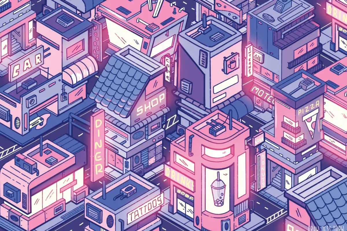
Isometrisk illustration ritar allt i en fast 30-graders vinkel, vilket gör att du ser tre sidor av ett objekt samtidigt: djup utan äkta perspektiv. SaaS- och teknikbranschen älskar det eftersom det kan visualisera ett system, ett arbetsflöde eller hur en produkt är uppbyggd i en tydlig bild, där man ser hur delarna hänger ihop, vart datan tar vägen och vad som faktiskt finns inuti. Det ser tekniskt och modernt ut, samtidigt som det är billigare att producera än full 3D.
När ska man använda isometrisk illustration:
När det gäller att visa struktur och process är det svårslaget, och det är snällare mot budgeten än fotorealistisk 3D. Baksidan: bygger du med färdiga kit syns det, den låsta vinkeln begränsar dina kompositioner, och hela branschen har använt det så flitigt att den största risken nu är att man smälter in för mycket.
Alla dessa kan animeras, och det blir allt vanligare. Animerad platt design, loopande isometriska diagram, 3D i rörelse: allt detta är numera standard på landningssidor och vid onboarding, där några sekunders animation kan förklara en process snabbare än en stillbild. Rörelse höjer dock insatsen. Varje animerad tillgång är mer tidskrävande att skapa, svårare att hålla varumärkesenlig och kan snabbt försämra prestandan om du inte optimerar den. Se därför rörelse som en volymratt för den stil du redan valt genom ramverket, inte som ett separat beslut.
Här ser du dem sida vid sida. Skumma igenom dem och återgå sedan till dina egna förutsättningar.
Det finns ingen enskild stil som är bäst. Den bästa stilen är den som tjänar ditt budskap, håller över tid inom din budget och fungerar när teamet växer.
Vilken illustrationsstil fungerar bäst för en SaaS-produkt?
Flat design och line art är de säkraste valen för SaaS, tätt följt av isometriska illustrationer när du behöver visa hur något fungerar. De fungerar bra i gränssnitt, passar smidigt in i återanvändbara komponenter och är tillräckligt lätta för att inte sakta ner sidan. Spara 3D eller realistiska stilar till de stora ögonblicken, som en hero-sektion, där kostnaden motiveras av effekten istället för att bli en vardaglig belastning.
Hur väljer jag mellan flat design och 3D-illustrationer?
Välj flat design när du behöver många illustrationer som är billiga och konsekventa, och 3D när du behöver ett fåtal som verkligen fångar uppmärksamheten. Flat design är betydligt billigare att producera och underhålla och hör hemma i gränssnitt och designsystem; 3D ger djup och realism men kräver specialverktyg och tid för varje enskild tillgång. Om ett roterande team ska ansvara för arbetet vinner flat design nästan alltid när man ser till den totala kostnaden.
Vad är skillnaden mellan illustrationsstil och illustrationsteknik?
En stil är det övergripande utseendet – flat, handritat, retro – medan en teknik är hur du skapar det, till exempel vektorritning, digital målning eller 3D-rendering. En stil kan skapas med flera olika tekniker, och tekniken du väljer är det som verkligen avgör kostnad, leveranstid och hur enkelt arbetet är att underhålla. Bestäm stilen först, välj sedan den teknik som dina resurser faktiskt kan hantera.
Vilka är de vanligaste typerna av illustrationer?
De vanligaste typerna av illustrationer idag är flat design, line art, handritat, 3D, tecknat, realistiskt, abstrakt, retro/vintage och isometriskt. De sträcker sig från enkla och skalbara (flat design, line art) till detaljerade och krävande (3D, realistiskt). Varje typ är skapad för ett specifikt syfte, från att förtydliga ett gränssnitt till att bära hela varumärkets emotionella berättelse.
Vilken illustrationsstil är bäst för varumärkesbyggande?
Den bästa stilen för varumärkesbyggande är den som passar hur ni vill uppfattas och som ni kan hålla konsekvent överallt. Handritat och tecknat bygger värme och personlighet; abstrakt och 3D signalerar modernitet och finess; retro spelar på arv och nostalgi. Det som betyder mer än själva valet är konsekvensen: en enhetlig stil vinner alltid över en som bara är trendig.
Hur skapar jag en konsekvent illustrationsstil?
Skriv ner en liten uppsättning regler för färgpalett, linjetjocklek, karaktärsproportioner och perspektiv, och genomdriv dem via ett designsystem med återanvändbara komponenter och dokumenterade tokens. Ge sedan en person det slutgiltiga ansvaret, en art director, så att nytt material kontrolleras mot reglerna istället för att improviseras fram. Konsekvens brister sällan för att en stil är fel; den brister för att stilen vuxit fram inom ett team utan en gemensam referens.
Är flat design föråldrat 2026?
Nej. Flat design är fortfarande en av de mest använda stilarna inom digital design eftersom den är skalbar, systematiserbar och högpresterande. Många team lägger numera till lite djup, textur eller gradienter för att undvika ett generiskt utseende, men grundmetoden är fortfarande ett pålitligt förstahandsval. Den verkliga risken är inte att stilen ser gammal ut, utan att den kan få en komplex produkt att framstå som enklare än vad den faktiskt är.
Vilken illustrationsstil använder företag inom mjukvarubranschen?
Mjukvaruföretag inom enterprise och B2B förlitar sig ofta på abstrakta, minimalistiska och isometriska stilar, eftersom de uppfattas som trovärdiga av köpare som väger risk mot tillförlitlighet. Stripes gradienter är den vanligaste referenspunkten. Tecknade och lekfulla stilar undviks oftast i den huvudsakliga företagskommunikationen, då de kan skada förtroendet mitt i en köpprocess. Anpassa stilen efter hur stor risk din köpare tar.
Välj fel illustrationsstil och skadan blir djupare än bara det visuella. Det kan försämra användbarheten, sakta ner onboarding-processen och i tysthet nöta ner det varumärkesförtroende du förlitar dig på för att stänga företagsaffärer, oftast utan att någon kopplar det till bilderna. En UX-revision från Imaginary Cloud identifierar var ditt visuella språk gör nytta, var det står i vägen och vad som bör åtgärdas först.
Öka dina intäkter och ditt användarengagemang med en UX-revision: boka ett möte.
Illustrationer fyller sin funktion när de gör en idé lättare att förstå och ett varumärke lättare att lita på. För ett produktteam är valet av stil dock ett strategiskt beslut som rör kostnad, konsekvens och trovärdighet, snarare än en smaksak. De team som lyckas utgår från dessa tre faktorer och låter stilen följa därefter.
Det är själva kärnan i Fit-First Framework. Räkna ut vad en stil kostar per kvartal, om ditt team kan hålla den konsekvent och hur din specifika målgrupp kommer att uppfatta den – välj sedan. Ett system baserat på platt, abstrakt eller isometrisk design kan överleva flera rekryteringsomgångar, medan ett handritat system utan tydlig styrning snabbt faller isär. Få ordning på dessa tre så slutar bilderna att bara vara dekoration och börjar göra nytta: minskad supportbelastning, snabbare onboarding och en visuell berättelse som äntligen stämmer överens med den du förmedlar i alla andra kanaler.
Så, den korta versionen? Välj illustrationsstil utifrån vad som passar, aldrig utifrån smak, och se till att det valet är något som din budget och ditt team faktiskt kan upprätthålla.
Marknadsföringspraktikant med ett särskilt intresse för teknik och research. På fritiden spelar jag volleyboll och skämmer bort min hund så mycket jag bara kan.
Jag är produkt- och servicedesigner, brinner för skandinavisk design och alla dess former av samarbete, delaktighet och innovation!
People who read this post, also found these interesting: