Written by:


Last Published:
29 June 2026
•
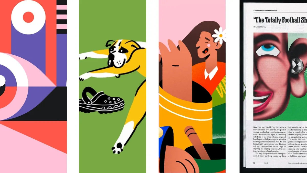
Illustration styles are the distinct visual approaches used to communicate an idea, each one defined by its shapes, colour, detail, and technique. The nine you will meet most often are flat, line art, hand-drawn, 3D, cartoon, realistic, abstract, retro, and isometric. Pick the wrong one and it costs you. Pick the right one and nobody notices, which is rather the point.
Most articles stop at the list and leave you to it. The hard part was never naming the styles. It is the decision: which one stays affordable when your product ships its fortieth feature, which one holds together as three designers become nine, and which one a cautious enterprise buyer reads as "serious" rather than "toy".
So we have built this the other way round. Lead with the decision, then treat the nine styles as the reference shelf you reach for once you know what you are solving. Why bother? Because a style that clashes with your product is not just an eyesore. When a breezy flat illustration hides how much setup a product really needs, users hit that wall after signing up, and in our UX audits that wall tends to show up twice: as onboarding drop-off, and as support tickets.
In short:
An illustration style is the overall look of an image: its shapes, colour, detail, and composition. A technique is how you make that look happen, whether that is vector drawing, digital painting, or 3D rendering. Think of a style as the accent a product speaks in, and technique as the vocal cords doing the work. You can settle on the accent long before you decide who does the talking, and that second choice is where your cost and turnaround live.
Illustration is old. Genuinely old. The figurative drawings in France's Chauvet Cave are the earliest known anywhere, the oldest of them reckoned at around 36,000 years. The job has not changed much since; only the wall has. Today it is websites and product screens that lean on illustration to explain a feature, set a mood, and make something abstract feel graspable.
That usefulness comes with a condition. Nielsen Norman Group's eyetracking work found that people look harder at images which back up the words around them, while a visual that does not pull its weight is a wasted slot that can reduce the memorability of your message. So a style is only earning its keep when it earns the attention it takes.
We make the fuller case in our piece on why good illustration matters: a strong illustration has to carry a story and set a mood, not just sit there looking nice. The nine styles below can all do that. They just do it for different readers, at different prices, with very different odds of falling apart as you grow.
Before you fall for a single style, answer the money questions and the people questions. For a product company, an illustration style is not something you buy once. It is a standing cost and a promise to stay consistent, and our Fit-First Framework weighs three of those pressures in order: cost, consistency, and credibility.
The core idea: a style is a rate, not a purchase. You do not buy it once. You pay it again every time you make a new asset, for as long as the product lives.
One 3D or photorealistic illustration can look glorious. The trouble is the next one, and the one after that, each demanding specialist tools and hours. For a product shipping features every sprint, that per-asset bill quietly becomes a line item you never stop paying.
Flat, line art, and abstract styles behave more like a set of moulds. You pay upfront to cut the shapes, colours, and rules, then every later illustration is a cheap pour from a mould you already own. So ask the blunt version: how many illustrations will this product need each quarter, and who is drawing them? If the honest answer is "lots, by a rotating cast of designers and contractors", a heavy style will either break the budget or drift in quality. Usually both.
Want it in pounds and pence? Illustratively, if a badly matched style adds just one extra support ticket per fifty new users, a product onboarding 20,000 users a year swallows roughly 400 avoidable tickets. That cost recurs. Every year, until someone fixes the visual language. Which is how the cheap-looking choice turns out to be the dear one.
The dear illustration is never the first one. It is the fiftieth, drawn by someone who never saw the first. Expressive styles like hand-drawn and realistic are hard to pin down, and when they wander across a growing product, users read the wobble as sloppiness, which quietly chips at their trust in the thing itself.
Picture a choir. Give everyone the same sheet music and nine voices sound like one; hand them nothing and you get nine people improvising in the same room. A design system is that shared sheet music: the library of components, rules, and assets a team reuses across a product, held together by design tokens, the named, reusable values (colours, spacing, sizes) that keep everything in tune. Building that foundation well is core to digital product design.
Can an expressive style still scale? Yes, with a firm hand. Mailchimp is the proof. Its inky, surreal illustration system, brought in during the rebrand by the agency Collins and described by Mailchimp as "personal expression over realistic accuracy", holds together only because a single art director keeps it honest. Art direction just means one guiding hand, or one rule set, making sure the visual choices stay coherent. Take that away and the same style shatters.
Style is a signal, and different buyers read it differently. A cartoon mascot that charms a consumer crowd can quietly undercut you in an enterprise deal, where the person signing is weighing risk, compliance, and whether you will still exist in three years. Flip it around and a coldly realistic style can feel stiff and corporate in a playful consumer app.
The question is not "what looks good". It is "what does this particular buyer read as competent". There is a documented way to get this wrong: Nielsen Norman Group flagged an illustration so abstract that users could not grasp it quickly, one that required too much work to interpret. A clever visual that fails to communicate is worse than a plain one that lands. Big decorative imagery carries the same tax, and NN/g has shown it can crowd out the functional content people actually came for.
Weighed cost, consistency, and credibility? Good. Now four quick questions to narrow the field:
Choose for fit, not favouritism. Get it right and the work earns back its keep: less support load, faster onboarding, and a visual story that matches the one you are already telling everywhere else.
Reach for these once the Fit-First Framework has narrowed your options. Each entry covers what the style is, when to use it, and the trade-off you are signing up for, with a real brand doing it well.
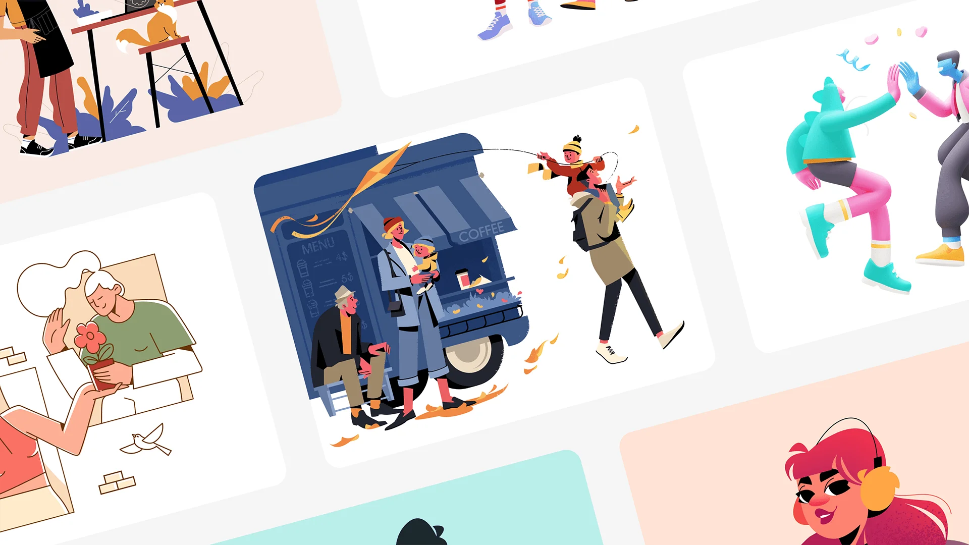
Flat illustration keeps things simple: bold colour, clean shapes, no gradients or fussy texture. That plainness is the point, which is why it runs the show across SaaS interfaces, dashboards, and mobile apps. It scales across screen sizes and behaves itself inside a design system. Slack and Dropbox have both leaned on flat systems in their product marketing for exactly that reason.
When to use flat illustration:
The upside is obvious: fast to make, cheap to maintain across a system, endlessly responsive. The downside creeps in with overuse, when flat starts to feel like everyone else's flat, and with its shallow depth, so it never gets as expressive as hand-drawn or 3D. Its sneakiest risk is honesty. Make a complicated product look effortless and you have written a cheque the interface then has to cash.
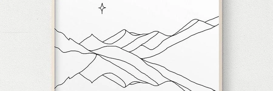
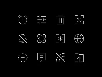

Line art is all outline and restraint: clean strokes, little or no fill, next to no shading. That economy makes it one of the most portable styles going, equally at home in an app icon, an editorial spread, or a minimalist brand. It is light on the page too, which your load times will thank you for.
When to use line art:
It adapts to almost any format, systematises easily, and works whether you have one colour or a handful. The catch is thinness. With so little to work with, weak composition shows up immediately, and it will never carry the personality of a cartoon or a hand-drawn piece.

Hand-drawn illustration wears its imperfections on purpose: organic lines, visible texture, the wobble of a human hand. It reads as warm and genuine, which is gold for storytelling and for brands that would rather not sound like a boardroom. Mailchimp is the case study here, its inky, surreal system giving a mass-market tool a voice rivals cannot easily photocopy.
When to use hand-drawn illustration:
Nothing else is as distinctive or as hard to copy, and it tugs on emotion in a way clean vectors cannot. It is also the fiddliest to keep in line: slow to produce, tricky to standardise, and quick to drift across a big system the moment art direction slips.

3D illustration brings depth, light, and real texture, building images you could almost pick up. It grabs attention and makes complex ideas feel solid, which is why product marketing, hero sections, and tech and gaming brands reach for it. Apple's product renders sit at the top of the range: precise, beautifully lit, unmistakably premium.
When to use 3D illustration:
For sheer impact and a sense of depth it is unmatched, and it moves happily into animation when you need it. The bill is the problem. It wants specialist tools and specialist people, the files are heavy enough to drag on performance if you do not optimise them, and this is exactly where the framework's cost question bites hardest. 3D is rarely cheap to keep.
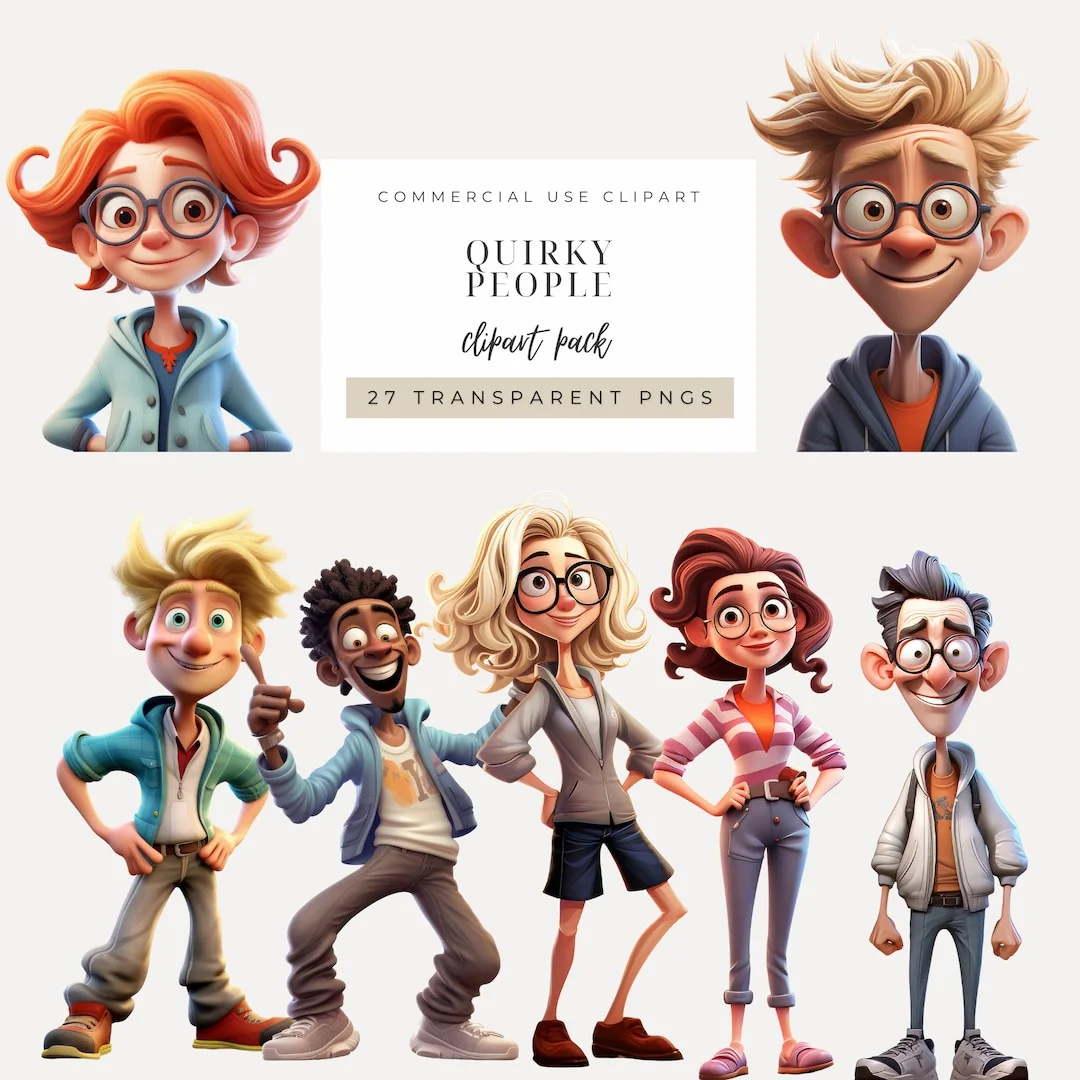
Cartoon illustration leans on exaggeration: outsized features, simplified forms, characters with actual personality. It is friendly and it sticks in the memory, which suits mascots, teaching, and campaigns that want to raise a smile. Duolingo's Duo, an owl that has become a marketing phenomenon in its own right, shows how one character can carry a whole brand's voice.
When to use cartoon illustration:
It is expressive, memorable, and brilliant at making a product feel human. It also has a ceiling: in formal or enterprise settings it can read as unserious, and it only holds up as a lasting asset if you keep the character consistent. Match it to a buyer who wants warmth, not one auditing you for risk.
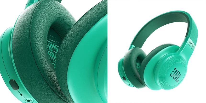
Realistic illustration chases accuracy: true proportions, real texture, careful light and shadow. You reach for it when credibility is non-negotiable, which is why it turns up in medical and scientific work, high-end advertising, and product visualisation, where getting the detail right is the whole job. It lives in the gap between photography and illustration, giving you control a camera cannot.
When to use realistic illustration:
The detail buys you real authority, especially in technical fields, and it shows a product off like little else. But it is slow and costly to produce, painful to iterate on, and, oddly, can end up looking less distinctive than a bolder, more stylised choice.
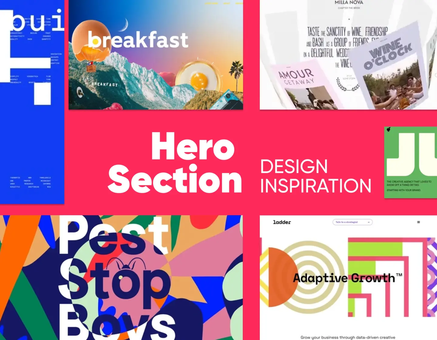
Abstract illustration works in shape, colour, and composition rather than literal things. It chases mood and idea, which makes it a natural fit for the intangible: technology, data, that word "innovation" everyone reaches for. Stripe is the archetype, its gradients and pared-back forms signalling sophistication without drawing a single concrete object, and scaling across a huge surface without breaking a sweat.
When to use abstract illustration:
It bends to almost any format, scales cleanly, and sidesteps the literal or cultural misreadings that trip up representational work. The risk is meaning. Without a strong idea underneath, abstract slides into wallpaper, and it is useless when you actually need to instruct. NN/g documented exactly this, an abstract product illustration that users could not decode quickly enough to be any use.

Retro illustration borrows from the past on purpose: the palettes, textures, and type of the 1950s, 70s, or 80s. By pointing at a specific era it becomes instantly recognisable and unusually good at stirring feeling and heritage. It shines for food, fashion, music, and lifestyle brands.
When to use retro illustration:
Done well it is nostalgic, distinctive, and a gift to storytelling. Done carelessly it just looks dated, it rarely suits a modern or tech-forward brand, and, like every character-led style, it needs a consistent hand or it turns to visual noise.
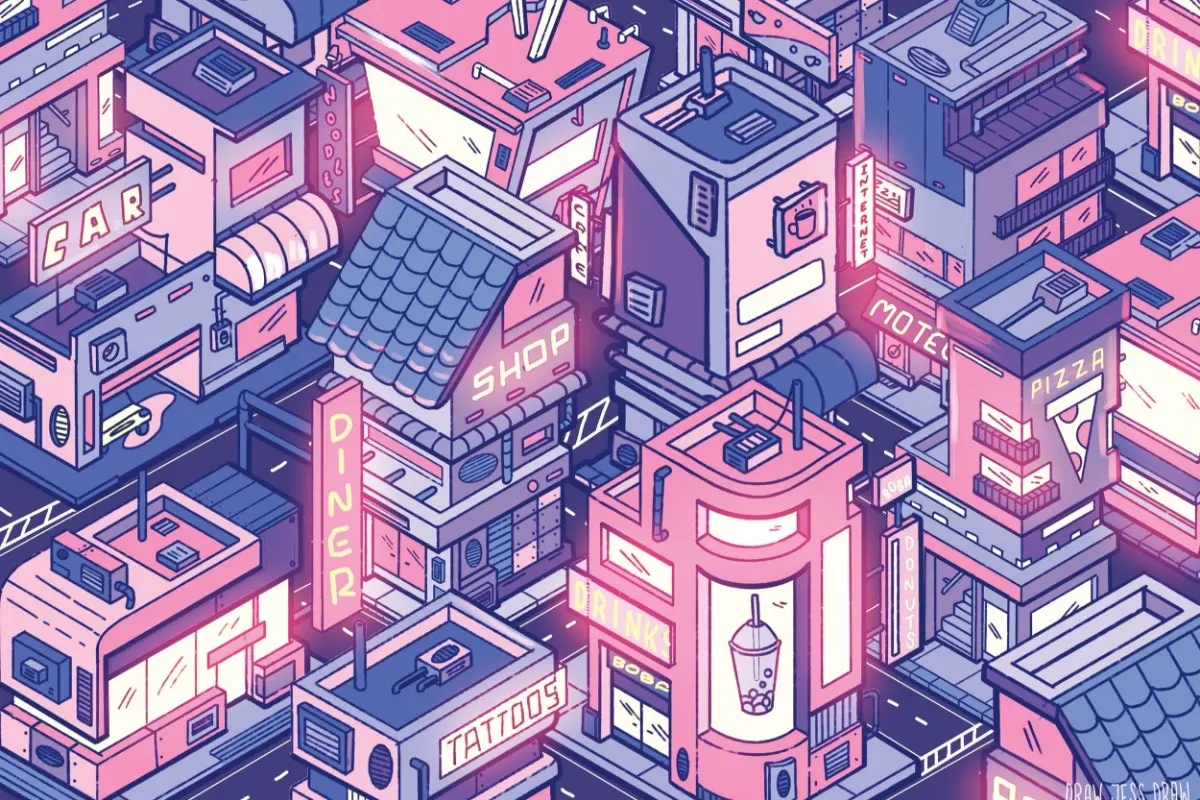
Isometric illustration draws everything on a fixed 30-degree angle, so you see three sides of an object at once: depth without true perspective. SaaS and tech love it because it can lay out a system, a workflow, or a product's plumbing in one clear frame, showing how the parts connect, where the data goes, what is actually inside the box. It looks technical and modern while costing less to make than full 3D.
When to use isometric illustration:
For showing structure and process it is hard to beat, and it is kinder to the budget than photorealistic 3D. The flip side: build it from stock kits and it looks it, that locked angle limits your compositions, and the whole industry has used it so heavily that blending in is now the real danger.
Any of these can move, and increasingly they do. Animated flat, looping isometric diagrams, 3D in motion: all common now on landing pages and in onboarding, where a few seconds of animation can explain a process faster than any still frame. Motion raises the stakes, though. Every animated asset is heavier to build, harder to keep on-brand, and quicker to hurt performance if you do not optimise it. So treat motion as a volume knob on the style you already chose through the framework, not a separate decision.
Here they are side by side. Skim it, then get back to your own constraints.
| Illustration Style | Complexity | Production cost at scale | Typical use case | Best for |
|---|---|---|---|---|
| Flat | Low | Low | UI design, SaaS, dashboards | Clarity and scalability |
| Line art | Low | Low | Icons, editorial, infographics | Minimal, clean visuals |
| Hand-drawn | Medium | High | Branding, storytelling | Personality and uniqueness |
| 3D | High | High | Marketing, product visuals | Visual impact and depth |
| Cartoon | Medium | Medium | Mascots, education, campaigns | Engagement and emotion |
| Realistic | High | High | Advertising, medical, product | Accuracy and credibility |
| Abstract | Low to medium | Low | Branding, web design | Conceptual communication |
| Retro / vintage | Medium | Medium | Packaging, lifestyle branding | Nostalgia and identity |
| Isometric | Medium | Medium | SaaS, technical diagrams | Showing systems and structure |
There is no single best style. The best one is whichever serves your message, survives your budget over time, and holds together as your team grows.
What illustration style works best for a SaaS product?
Flat and line art are the safest defaults for SaaS, with isometric close behind when you need to show how the thing works. They scale across an interface, drop neatly into reusable components, and stay light enough not to slow the page. Keep 3D or realistic for the big moments, a hero section say, where the cost earns its place instead of becoming routine.
How do I choose between flat and 3D illustration?
Pick flat when you need many illustrations made cheaply and consistently, and 3D when you need a handful that stop people in their tracks. Flat is far cheaper to produce and maintain and belongs in interfaces and design systems; 3D brings depth and realism but wants specialist tools and time for every single asset. If a rotating team will own the work, flat almost always wins on total cost.
What is the difference between illustration style and illustration technique?
A style is the overall look, flat, hand-drawn, retro, while a technique is how you produce it, such as vector drawing, digital painting, or 3D rendering. One style can be made with several techniques, and the technique you choose is what really sets your cost, turnaround, and how easy the work is to maintain. Decide the style first, then pick the technique your resources can actually sustain.
What are the main types of illustration?
The main types of illustration today are flat, line art, hand-drawn, 3D, cartoon, realistic, abstract, retro or vintage, and isometric. They run from simple and endlessly scalable (flat, line art) to detailed and demanding (3D, realistic). Each one is built for a different job, from clarifying an interface to carrying a brand's whole emotional story.
Which illustration style is best for branding?
The best style for branding is the one that fits how you want to be seen and that you can keep consistent everywhere. Hand-drawn and cartoon build warmth and personality; abstract and 3D signal modernity and polish; retro trades on heritage and nostalgia. What matters more than the pick is the consistency: a coherent style beats a merely fashionable one.
How do I create a consistent illustration style?
Write down a small set of rules, colour palette, line weight, character proportions, perspective, and enforce them through a design system with reusable components and documented tokens. Then give one person the final say, an art director, so new work is checked against the rules rather than improvised. Consistency rarely breaks because a style is wrong; it breaks because the style grew across a team with no shared reference.
Is flat illustration outdated in 2026?
No. Flat is still one of the most widely used styles in digital design because it scales, systematises, and performs. Plenty of teams now add a little depth, texture, or gradient to dodge the generic look, but the core approach is a dependable default. The genuine risk is not that it looks old; it is that it can make a complex product look simpler than it really is.
What illustration style do enterprise software companies use?
Enterprise and B2B software leans on abstract, minimal, and isometric styles, because they read as credible to a buyer weighing risk and reliability. Stripe's gradients are the usual reference point. Cartoon and heavily playful styles tend to stay out of the core enterprise story, where they can dent trust mid-purchase. Match the style to how much risk your buyer is carrying.
Choose the wrong illustration style and the damage runs deeper than looks. It can blunt usability, slow onboarding, and quietly wear away the brand trust you lean on to close enterprise deals, usually without anyone tracing it back to the pictures. A UX Audit from Imaginary Cloud finds where your visual language is pulling its weight, where it is getting in the way, and what to fix first.
Grow your revenue and user engagement with a UX Audit: book a call.
Illustration earns its place when it makes an idea quicker to grasp and a brand easier to trust. For a product team, though, the style you pick is a standing decision about cost, consistency, and credibility, not a matter of taste. The teams who get it right start from those three and let the style follow.
That is the whole point of the Fit-First Framework. Work out what a style costs you each quarter, whether your team can keep it consistent, and how your particular buyer will read it, then choose. A system built on flat, abstract, or isometric can outlast several rounds of hiring; a hand-drawn system with nobody steering it falls quietly apart. Get those three right and the pictures stop decorating and start working: less support load, faster onboarding, and a visual story that finally matches the one you tell everywhere else.
So, the one-line version? Choose your illustration style for fit, never for taste, and make that fit something your budget and your team can actually keep.

Marketing Intern with a particular interest in technology and research. In my free time, I play volleyball and spoil my dog as much as possible.
I'm a product and service designer, passionate about Scandinavian design and all its forms of collaboration, participation and innovation!
People who read this post, also found these interesting: