Written by:


Last Published:
21 July 2026
•

Good sign up and login page design comes down to four things: ask for the fewest fields authentication actually needs, put the login entry point where people can see it, write errors that tell users how to fix the problem, and give them a password recovery route they can find while irritated. Get those right and the rest is polish. Get them wrong and you pay full price for traffic that never reaches your product. Studies found that 18% of shoppers abandon a purchase because a site forces them to create an account, and 17% because the process is too long or complicated.
That is the short answer. Below are the fifteen decisions that move those numbers, how to sequence them, and what each one is worth to your business.
Think of your acquisition budget as water in a pipe. Paid search, content, outbound, partner referrals: every channel feeds the same pipe, and it all arrives at one narrow joint where you ask someone to create an account. Whatever leaks there, you have already paid for.
The leak is well documented. Baymard's checkout usability research found that the average US checkout flow shows 23.48 form elements by default, while large-scale usability testing shows an ideal flow can be as short as 12 to 14. Roughly half the fields you are asking people to fill in do nothing. And the upside is not small: focusing only on checkout usability issues documented as solvable, the average large e-commerce site can gain a 35.26% increase in conversion rate through better checkout design, which across combined US and EU e-commerce sales translates to an estimated $260 billion in recoverable orders.
Is that a design problem or a business problem? Both, and that is precisely why it stalls. For a CEO, CTO or COO it lands on three lines.
Customer acquisition cost. If your registration flow converts at 40% rather than 55%, your effective CAC climbs by more than a third. No change in ad spend. No change in headcount. No change in funnel volume above it. You are simply keeping less of what you bought.
Conversion rate. Registration friction is one of the rare conversion problems entirely inside your control. No pricing change, no new feature, no repositioning. It is a design and engineering problem with a measurable ceiling, which is exactly what a technical and UX audit exists to size.
Churn risk. Someone who struggles at sign up has already formed a view of your product before seeing a single feature. Password reset failures and account lockouts feed support tickets and early cancellations. Those costs land on operations, not marketing, which is usually why nobody notices them in the conversion conversation.
Most login UX advice arrives as a flat checklist, and that is exactly why teams implement it badly. They ship the easy items. The high-impact ones sit in the backlog, because a checklist tells you what to do and says nothing about what to do first.
So we score instead. TSU: Traffic, Security, User type. Three axes, one to five each, developed across our client engagements and consistent with our broader product design process built on design thinking. Add them up and act on the total.
A password recovery flow used by 2% of your base is not the same priority as a sign up form every new user must cross. Pull the real funnel numbers before you score anything. Teams routinely over-invest in edge cases, and more often than not it is because those flows generate the loudest support tickets, not the most volume.
Some friction is load-bearing. Removing password confirmation is safe. Sharpening your error messages is not, because "wrong password" quietly confirms to an attacker that the email is a real account, halving the work of a credential-stuffing attempt (an automated attack that replays username and password pairs leaked from other breaches). Score 5 where a change is security-neutral. Score 1 where it trades genuine risk for convenience.
A consumer app optimises for speed and social login. A B2B platform where an administrator provisions accounts optimises for clarity, single sign-on and role assignment. Same change, different score, depending on whether your user chose to be there or was told to be there.
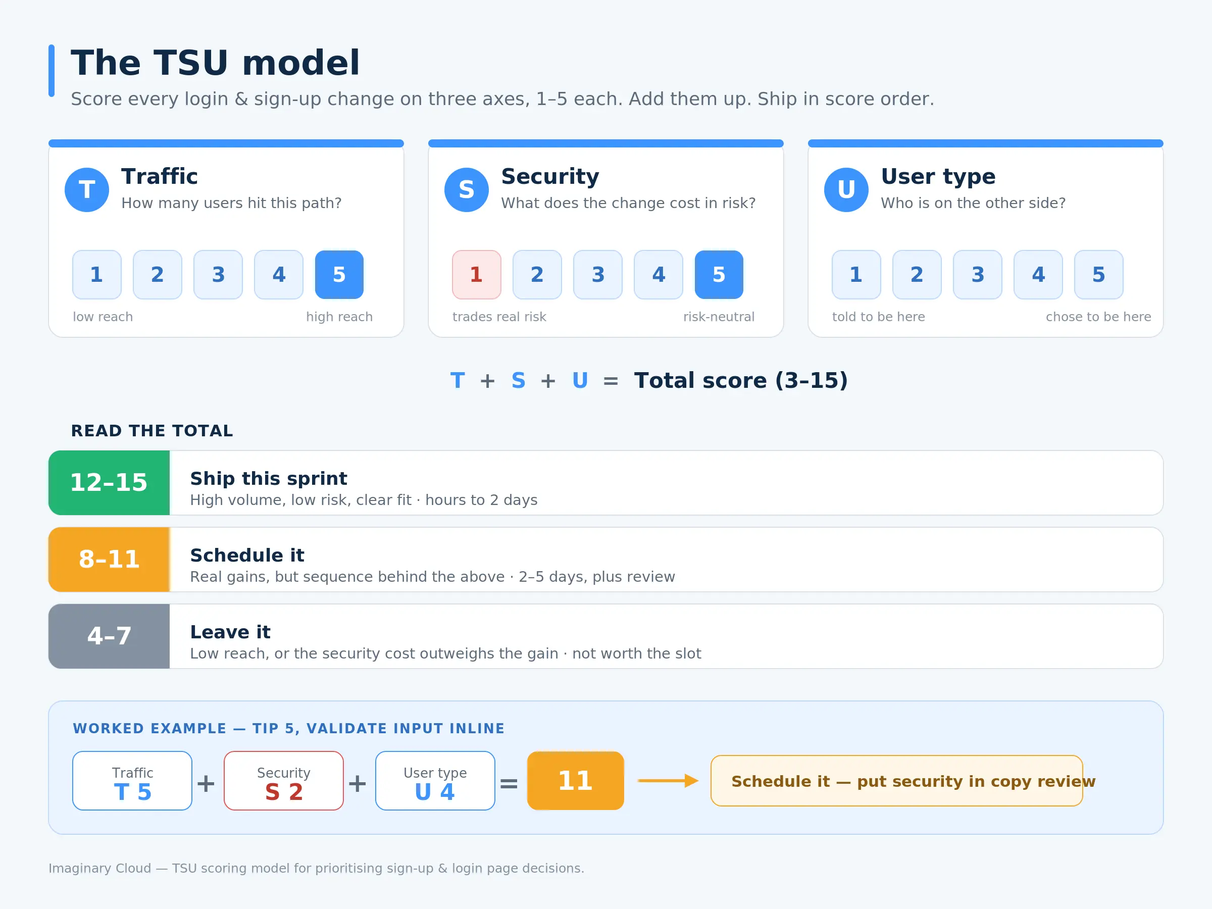
The point is not the arithmetic. The point is that scoring drags the security conversation forward to design time instead of code review, which is where login redesigns go to die and where rework gets expensive.
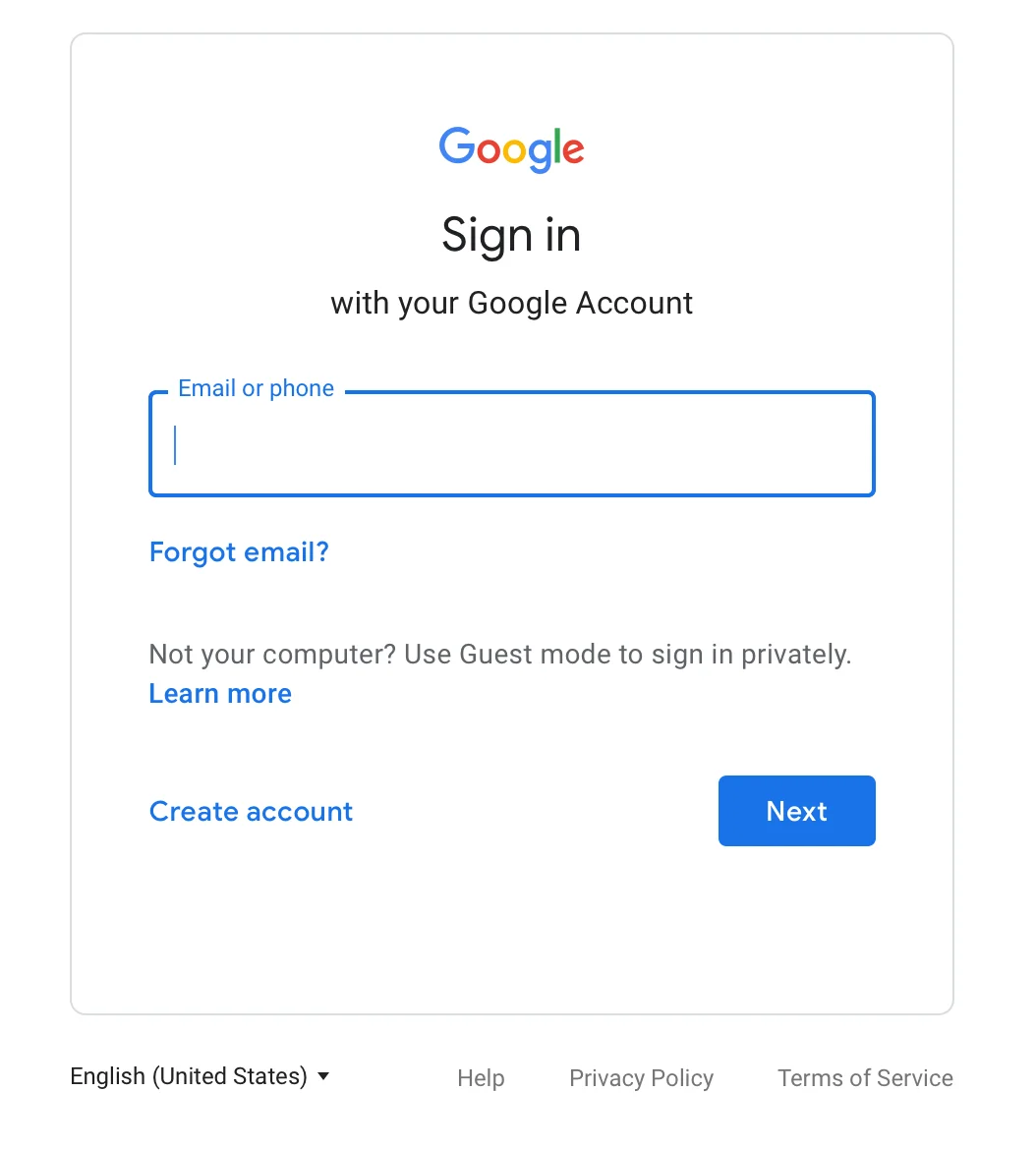
If someone has to hunt for the login area, you have added friction before the form has even loaded. Put it top-right in the header, where convention already trained everyone to look, and keep it there across the whole site rather than the homepage alone.
Google's sign-in screen is the reference implementation. One field, one clear action, recovery links sitting exactly where a stuck user will go looking.
TSU: T5 / S5 / U5 = 15. Ship it. Commercially: the cheapest fix on this list, a navigation and CSS change measured in hours, affecting every visitor who ever tries to come back.
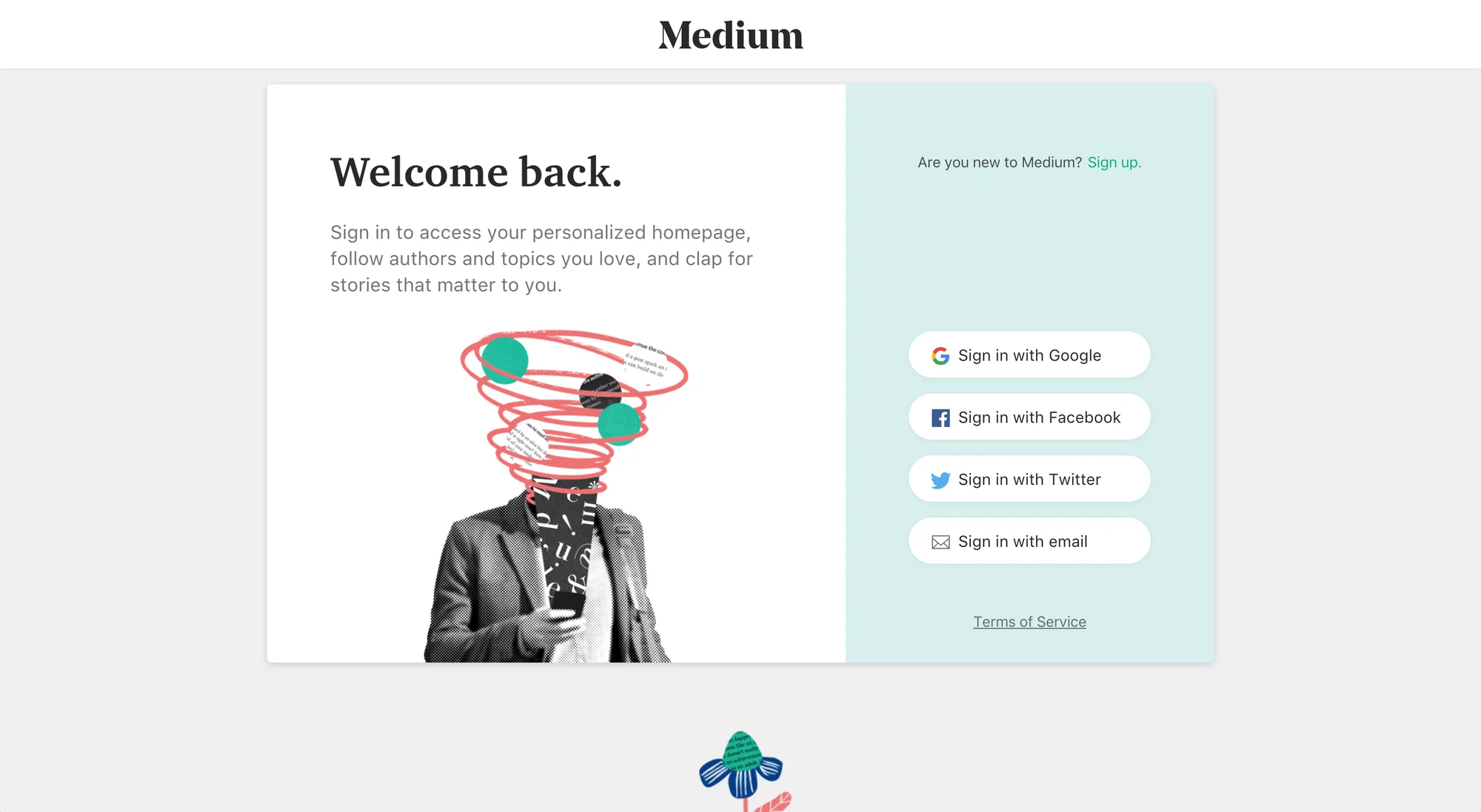
Signing up with an existing account removes password creation altogether, and password creation is where a good share of abandonment happens. It also lightens your own load. You are no longer the custodian of a credential you would otherwise have to defend.
On providers, keep it simple. Consumer products should offer Google and Apple, since Apple requires its own sign-in option for iOS apps that offer third-party login. B2B products should lead with Google Workspace and Microsoft, plus SAML SSO (Security Assertion Markup Language single sign-on, the protocol enterprise IT teams use to centralise employee access) if you sell to enterprise buyers. Match the list to your actual users rather than to whatever your closest competitor happens to display.
TSU: T5 / S4 / U4 = 13. Ship it. Commercially: removes a step for every new user and permanently cuts password-reset ticket volume. Take a point off the security axis if you handle regulated data, where leaning on an identity provider needs its own review.
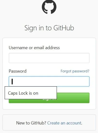
Someone typing blind with Caps Lock on will fail, retry, fail again, and end up in your password reset flow. That costs them time and costs you a ticket, over a keyboard state you could have shown them. GitHub's login page puts an inline "Caps Lock is on" warning right there, and it takes a few lines of JavaScript.
TSU: T4 / S5 / U4 = 13. Ship it. Commercially: half a day of engineering against a recurring and entirely avoidable support cost.
"Sign in", "log in", "login" and "log on" all mean the same thing. Mixing them inside one product creates a small flicker of doubt, repeated at every touchpoint. Pick one and hold the line, including the opposite action: if you use "sign in", use "sign out", never "logout".
Worth passing to your engineers, because this one slips through constantly. "Login" is a noun, as in the login page. "Log in" is a verb, as in log in to your account. Getting it wrong in interface copy reads as careless to exactly the technical audience you least want thinking that.
TSU: T5 / S5 / U3 = 13. Ship it. Commercially: near-zero build cost, and it compounds with every other trust signal on the page.
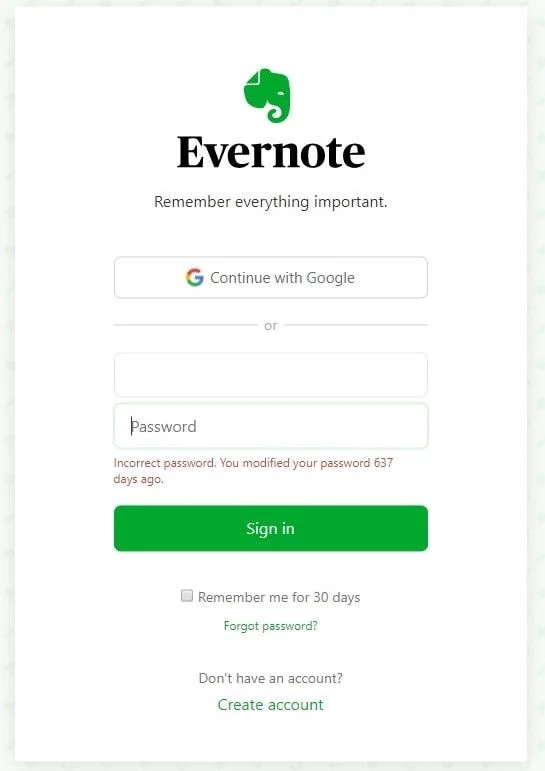
Inline validation stops people submitting a form only to learn, after the round trip, that something was wrong three fields ago. Fire it when the user leaves a field rather than on every keystroke, and tell them how to fix the problem instead of merely flagging that one exists.
Then there is the login failure message, where good UX and good security pull in opposite directions. "Wrong password" helps the user. It also confirms to an attacker that the email belongs to a real account, which halves the work of a credential-stuffing run. "Invalid email or password combination" is the right trade. Enumeration protection, meaning stopping attackers from discovering which addresses have accounts, is worth more than the sliver of clarity you give up.
TSU: T5 / S2 / U4 = 11. Schedule it, and put security in the copy review. This is the item that most needs the model, because design-optimal and security-optimal genuinely disagree. Commercially: scoring it is what stops that disagreement parking your entire redesign for a fortnight.
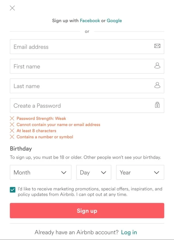
Do not spring your password rules on someone after they have already failed to meet them. Put the requirements beside the field from the start and validate them live as the user types.
Two traps here. First, rules so baroque that everyone defaults to the same weak-but-compliant pattern. Second, forced periodic rotation, which is now formally out of favour. NIST Special Publication 800-63B-4, the US National Institute of Standards and Technology's digital identity guidelines finalised on 31 July 2025, states that verifiers shall not require periodic rotation unless there is evidence that the authenticator has been compromised. The shift from "should not" in the 2017 edition to "shall not" moves this from a recommendation to a requirement. The reasoning is familiar to anyone who has ever owned a work laptop: mandatory rotation breeds predictable incremental passwords, "Password1!" becoming "Password2!". One caveat: where a specific regulation such as PCI-DSS conflicts with NIST guidance, the regulation takes precedence.
TSU: T5 / S5 / U4 = 14. Ship it. Commercially: dropping rotation cuts reset volume and removes recurring friction for paying customers, at no security cost under current guidance.
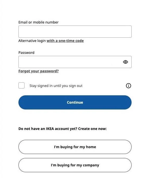
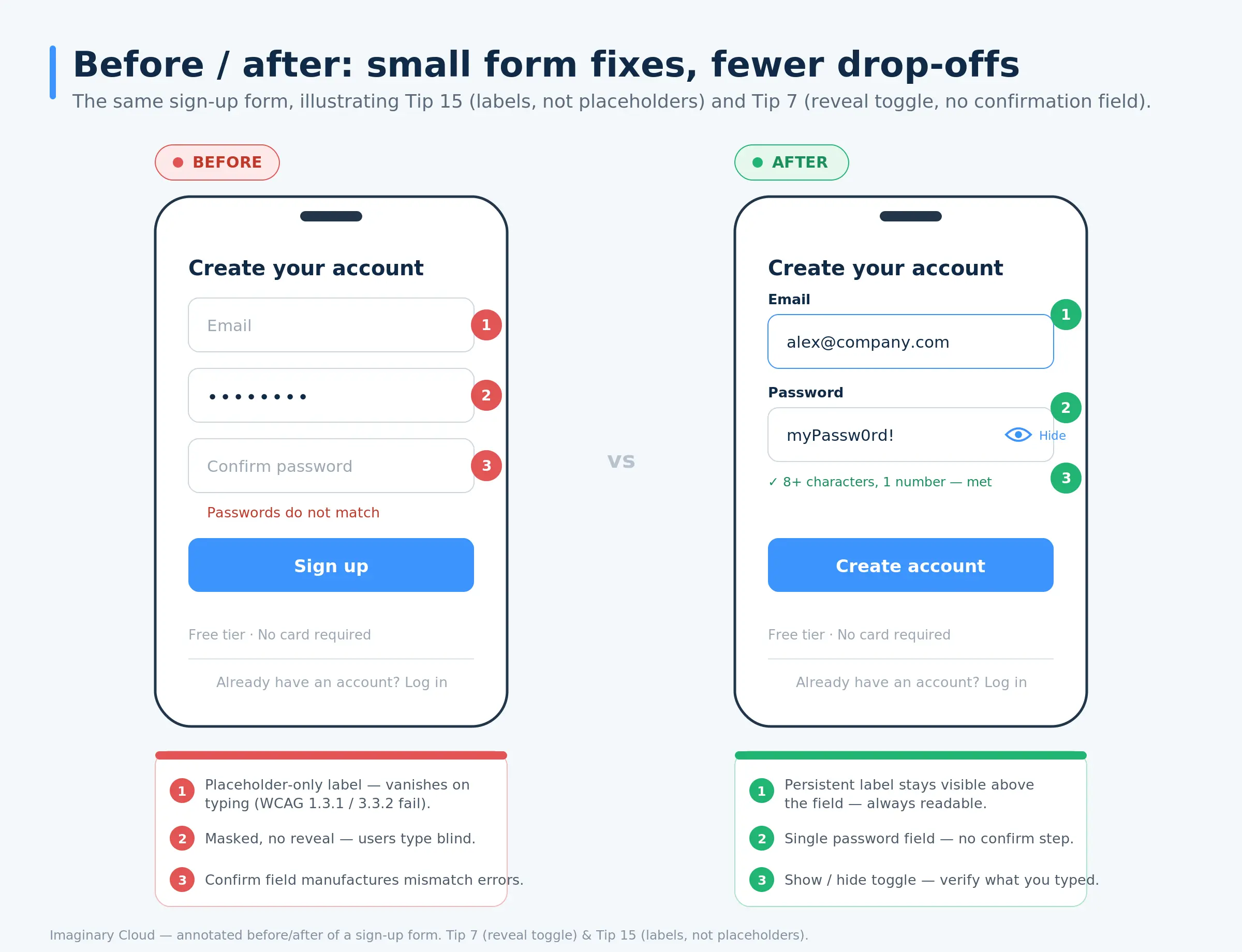
The confirm-password field is a legacy pattern that manufactures the very error it was built to prevent. The entries do not match, the user cannot see either one, and now they have to clear both and start again without knowing which was wrong. Brilliant.
A show-and-hide toggle solves it faster. People verify what they typed and correct it on the spot, as most modern consumer platforms now let them.
TSU: T5 / S4 / U4 = 13. Ship it. Commercially: one fewer field and one fewer failure state on the highest-traffic form you own.

If someone can sign up down more than one path, free tier and paid tier, personal and business account, the button has to say which one it commits them to. "Sign up" tells a user nothing when two of them share a screen. "Start free trial" and "Buy Pro" tell them everything.
TSU: T4 / S5 / U4 = 13. Ship it. Commercially: this shifts your tier mix, which moves revenue per signup rather than merely signup volume.

A returning customer landing on the sign up form and a new visitor landing on the login page have the same problem in opposite directions. Both need a visible way across, immediately. Differentiate the two states through layout and copy, the same principle that governs a successful website redesign, and make the switch a single click with no page reload.
TSU: T5 / S5 / U4 = 14. Ship it. Commercially: returning users are revenue you already hold. Losing them at the door costs more than losing a prospect who never had a relationship with you.

Usernames hand your users a memory problem they never asked for. They forget which variant they registered with, and taken-username errors bolt a failure point onto a form that had none.
Email does double duty as identifier and recovery channel, plus it gives you a legitimate route back to the user for onboarding and re-engagement. Subject, of course, to consent under the GDPR, the EU General Data Protection Regulation, which for European operations is not a matter of preference.
TSU: T5 / S4 / U4 = 13. Ship it. Commercially: one field removed, one failure state removed, one marketing channel gained.

People forget passwords. That is not a design failure waiting to be engineered away, it is ordinary human behaviour that your product should handle gracefully. Put the reset link on the login page itself, get the email out in seconds, and return the user to wherever they were rather than depositing them on the homepage to start over.
Mind the security detail. "We sent a reset link if that account exists" sidesteps the same enumeration problem from Tip 5.
TSU: T3 / S4 / U4 = 11. Schedule it. Commercially: lower traffic than sign up, but this flow lands disproportionately on returning paying customers. Weight it up if subscriptions are your base.

Fifteen fields on one screen reads as work. The same fifteen across three labelled steps with a progress bar reads as manageable, and it lets you capture a usable account after step one instead of losing the lot when someone walks away at field eleven.
Better still, ask only for what creating the account requires and collect the rest once the user has seen some value. Everything that is not authentication belongs in onboarding and product design, not in the gate.
TSU: T5 / S5 / U4 = 14. Ship it. Commercially: partial capture alone recovers a share of abandoned registrations that would otherwise be total write-offs.

Let people decide about persistent sessions rather than deciding for them. On a shared or public machine they need to opt out. On their own laptop they will happily opt in. Leave the box unchecked by default and label it in plain words.
TSU: T4 / S3 / U4 = 11. Schedule it. Commercially: session lifetime is a real risk decision, particularly around financial or health data. Score that axis with your compliance lead in the room, not afterwards.
Mobile is where most registration volume now arrives, and where most of it is lost. Baymard's abandonment data puts mobile rates well above desktop, and login forms are among the worst offenders because the failure modes stack: small targets, a keyboard covering half the screen, and password entry without a manager to help.
Four fixes carry most of the gain. Set the correct input types, type="email" and type="tel", so the right keyboard appears instead of making people hunt for the @ symbol. Set autocomplete attributes, email, current-password, new-password, so browser and password manager autofill actually works. Meet a minimum touch target of 24x24 CSS pixels, per WCAG 2.2 success criterion 2.5.8 Target Size (Minimum). And check that your primary button is not hiding behind the on-screen keyboard the moment a field takes focus.
TSU: T5 / S5 / U4 = 14. Ship it. Commercially: the single largest volume opportunity here for most consumer products, and the one teams miss most often, because they test on the desktop sitting in front of them.
Accessibility on login and sign up forms is a conversion issue and a legal exposure at once. Under the European Accessibility Act, in force since 28 June 2025, it is a compliance requirement for many products sold in the EU. The relevant WCAG 2.2 success criteria are specific and testable, which makes this easier to action than most compliance work.
Labels, not placeholders (1.3.1, 3.3.2). Every input needs a programmatically associated label. Placeholder text vanishes the moment someone types, leaving screen reader users and anyone who lost their place with nothing to go on.
Errors identified and explained (3.3.1, 3.3.3). Messages must name the problem and suggest the fix, and must reach assistive technology. Turning the field red is not an error message.
Accessible authentication (3.3.8). Blocking paste, or scripting that prevents browsers and password managers from filling fields, fails this criterion, because memorising or transcribing a password places a very high or impossible burden on people with certain cognitive disabilities. Read that twice if your security team currently blocks paste on password fields. That control is now a WCAG failure.
Contrast and keyboard operation (1.4.3, 2.1.1). The whole form has to be completable on a keyboard alone, with visible focus states and text contrast at 4.5:1 minimum.
TSU: T5 / S5 / U5 = 15. Ship it. Commercially: the only item on this list carrying direct regulatory exposure. It also helps users on old devices, cracked screens and in bright sunlight, which is a far bigger group than most teams assume.
Four decisions and one method. Ask for less, meaning the minimum fields authentication requires, with everything else deferred into the product. Make the paths obvious, meaning a visible login page entry point, an obvious switch between sign up and login, and a recovery link people can find while frustrated. Fail gracefully, meaning inline validation that explains the fix, a reveal toggle instead of a confirmation field, and login errors deliberately vague enough not to hand attackers a list of valid accounts. Design for mobile and assistive technology first, because that is where the volume sits and where the legal exposure sits too.
The method is TSU. Score every change on Traffic, Security and User type, then ship in score order. It exists because the thing that sinks login redesigns is almost never ignorance of best practice. It is teams shipping the easy wins while the high-volume, security-sensitive work stalls in review. Baymard's finding that solvable checkout usability issues represent an average 35.26% conversion increase only pays out for teams that sequence the work and actually ship it.
Start with one form: an email field and a password field, both with visible labels and correct autocomplete attributes. Add a single primary button, a visible reset link, and a clear route to the sign up form for people without an account. Put social or SSO options above the form if your users expect them. Then handle the failures: a generic "invalid email or password combination", a Caps Lock warning, and rate limiting on repeated attempts. Everything past that is polish.
At minimum, an email field, a password field with visible requirements and a show-and-hide toggle, and one clearly labelled submit button. Add social login if it suits your audience, a visible link to your terms and privacy policy, and a route back to the login page for returning users. Leave out anything that is not authentication. Company size, job title and phone number belong in onboarding, after the account exists.
As few as authentication requires, which is frequently email and password, or one social login button. Baymard found the average US checkout flow displays 23.48 form elements when an ideal flow can be as short as 12 to 14. Every extra field is another point where someone can stall. When a stakeholder asks for one, ask what breaks if that data arrives a week later from inside the product.
In order: cut fields to the authentication minimum, add social or SSO login, split whatever remains into labelled steps with a progress indicator, fix mobile input types and autofill, and rewrite errors so they explain the fix. Then instrument the funnel, so you can see which change moved which number. Most teams ship all five at once and learn nothing about which one mattered.
Directly, and you can measure it. Baymard found that 18% of shoppers abandon because a site requires account creation, and 17% because the process is too long or complicated. Registration sits right at the end of the acquisition funnel, so drop-off there wastes money you already committed upstream. That is why it usually returns more per engineering hour than optimisation further up.
Functionally, nothing. They describe the same action. The difference is grammatical, and then it is about consistency. "Login" is a noun, as in the login page. "Log in" is the verb, as in log in to your account. "Sign in" works as a verb phrase, with "sign-in" as its noun form. Pick one convention, apply it everywhere, and do not forget the matching sign-out or log-out wording.
No. A show-and-hide toggle does the same job with less friction. When confirmation fields fail to match, users cannot see either entry, so they retype both without ever learning which one was wrong.
For most B2B products, yes, provided you use enterprise-appropriate providers. Google Workspace and Microsoft Entra offer stronger authentication than most in-house password systems, including enforced multi-factor authentication and centralised revocation the day an employee leaves. For regulated industries or enterprise buyers, SAML SSO tends to be a procurement requirement rather than an optional extra.
Set correct input types so the right keyboard appears. Set autocomplete attributes so password managers can fill the fields. Meet the 24x24 CSS pixel minimum touch target from WCAG 2.2 criterion 2.5.8. And check the submit button is not buried behind the on-screen keyboard when a field takes focus. Test on a real handset, not an emulator, because keyboard behaviour is precisely the thing emulators get wrong.
Instrument three things: the drop between login page view and successful authentication, the ratio of password reset requests to active sessions, and the share of registrations abandoned after the first field. Segment by device, because mobile drop-off is usually materially worse than desktop and that is often where your recoverable volume hides. There is no universal benchmark for a healthy reset rate. What matters is your own trend line, and what happens to it when you change something.
If your sign up or login page is leaking conversions, the first job is working out where and how much. We start with a UX audit of your existing registration flow: mapping the funnel from first view through to successful authentication, finding the specific drop-off points, and benchmarking your completion rates against comparable products in your sector.
You leave with a prioritised list scored against the TSU model. What to change, in what order, what each fix is worth against your current CAC, and what it costs to build. That last part matters, because it lets you weigh login work against everything else competing for the same sprint rather than arguing about it as a matter of taste. Not a report to file. A backlog your engineers can pick up on Monday.
Book a call with our UX/UI design and product team to review your current flow.

Alexandra Mendes is a Senior Growth Specialist at Imaginary Cloud with 3+ years of experience writing about software development, AI, and digital transformation. After completing a frontend development course, Alexandra picked up some hands-on coding skills and now works closely with technical teams. Passionate about how new technologies shape business and society, Alexandra enjoys turning complex topics into clear, helpful content for decision-makers.
Young UX/UI designer passionate about details and human behaviour who loves to learn something new every day.
People who read this post, also found these interesting: