Most of the corrections that come back from a design review are typography corrections. Not layout, not colour, but text. The weight is wrong, the title should be uppercase, the character spacing is off.
Four things account for nearly all of them: the anatomy of the letterform, the difference between a font and a typeface, the split between serif and sans-serif, and the spacing that turns characters into a paragraph and a paragraph into a page. Get those right and most of what comes back in a front-end review never needs to be raised at all.
In short:
The gap is one of perception, not effort. The designer expects one thing, the developer sees another, and neither is being difficult — the designer simply notices a category of things the developer was never trained to look for. And every correction is rework: time to spot it, time to change it, a release sitting still while the two of you agree. The fundamentals below get learned once and reused on every project after, which makes them the cheapest trade in a design-to-development handover. Which is why I decided to make a typography workshop.
Before any of the explanations, it helps to understand how a single letter works, what its relationship is to the letters around it, and how that relationship travels up into the word, the sentence and the paragraph.
Typography is the craft of arranging type so it can be read: choosing the typeface, setting its size and weight, and controlling the space between the characters, the lines and the blocks of text. It covers the shape of the letters, and the shape of the page they sit on. Everything in this article is one or the other.
Basic notions, worth having, and they make it much easier to talk about typography with anyone else:
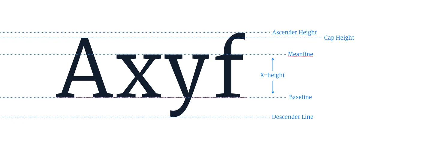
A letterform shares common characteristics with its fellows inside the same typeface. Those characteristics come down to the sizes and proportions of the same basic anatomic features, and they run through all western characters.
I thought it would be interesting to list them. Not so you memorise them, because the naming will not make much difference to the day-to-day life of either the graphic designer or the developer.
I'm listing them so you know what to look for when you're comparing two typefaces, and so the variety of jobs different fonts can do starts to make sense from their anatomy.
| Feature | What it is |
|---|---|
| Baseline | The invisible line the letters sit on |
| x-height | The height of a lowercase x, so the height of the main body of the lowercase letters |
| Cap height | The height of the uppercase letters, measured from the baseline |
| Ascender | The part of a lowercase letter that rises above the x-height, as in b, d, h, k and l |
| Descender | The part of a lowercase letter that drops below the baseline, as in g, j, p, q and y |
| Stem | The main vertical or diagonal stroke of a letter |
| Bowl | The curved stroke that encloses a space, as in b, d, o and p |
| Counter | The enclosed or partly enclosed space inside a letter, such as the hole in an o or an e |
| Shoulder | The curved stroke that comes off a stem, as in h, m and n |
| Serif | The small stroke finishing off the end of a main stroke |
| Terminal | The end of a stroke that carries no serif |
| Aperture | The size of the opening between a stroke and a counter, as in c, e and s |
| Ligature | Two or more characters joined into a single glyph, as in fi and fl |
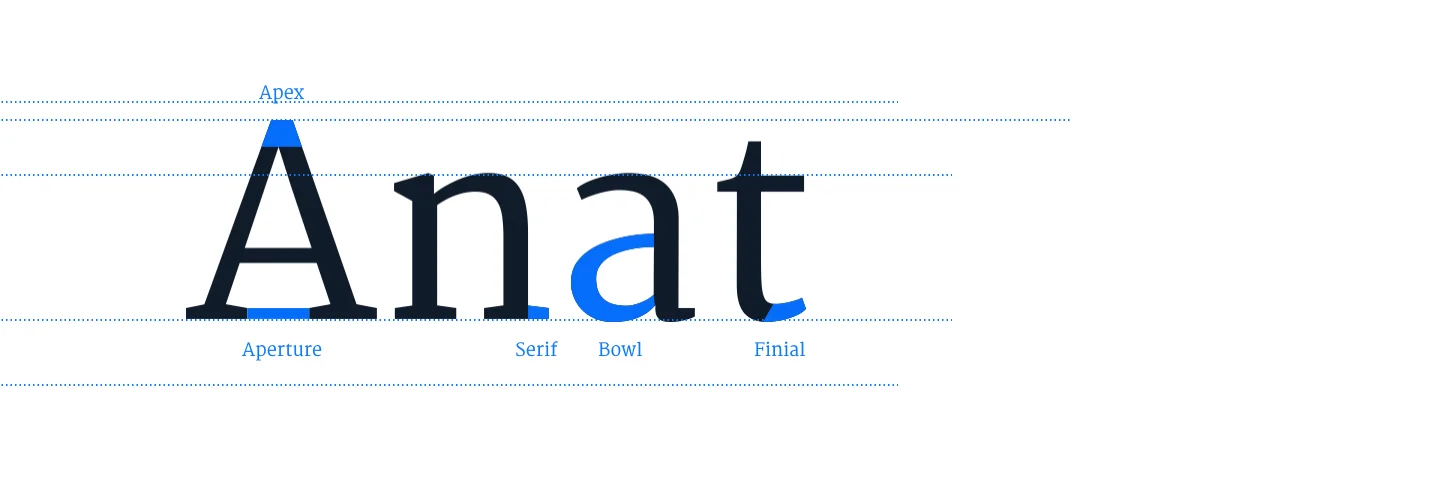
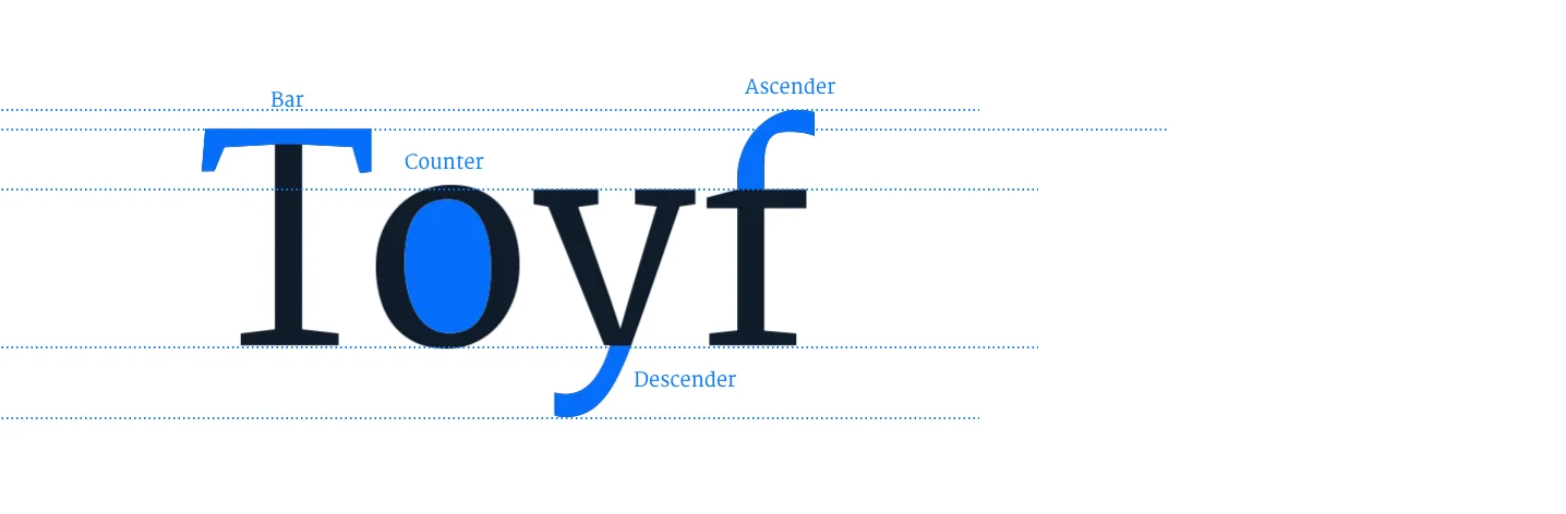
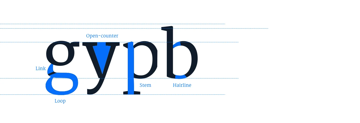
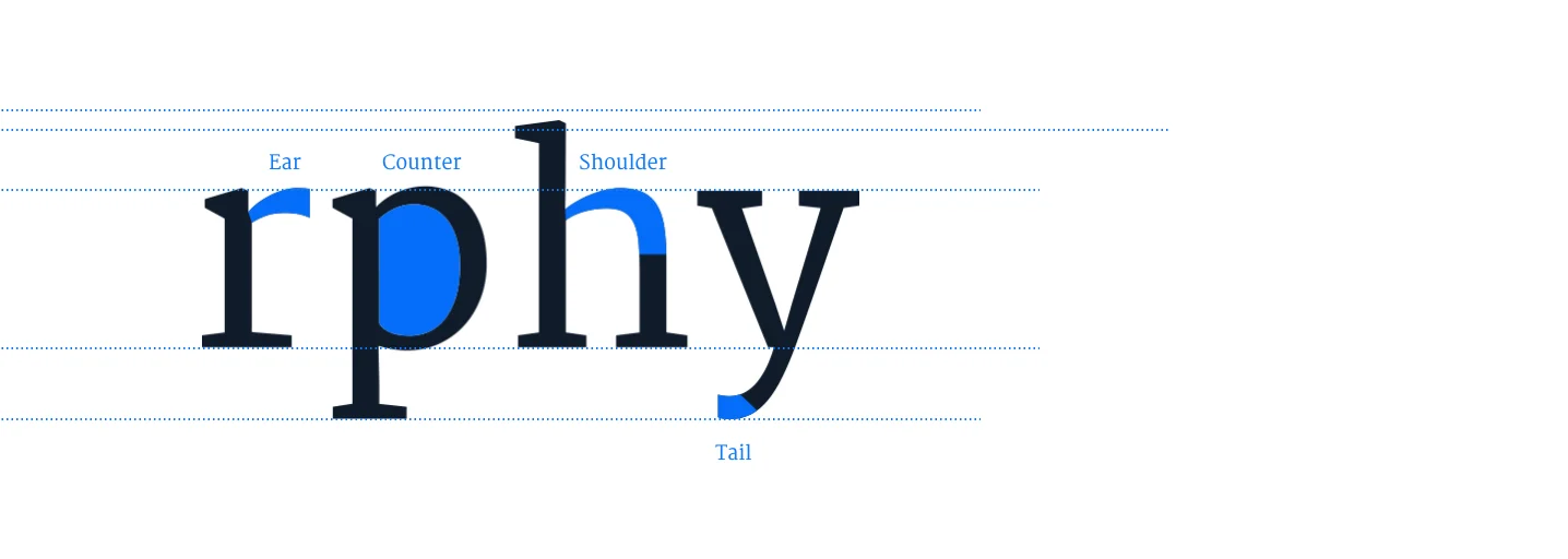
Two of them do most of the work in practice. A large x-height makes a typeface look bigger at the same set size and holds up better when it shrinks. A wide aperture stops letters like c, e and s from closing up and starting to read as one another.
Type gets classified by these structural features, by interpretational definitions, or simply by where it sits in history. The classification is only useful if it tells you where the typeface belongs, so here it is as a decision rather than a glossary:
| Classification | What defines it | Reach for it when | Avoid it when |
|---|---|---|---|
| Serif | Carries serifs. Usually subdivided by period into old style, transitional, modern and slab serif, which differ mainly in stroke contrast and in how the serifs are shaped | You want sustained reading and a settled, authoritative tone: long-form articles, editorial, documentation intros. Old style and transitional are the safe picks | Sizes drop below roughly 14px, or the face is a high-contrast modern like Didot. The thin strokes disappear on low-density screens and the text starts to shimmer |
| Sans-serif | Carries no serifs. Usually subdivided into grotesque, neo-grotesque, geometric and humanist | Almost anything interface-shaped: navigation, buttons, labels, forms, dashboards, small sizes, and any text that has to survive being resized by the reader | You need warmth or editorial personality and you've reached for a neutral neo-grotesque. It will read as correct and say nothing. Humanist sans faces are the way out |
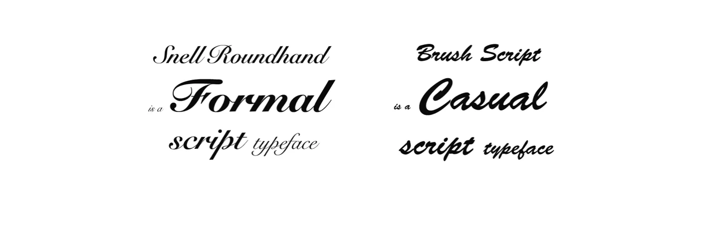
| Script | Modelled on handwriting or calligraphy, with letters that often connect | A single decorative moment: a logotype, a pull quote, a signature. One line, large, and never more | Anything a user has to read to complete a task, and anything set in uppercase — connecting letterforms fall apart when you capitalise them |
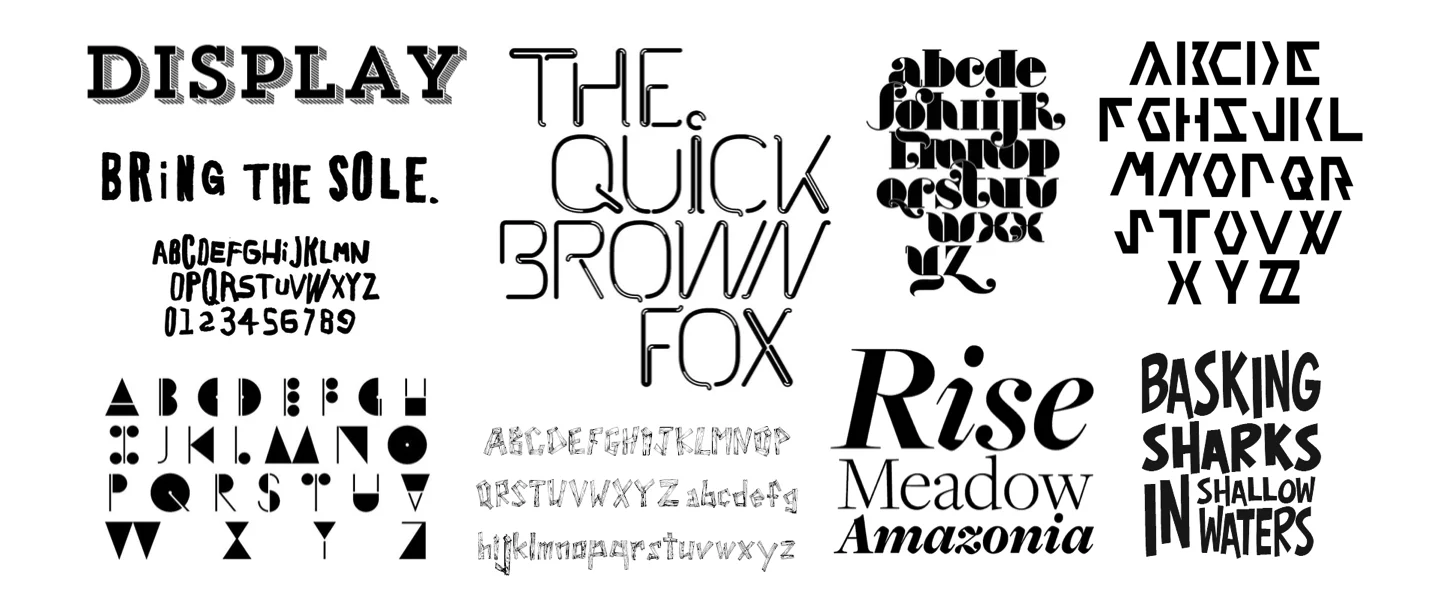
| Display | Designed for large sizes and short strings, where character matters more than sustained readability | Hero headlines and campaign pages, where the job is tone rather than throughput | It has to hold up at body size or below. Display faces are drawn for one size band and stop working outside it |
| Blackletter | The dense, angular style of early European printing | You have a specific historical or genre reason, and the string is short | Practically everywhere else. Legibility is poor for modern readers and the cultural associations are heavier than most brands want |
| Monospaced | Every character occupies the same horizontal width | Code, terminal output, IDs, diffs, and anything where column alignment carries meaning. Also numeric tables, where tabular figures stop the columns dancing | It's standing in for body text as a stylistic choice. The even widths that make code scannable make prose slower to read |
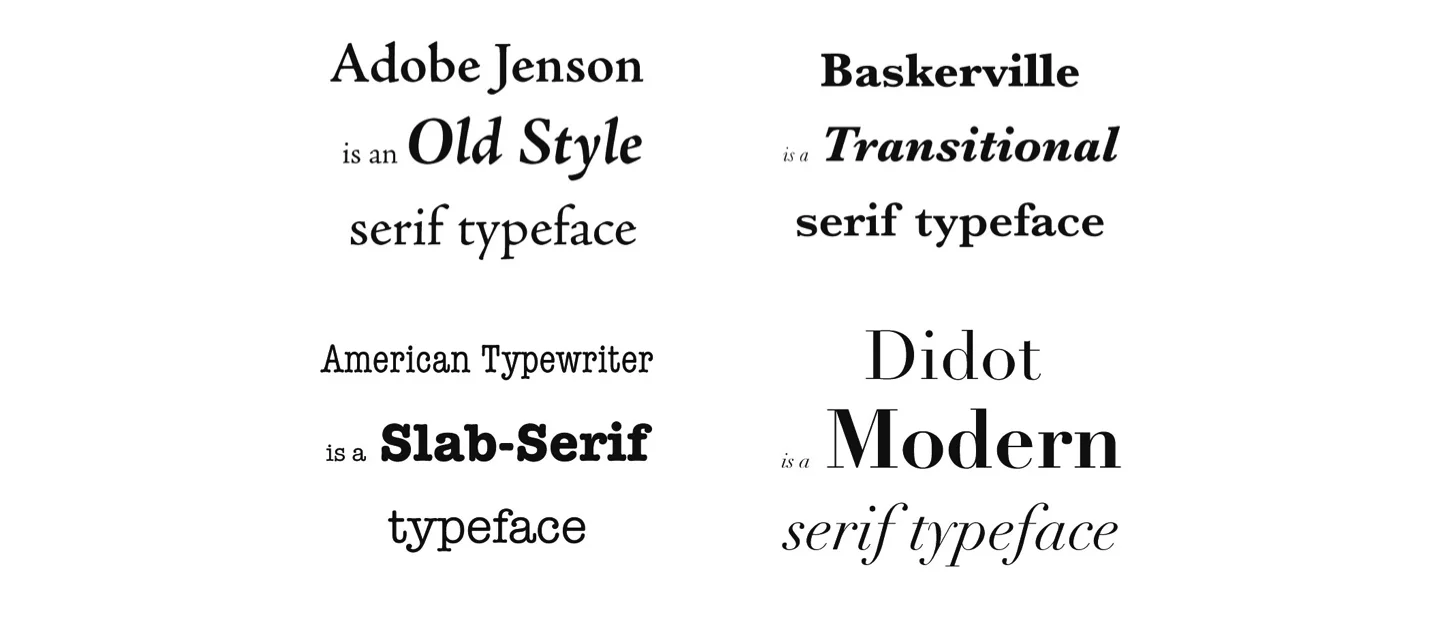
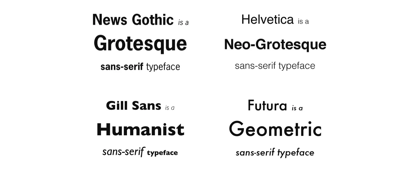
The two that matter most once you're writing code are the famous serif and sans-serif. They matter because the defining feature is objective and plainly visible, once you know what you're looking at.

The serif type, on the other hand, is said to be the best choice for long text, the kind you find in books and newspapers. Is that true? Not reliably. Much of what makes the family readable can turn against itself, depending on the features of the individual typeface. I'm fairly sure a Didot, serif though it is, will read worse than a Lato over a long stretch of text.
Didot has a high contrast between its horizontal and vertical lines, and that contrast puts noise and "bumps" into the reading flow. Lato keeps a more even proportion between the different lines of the letter, which makes it the better option of the two. It is not a perfect comparison, but the principle holds. Judge the individual typeface, not the family it belongs to.
The thing worth understanding about these two styles, if you want to know which one goes where, is what the serif is actually for. And that is easier to grasp once you know where it came from, which is what the next section is for.
Before any of this. Before we, mankind, were even considering pressing little metal pieces against paper to make books faster. Before we had considered the idea of a book, or paper, or text at all, we were already making visuals to communicate with each other.

Thousands of years of evolution made more complex visual communication a necessity, hence alphabets. But alphabets were not born out of thin air. They were the result of their own mutations and adaptations, and, as it is commonly told, the history of the letter "A" is about the most straightforward example of how most letters got where they are.

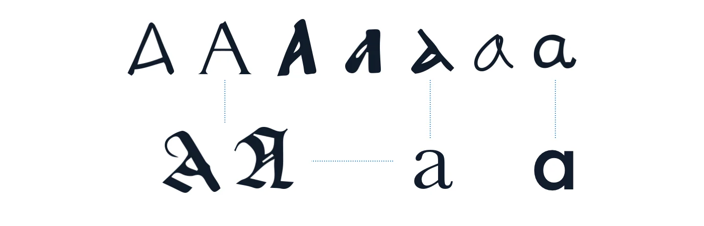
Civilisations came and went. Meanings and sounds were established, some mutated, some didn't, and the ox head was steadily simplified, rotated, geometrically perfected by Romans so it could be carved into monuments, written and embellished by monks, hand-distorted for faster and better-flowing writing, and finally picked up by typographers.
So, to sum up: the serif was born out of the need to write fast and to connect one letter to the next. Later, when reading stopped being the preserve of the clerk and the monarchy, better reading became a requirement too, and the serif got put to that use instead. That is the part worth carrying forward. The serif was a readability device before it was ever a style, so choosing between serif and sans-serif is a decision about how the text will be read, not about how it will look.
Then came typography.
As people grew more conscious of how readable a typeface was, its usage and its arrangement on the page started getting the same attention and care.
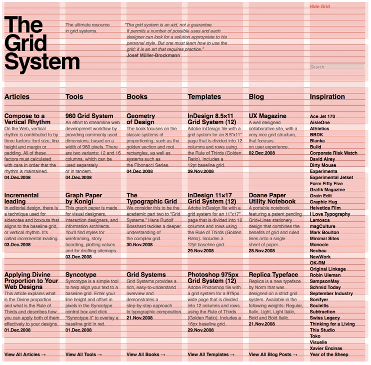
Something as basic as line spacing, which is driven directly by the typeface and its size, goes on to influence the entire page. Grid systems came along to consolidate that into rules, so any designer could build readable text and balanced pages without starting from scratch.
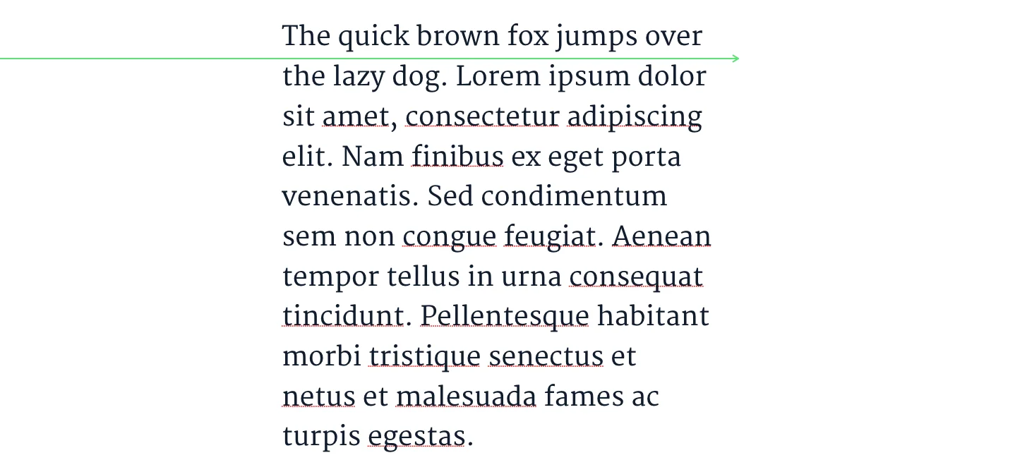
Line spacing, by the way, is line-height in CSS: the vertical distance between one line of text and the next. It can make or break any text area, because set it too tight or too loose and the reader starts skipping lines, or reading the same one twice. Everyone has been there. It was never your fault.
There is an optimal range, usually somewhere between 120% and 145% of the text size — the figure Matthew Butterick gives in Practical Typography, where he also recommends expressing it in CSS as a unitless value, so 130% becomes 1.3. If you need to work it out by eye instead, here's the trick:

Draw an imaginary line straight across the middle of the lines of text, without bumping into any descenders or ascenders. If it goes through clean, you're fine.
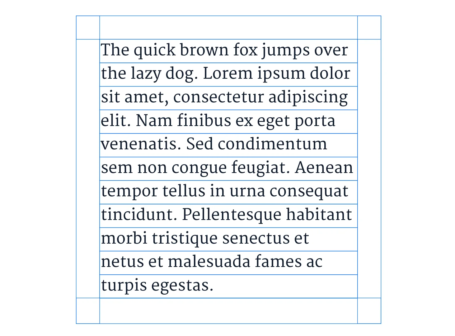
Mind the length of the lines too. The grid modules get sized from the line height, and they usually end up pretty small compared to the size of the typeface. That is not an accident. Small modules give the designer room to move when organising a page, allowing for bigger or smaller text areas while keeping a good, proportional distance between the elements.
Also, in practice, shorter lines are easier to read.
There is a good measurement for line length, and the sources cluster rather than agree. The Baymard Institute puts the optimum at 50 to 60 characters per line including spaces, following Emil Ruder, and notes that other sources accept up to 75. Butterick's line length page runs wider, at 45 to 90. Taking the overlap, 50 to 75 is the range worth designing to, with anything past 80 a problem — that is also where WCAG draws its own line. There are a few good reasons for it.
Lines that run too short force the reader to break flow constantly, going back to the left edge every few words. Important words at the end of a line start getting skipped in all that going back and forth, which is about as tiring to read as it sounds.
Lines that run too long are hard to focus on, because you cannot see where the line ends and you spend the whole time braced to jump. Plus, when the reader does jump, they are more likely to land on the wrong line entirely, because the left edge is now so far away that it is hard to tell where the last one started.
In practice, attention is highest at the start of a line and thins out towards the end, so there is a very tight balance to keep. Hence the 50 to 75 character interval as a rule of thumb.
Line spacing and line length settle one block of text. Hierarchy settles how the blocks relate to each other, and it is the part that most often reaches the developer as a vague instruction.
A type scale is the fixed set of sizes a page is allowed to use, each one a deliberate step from the last. Pick the body size first, because that is where the reader spends their time, then derive the headings from it instead of choosing them by eye. Few steps, clearly distinct. That is what makes a heading read as a heading.
Size is not the only tool, and on its own it is rarely the best one. Weight, case, colour and the space above and below a heading all separate one level from another, and space is usually the cheapest of the four. If your hierarchy only works because one level is much bigger than the next, it will collapse on a narrow screen, where every level has to shrink at once.
Readability and accessibility are the same subject looked at from two ends. Every choice above has an accessibility consequence: body size set too small, line height set too tight, line length run too wide. All of them cost some readers far more than others.
Three habits carry most of it. Keep enough contrast between the text and its background, and never let a brand colour make that decision on its own — WCAG 2.2 sets the floor at 4.5:1 for body text and 3:1 for large text. Don't let weight or colour be the only signal that something is different, because it will not reach every reader. And let text respond to the reader's own settings rather than pinning it in place; browsers and operating systems let people choose a larger size for a reason, and WCAG's resize requirement expects your layout to survive it up to 200%.
That covers most of what matters where readability is concerned. If you want a good grounding in typographical expression more broadly, though, Gary Hustwit's 2007 documentary Helvetica is your go-to.
It walks through the thinking behind the new design coming out of the fifties, and how that work grew a consciousness rooted in social responsibility, a hangover from the Second World War. You also get a look at some genuinely interesting design from the period, and an introduction to where the famous Helvetica typeface came from and what it was for.
You'll also come away seeing the stark contrast between advertising before and after the International Style, the mid-century Swiss approach built on grids, sans-serif type and the removal of decoration, and what that shift meant in practical terms for the way visual communication was, and is, done.
There are other things worth knowing, and I'm going to list them next. Do keep in mind that there are exceptions to all of these, depending on the role typography is playing in whatever you happen to be building.
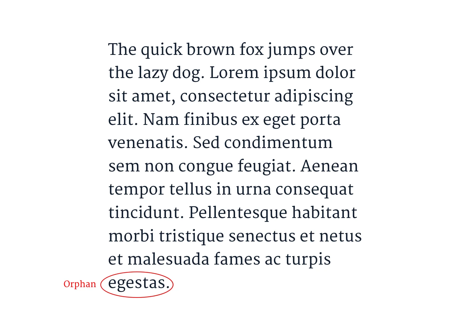
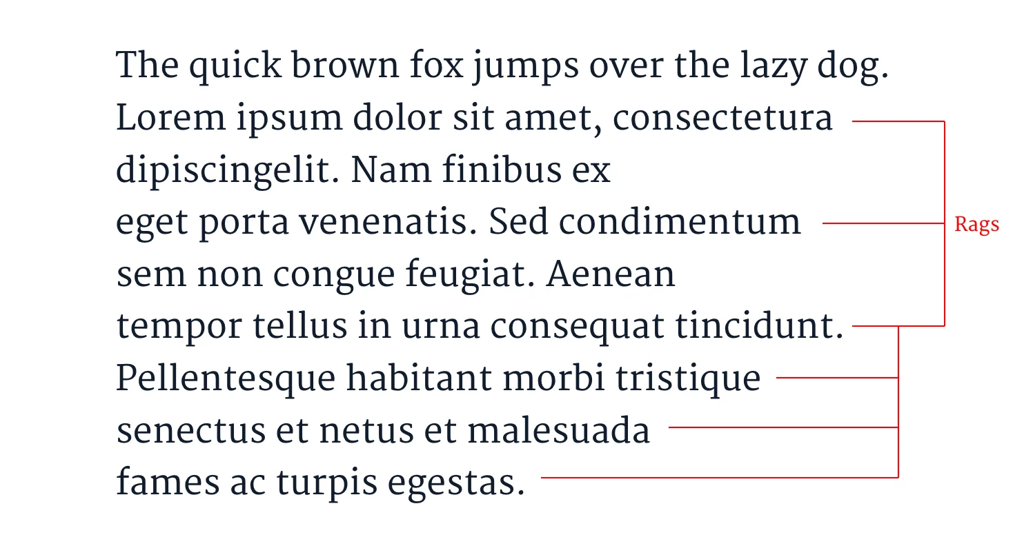
Take words that end up stranded, at the end of a paragraph or at the top of a column. They even have names. A widow is a lone last line of a paragraph left at the top of a column; an orphan is a lone first line left behind at the bottom of one. Either way you get a hole that breaks the texture of the page and pulls the eye to the wrong place. In all fairness, they are not easy to avoid in responsive design, so expect to catch them at the final breakpoints rather than design them away. Same goes for "rags", the ragged right-hand edge left by unjustified text, which you want uneven but never lumpy.
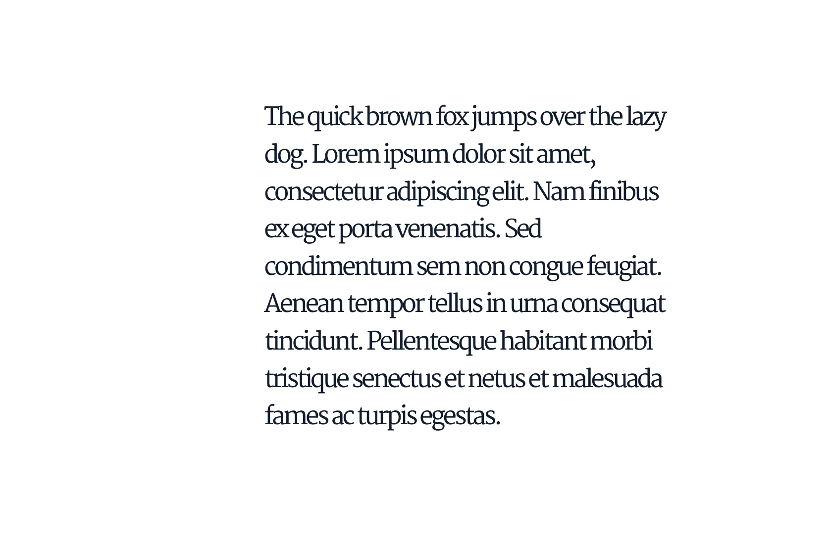
Another clear "do" or "don't", and this one is much easier to control, is character spacing: the space between the characters. Make it too tight or too loose and legibility over a long text is clearly compromised.
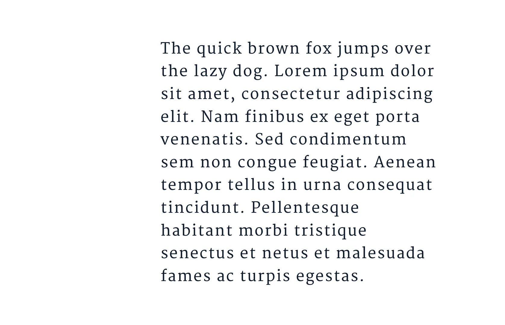
Short text and displays are a different matter, and they can take some stylisation, depending on the mood you're after.

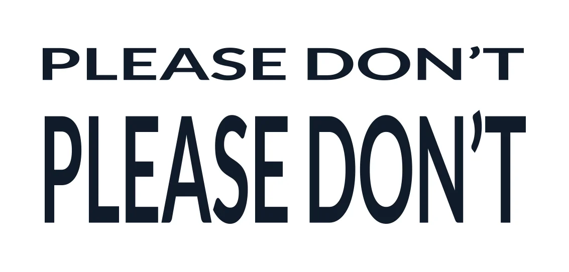
Whatever you do, though, do not distort your text by hand. Need something horizontally wider? Look up "extended" typefaces. Need something taller and more impactful? Go for a "condensed" type, there are plenty to pick from.
When you distort a typeface manually, every proportion inside the character goes out of true. The stroke weights and stem widths stop matching the rest of the family, and the character reads as broken sitting next to its neighbours.
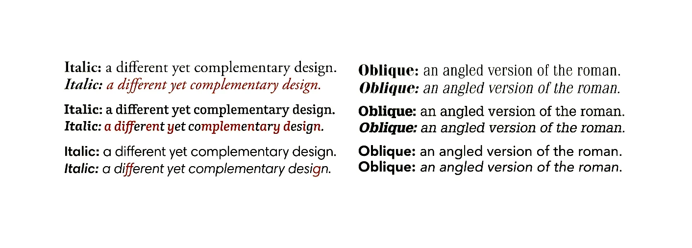
The same applies to angling a typeface to fake an "italic". It doesn't always end up looking bad, admittedly, but there are plenty of better options.
Well-designed italic fonts are not just an existing typeface on a slant. They have their own set of proportions, which is what keeps them legible and lets them sit alongside the regular version without the two of them arguing.
There is a lot more to say and a lot more to learn. At the same time, this is pretty much the necessary minimum for knowing what to look for when you're turning typography into code.
Next time you're doing front-end, the routine will more or less be there. "Text-transform?" Check. "Character-spacing?" Check. "Line-height?" Check. "Is this a serif or a sans-serif?" You can answer that one now. "Should this typeface be in a menu at all?" That one takes longer, and it is worth asking anyway.
Run that routine yourself and it is a nice habit. Agree it across a team, as a shared type scale and a short list of checks both sides use at the handover, and it stops being a habit and becomes infrastructure. The same corrections stop turning up on every project, and the argument moves off what the text should look like and onto what the product should do. Accessibility works the same way. Treat it as a preference and it is the first thing cut; treat it as a requirement and it becomes a constraint the type scale is built to satisfy from the start, which is a great deal cheaper than retrofitting it later.

What is typography?Typography is the craft of arranging type so it can be read: choosing the typeface, setting its size and weight, and controlling the space between the characters, the lines and the blocks of text. It covers the shape of the letters and the shape of the page they sit on.
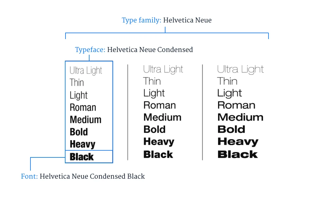
What is the difference between a font and a typeface?A typeface is a set of typographical symbols and characters. A font is a complete character set within a typeface, often of a particular size and style. Type families are groups of typefaces with related designs.
What is the ideal line height?Usually between 120% and 145% of the text size, following Butterick's Practical Typography, and best expressed in CSS as a unitless value. To judge it by eye, draw an imaginary line across the middle of the lines of text without bumping into any descenders or ascenders. If it goes through clean, you're fine.
How many characters should a line of text have?Between 50 and 75 including spaces. Baymard puts the optimum at 50 to 60 and accepts up to 75; Butterick allows 45 to 90. Past 80 you are outside what WCAG considers readable. Shorter lines break the reader's flow too often, and longer ones make it hard to see where a line ends and where the next one starts.
Is serif or sans-serif better for long text?Serif is often said to be the better choice, but it depends on the individual typeface rather than the family. Didot is a serif with high contrast between its horizontal and vertical lines, which puts noise into the reading flow, so it reads worse over a long text than Lato, a sans-serif with more even proportions.
When should you use a monospaced or display typeface?Monospaced type is for code, terminal output, diffs and numeric tables, where equal character widths keep columns aligned; it slows prose down. Display type is for hero headlines and short strings, where tone matters more than throughput, and it stops working at body size or below.
What is a type scale, and why does hierarchy need one?A type scale is the fixed set of sizes a page is allowed to use, each one a deliberate step from the last. Set the body size first, then derive the headings from it. Few, distinct steps are what make a heading read as a heading, and weight, case, colour and surrounding space do the rest.
Why should you not fake an italic or stretch a typeface?Because distorting a typeface by hand throws every proportion inside the character out of true, and the stroke weights and stem widths stop matching the rest of the family. If you need something wider, look up "extended" typefaces; taller, "condensed". Well-designed italics have their own proportions rather than an angle applied to the regular weight.
On related design decisions, see Minimalism or Brutalism: which one to pick? and Designing apps for kids: a reading app user experience.
At Imaginary Cloud we have a team of experts on UI and UX design. If you think you could use some help with design, drop us a line.

I'm UI & product designer, illustration artist and painter. Known for my love of trashy beach towels, music production, typography and all kinds of pizza.
People who read this post, also found these interesting: