Written by:


Last Published:
11 August 2026
•
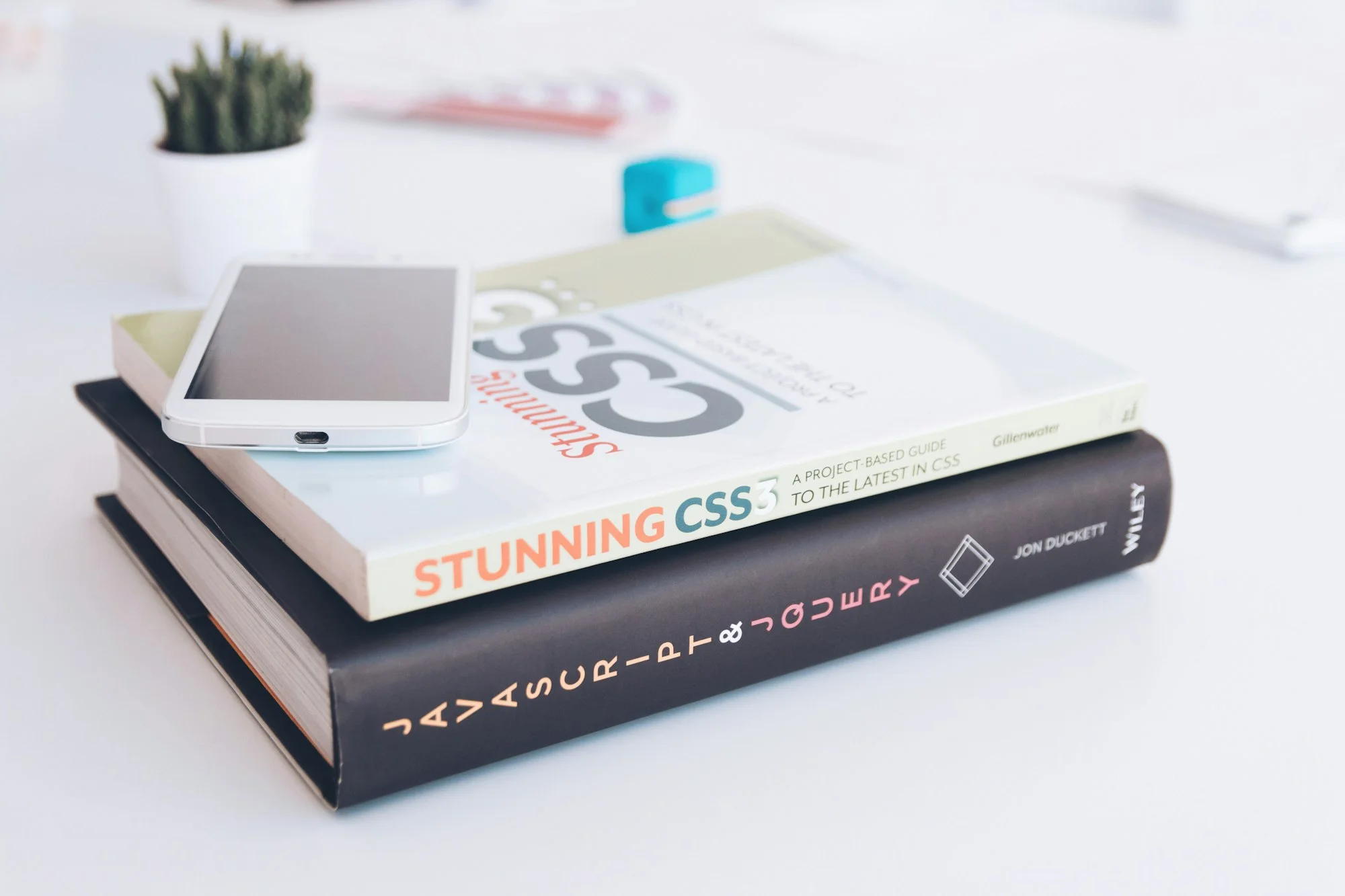
A CSS animation is a change to an element's style that the browser plays out over time. You can write one two ways: the transition property, for state changes such as hover, and the animation property with @keyframes, for sequences that run on their own. This guide covers both. But the argument underneath it is simpler than either: the property you choose to animate matters more than the syntax you choose to write it in. Syntax takes an afternoon to learn. Whether the animation rides on the compositor thread or forces the browser to recalculate layout sixty times a second is what decides if the interface still feels fast on the hardware your users actually own, and it is the one that costs money to get wrong.
At Imaginary Cloud we scope animation work against two elements: Animation Timing, the duration and delay that turn an instant style change into movement, and Inner Components, the pseudo-elements and extra elements that let one component carry several movements at once. Between them they tell you what an effect will cost to build and to keep, and they run through every section below.
You can build motion on a webpage in a few ways. Drop in a premade GIF as a regular image and it is simple, but you have just given up the ability to change that animation in code. Manipulate HTML elements with JavaScript and it works, though it runs on the browser's main thread and queues behind everything else there. Or define multiple styles of an element in CSS and let the browser move between them over time, which is easier to write and easier for the browser to optimise.
None of this is decoration. A loading animation tells a user that something is still happening, where a blank white page leaves them wondering whether the tab has died. Same wait, different experience. That is the whole reason animation work is worth doing properly rather than not at all.
CSS offers two types. The transition property handles hover effects and other user interactions. The animation property handles continuous motion or, as we will see, motion with several stages.
See the Pen types of animations by Patrícia Silva (@patsilva_tese) on CodePen.
Simple or complex, every CSS animation comes down to two things: Animation Timing and Inner Components. An animation with no time attached is not an animation at all, since it just changes instantly. And inner components save you, because more often than not one element is not enough to build the effect you actually want. Let us take them in turn.
To get a smooth animation or transition, you have to define time limits. Both the transition and animation properties give you duration, how long it takes to go from start to finish, set by the first time unit in the declaration. Then delay, how long the element waits before starting, set by the second.
/* transition: property duration timing-function delay; */
transition: all 0.5s linear 0.2s;

/* animation: name duration timing-function delay iteration-count; */
animation: rotate 1s linear 0.2s infinite;
See the Pen animation timing by Patrícia Silva (@patsilva_tese) on CodePen.
The second key factor, and the route to anything sophisticated, is inner components. If you only need one or two extra elements, the ::before and ::after pseudo-elements will do it. Your HTML stays exactly as it was:
<ul>
  <li><a href="#">home</a></li>
</ul>
And the two extra elements get declared entirely in CSS:
a::before { content: ""; }
a::after  { content: ""; }
Style them as usual in your stylesheet. There is no need to declare them in the HTML at all, because the browser attaches them to the main component for you and leaves the markup intact. The one difference is the content property, which takes a string. Think of it as describing the text inside a div, except you are doing it from the CSS side. Here is how a::before was styled, with an empty string on content so that it creates nothing but that little corner:
a::before {
  content: "";
  position: absolute;
  bottom: 12px;
  left: 12px;
  width: 12px;
  height: 12px;
  border: 3px solid #FCD63F;
  border-width: 0 0 3px 3px;
  opacity: 0;
  transition: all 0.3s;
}
And the hover state it transitions into:
a:hover::before {
  opacity: 1;
  bottom: -8px;
  left: -8px;
}
Need more than two extra elements? Then use standard HTML components. Change the structure, drop in unstyled spans, style them, and apply the transition or animation. Multiple components also earn their place when you have different types of movement happening at once, since each component can only take one animation or transition at a time. The loading effect below is exactly that: a div named container with four spans inside, where the container has one animation making it grow and each span has another making it rotate.
<div class="container">
  <span></span>
  <span></span>
  <span></span>
  <span></span>
</div>
This is also where your estimate comes from. An effect that needs no inner components is a change to a stylesheet. An effect that needs four is a change to the markup, which means review, cross-browser checking, and a component somebody has to understand a year from now.
So how do you implement a transition? Start by defining an initial and a final state for every element involved, including the ::before and ::after components. The transition property then tells those components how to behave in between. It is a composition of four others: transition-delay and transition-duration, the time-related pair we covered under Animation Timing, plus transition-property and transition-timing-function.
See the Pen transition property by Patrícia Silva (@patsilva_tese) on CodePen.
Let us look at those last two.
This specifies which properties are affected. Set it to all and every property that changes between the two styles gets picked up. Or name a specific property, or a set of them, which is what you want when different properties should move at different speeds. Say you want the background colour to change much faster than the text colour:
transition-property: background-color, color;
transition-duration: 0.2s, 1s;The timing function sets the transition's velocity. It has a menu of keyword values, plus two functions that let you define your own curve:
linear, constant velocity throughout;ease-in, starts slow, then gets faster;ease-out, starts fast, then gets slower;ease-in-out, a mix of the two: slow, faster, slow again;ease, a variation of the previous one and the default value of this property;steps(n), which jumps between n discrete states rather than interpolating, and is how sprite-sheet and typewriter effects get built;cubic-bezier(x1, y1, x2, y2), which defines your own acceleration curve when none of the keywords fit;linear(), a newer addition that approximates springs, bounces and other complex easing by listing points along the curve. It now has broad browser support, so you no longer need JavaScript for a bounce.See the Pen transition-timing-function possible values by Patrícia Silva (@patsilva_tese) on CodePen.
Unlike transitions, the animation property needs no list of affected properties and no explicit start and end state. That freedom comes from keyframes. Keyframes define the different states of the component under a name, which you then hand to the animation property. With two states, from and to will do. When you want more, use percentages, as in the rotate animation from the loading effect:
@keyframes rotate {
  0%   { transform: rotate(0deg); }
  10%  { transform: rotate(0deg); }
  50%  { transform: rotate(90deg); }
  90%  { transform: rotate(90deg); }
  100% { transform: rotate(90deg); }
}
Like transition, the animation property is a composition of others. You get animation-duration, animation-delay and animation-timing-function, which behave exactly as their transition equivalents did under Animation Timing. Then animation-name, where the keyframe name goes. Then animation-iteration-count, a specific number or infinite. Then animation-play-state, which takes running or paused and lets you freeze an animation in place from a class or from script. And finally animation-direction and animation-fill-mode, both below.
animation-fill-mode is the one that catches people out. It answers a question you only think to ask once something looks wrong: what happens to the element outside the animation's own running time?
See the Pen animation-direction by Patrícia Silva (@patsilva_tese) on CodePen.
Almost any property, as long as it is expressed in unit values. Colours, height and width, margins and paddings, opacities, transform: all fine. Border style, position, float, background-image, font-family: no effect at all. The MDN reference on animatable CSS properties keeps the full list.
But animatable is not the same as cheap. When a browser renders a page it works through a sequence of steps: Layout, which calculates where every element sits and how big it is; Paint, which fills in the pixels; and Composite, which assembles the painted layers onto the screen. Animate something that triggers Layout, like width, and the browser has to redo Paint and Composite on every single frame as well. Which is why properties that only touch the Composite step, transform and opacity, should be prioritised. Google's web.dev guidance on CSS transitions walks through why transform is the smooth, battery-friendly choice.
If you know an element is about to animate, you can hint it to the browser with the will-change property so the layer is promoted ahead of time. Use it sparingly: promoting everything defeats the point and eats memory.
Browser support is no longer your constraint. Transitions and animations have been part of the Baseline set of widely available features for years across every major engine. What your property choice still decides is how many of those three rendering stages the browser has to repeat, sixty times a second, on whatever device the page opens on.
See the Pen JjKbdeE by Patrícia Silva (@patsilva_tese) on CodePen.
As we said, transform is one of the cheapest properties to animate. Cheap does not mean limited. It gives you a lot to work with:
translate(x, y), moves an element x pixels horizontally and y pixels vertically. Negative values move it left or up, positive ones right or down.rotate(y), rotates an element y degrees. Positive for clockwise, negative for anticlockwise. It pivots around the centre of the element by default, which you change with the transform-origin property.scale(x, y), alters the size. Two values change the width x times and the height y times. One value changes both by that factor and keeps the element's proportions. Use scaleX(x) and scaleY(y) to target one axis. Above 1 makes it bigger, between 0 and 1 smaller.skew(x, y), skews the element x degrees horizontally and y degrees vertically. Give it one value and only the X-axis is affected, with y set to 0. As with scale, skewX() and skewY() target each axis individually.matrix(a, b, c, d, tx, ty), which combines scale, skew and translate in a single declaration, taking six values in that order.All of these pivot around the centre of the element unless you change transform-origin. That takes one or two percentages, or one of the keywords top, bottom, right, left and center. Note the American spelling on that last one: it is what the CSS specification defines, and the only form the browser will accept.
If you went digging through the code of the earlier animations, you may have noticed we are not using transform throughout. That does not mean the same animations cannot be built with transformations alone. So we rebuilt both effects using only transform, to show it. The HTML structure stays exactly as it was.
See the Pen previous animations using transform by Patrícia Silva (@patsilva_tese) on CodePen.
Here is the development that changes what a "CSS animation" even means in 2026. A scroll-driven animation ties a @keyframes sequence to scroll position rather than to the passing of time. The reveal-on-scroll effect that used to need IntersectionObserver, a scroll listener or a library such as GSAP is now three lines of CSS, and it runs on the compositor thread rather than the main one.
@keyframes fade-in {
  from { opacity: 0; }
  to   { opacity: 1; }
}

.card {
  animation: fade-in linear;
  animation-timeline: view();
}
Two functions drive it. scroll() ties the animation to a scroll container's overall progress, which is what you want for a reading-progress bar. view() ties it to a specific element's position within the viewport, which is what you want for a reveal. The MDN scroll-driven animations guide covers the full API.
One honest caveat on support. Chromium browsers have shipped this unflagged since Chrome 115 in July 2023, and Safari added it in Safari 26 in September 2025. As of mid-2026, Firefox stable still sits behind a flag, so global support is roughly 82 per cent and the feature is not quite Baseline yet. Treat it as a progressive enhancement: write the revealed state as your default, wrap the movement in @supports (animation-timeline: scroll()), and the failure mode is simply "no animation" rather than a broken page. Wrap it in prefers-reduced-motion as well, because scroll-linked motion is particularly likely to trigger discomfort for users with vestibular disorders.
A related pair worth knowing: @starting-style together with transition-behavior: allow-discrete finally lets you animate an element in and out of display: none, which is what you need for dialogs, popovers and toasts that used to demand JavaScript.
Think of the browser's main thread as a single-lane road. Layout, painting and every line of your application's JavaScript all queue on it, so when one heavy task takes the lane, everything behind it waits. CSS animations, depending on which properties you are changing, get to use a second lane called the compositor thread. Main-thread animations stall when traffic backs up. Compositor ones keep moving.
The consequence is measurable. A browser has roughly 16 milliseconds to produce each frame at 60 frames per second, and rather less once its own overhead is counted. Miss that budget and the frame is dropped, and a dropped frame is what a user reads as stutter. Keep animations to transform and opacity and the work leaves the critical path entirely. Property choice, far more than the choice between CSS and JavaScript, decides whether an animation holds its frame rate.
This is not abstract for us. When our front-end team rebuilt AppTweak's dashboard in React and TypeScript, keeping the heavy work off the main thread was a large part of what took its loading time down by 80 per cent. The same principle that keeps a dashboard responsive is the one that keeps an animation smooth.
It also matters commercially, because perceived speed is the thing users actually feel. Responsiveness now has its own Core Web Vital: Interaction to Next Paint (INP) replaced First Input Delay as a Google ranking signal on 12 March 2024, and it measures the full latency from a user's tap to the next painted frame across the whole visit, not just the first interaction. Google's own Search Central announcement spells out the change, and MDN keeps a plain-language definition of INP. An animation that blocks the main thread hurts that number directly. An animation on the compositor does not.
JavaScript still has its place. Reach for it when an animation has to respond to logic mid-flight, or when you need the finer control of the Web Animations API. For most interface motion, CSS is the faster and cheaper answer. If you want a second opinion on where your interface is losing frames, that is exactly what a technical and UX audit is for.
Motion is not neutral. For users with vestibular disorders, large or repeated movement can trigger nausea and dizziness, which is why operating systems expose a reduce-motion setting in the first place, and why WCAG 2.1 lists Animation from Interactions as a success criterion. Ignoring that setting is an accessibility failure. If you have a public-sector or enterprise client, it is a compliance one too.
CSS reads the setting directly through the prefers-reduced-motion media query. The safest default is to keep your animations as written and neutralise them for anyone who has asked for less motion:
@media (prefers-reduced-motion: reduce) {
  *,
  *::before,
  *::after {
    animation-duration: 0.01ms !important;
    animation-iteration-count: 1 !important;
    transition-duration: 0.01ms !important;
    scroll-behavior: auto !important;
  }
}
The near-zero duration rather than none is deliberate. It lets any animationend handler still fire, so nothing in your JavaScript sits waiting for an event that never arrives. And where motion carries meaning rather than decoration, a loading indicator being the obvious case, swap it for a static or fading equivalent instead of stripping the feedback away entirely. A cleaner pattern for new projects is to opt in the other way: define the reduced version as your default, then add motion only inside @media (prefers-reduced-motion: no-preference).
Animation gets estimated as polish and paid for as engineering. Scoped through Animation Timing and Inner Components, the cost lands in three places, and it is worth naming all three before a build starts.
The first is build time, and Inner Components is what predicts it. A transition on an existing element is a handful of declarations, well under an hour including review. A keyframed sequence needing four inner components is a different animal: markup changes, review of those changes, cross-browser checking, and a component somebody inherits. Realistically a day rather than an hour. That ratio is the number worth carrying into an estimate.
The second is performance risk. An animation on a Layout-triggering property is not slower in any way a developer notices on a fast machine. It shows up on mid-range mobile, where that same 16-millisecond frame budget has to be met with a fraction of the processing power, and where a stuttering interface reads to the user as a slow site rather than a janky one. Choosing transform over width costs nothing at build time and removes the risk outright. Our AppTweak dashboard rebuild is the proof: the 80 per cent we recovered came from keeping work off the main thread, not from adding it back.
The third is maintenance. Every animation is a state your interface can be caught in, and every one of them has to survive the next redesign. Timing and Inner Components help here too. An effect built from a clear timing rule and a small, named set of inner components is one another developer can pick up, and one you can change without unpicking the whole component. It is the same discipline that makes a design system worth having, and the same reason it pays to have a UI developer who owns the front-end rather than a stylesheet nobody owns.
There is a related judgement about tooling. When we migrated FlippedNormals from WordPress to a custom platform on AWS, the decision was not "custom is better" in the abstract; it was that the existing stack was capping growth, so the migration paid for itself in headroom and a traffic lift. Animation choices work the same way. The question is not whether motion is worth it. It is which interactions justify the structural work, and which are perfectly well served by a transition on a compositor-only property.
For most interface work, yes. CSS animations on transform and opacity can be handed to the compositor thread and keep running while the main thread is busy, whereas JavaScript animations run on that main thread and compete with everything else on it. JavaScript is still the right tool when an animation has to respond to logic mid-flight, or when you need the finer control of the Web Animations API.
transform and opacity, because they only trigger the Composite step of the rendering pipeline. Animating width, height, margin, padding or top and left triggers Layout, which forces Paint and Composite to run again on every frame. MDN's animatable properties reference lists what is available.
A transition runs between two states and needs something to trigger it, usually a hover or a class change. An animation runs on its own, needs no trigger, and can define as many intermediate states as you like through @keyframes percentages. Transition for a state change. Animation for a sequence.
In most browsers, yes. Scroll-driven animations use animation-timeline with scroll() or view() to tie a keyframe sequence to scroll position, entirely in CSS, running on the compositor thread. Support is broad but not universal as of mid-2026 (Firefox stable is still behind a flag), so wrap it in @supports and treat it as progressive enhancement. See the MDN scroll-driven animations guide.
Usually because it animates a property that triggers Layout, so the browser recalculates geometry every frame and blows its 16-millisecond budget. Check which properties you are animating first, then swap them for the transform equivalent where you can: translate() instead of top and left, scale() instead of width and height.
Honour the prefers-reduced-motion: reduce media query, which reports the reduce-motion setting the user has already chosen at operating-system level. Shorten durations to near zero rather than removing animations outright, so any code listening for animationend still fires. And where motion carries meaning, such as loading feedback, replace it with a static equivalent rather than with nothing.
It can. A main-thread animation competes with event handling, which hurts Interaction to Next Paint, the responsiveness Core Web Vital that replaced First Input Delay in March 2024. Keeping animations on the compositor with transform and opacity keeps that work off the critical path.
Not on the same property. Each element takes one transition or animation per property, which is exactly why sophisticated effects get built from inner components: ::before and ::after for one or two extra elements, additional spans or divs when you need more, each carrying its own movement.
As few as express the movement. The rotate animation in the loading effect above uses five, and three of those exist to hold a position rather than to move between them. Holding a state at 10% and 90% is what produces a pause. Adding keyframes that do not change a value adds nothing at all.
Making animations with CSS, and with transform in particular, should be your default. Get Animation Timing and Inner Components right, then choose properties that keep the work in the compositor lane. That single choice is what separates an interface holding 60 frames a second from one that stutters on the hardware most of your users have, and it costs nothing at build time to get right. Be careful about overusing motion, honour the reduce-motion setting, and remember the point underneath all of it: the property you animate matters more than the number of animations you write.
If you are weighing up front-end performance work, or want a second opinion on where an interface is losing frames, our web and mobile development team is happy to take a look. You can see how we have approached similar builds or start a conversation.
Web developer with a special love for front-end. Mother of cats. I try to help save the planet in my free time by sharing eco-friendly alternatives.
Alexandra Mendes is a Senior Growth Specialist at Imaginary Cloud with 3+ years of experience writing about software development, AI, and digital transformation. After completing a frontend development course, Alexandra picked up some hands-on coding skills and now works closely with technical teams. Passionate about how new technologies shape business and society, Alexandra enjoys turning complex topics into clear, helpful content for decision-makers.
People who read this post, also found these interesting: