
Sandro Cantante

09 August 2026

Min Read

UX design fails: what high-end companies get wrong

White iPad and black tablet displaying Spotify playlists, a case study in high-end UX design fails and wins.

The short version

- A design fail is the gap between what a product offers and what a user can actually find.
- Three products that hundreds of millions of people use daily (Spotify, Facebook and Google Analytics) each carry one that has survived years of iteration.
- They survive because scale absorbs the cost. The same fail is enough to sink a six-month-old product.
- The four costs worth putting to a budget-holder: abandoned journeys, support volume, early churn, and a late redesign (commonly cited as up to 100× the cost of fixing it at design time).
- Use the Four Questions UX Audit at the end to catch yours.

Design fails are the small breaks between what a product offers and what a user can actually find. A playlist buried three levels down. A privacy setting nobody can locate. A report nobody can build. Even the biggest companies ship them, and this article shows three, what each one costs, and how to catch yours.

It is written for whoever signs off the roadmap: a founder, a product owner, a budget-holder. The examples are consumer products because everybody has used them, but the argument is about what the same fail would do to yours. We have seen before how good UX can be determinant in some markets; here I want to look at the other side. What does bad UX actually look like, and how are we affected by it? From smaller businesses to high-end companies, nobody is immune.

blue arrow to the left
Imaginary Cloud logo

Three design fails hiding in plain sight

Think of a product as a building that keeps having rooms added to it. Every new room is useful. But nobody redraws the map at the door, so after a few years the most popular room is the one guests can never find, and the sign pointing to it went up before the extension was built.

Each of the three products below is used daily by hundreds of millions of people. Each carries a design fail that survived years of iteration, because the companies behind them can absorb the cost.

A laptop screen displaying the Spotify desktop application interface with various music playlists and UX design elements.

Spotify: a well-loved feature nobody can locate

Try to recall exactly where Discover Weekly sits in Spotify, without opening the app. Most people cannot. We know it exists, we like listening to it, and we have no real idea where to start looking.

Your Daily Mix? Release Radar? Search? The Made For You hub? Spotify has since moved Discover Weekly into that Made For You hub and, for the playlist's tenth birthday, given it a refreshed design and genre controls. Even so, it tellingly still leaves most people guessing where to tap first. Ten years of goodwill, and the feature is still somewhere you have to hunt for.

In his Medium case study on Spotify's navigation, Nabeel Khalid captures the experience well: searching for a single track and ending up several levels deep inside a random album, left wondering how to get back out.

The failure here is navigational depth. A feature people already want has been put somewhere they cannot predict. Nielsen Norman Group's usability heuristics call this a breach of recognition over recall, the principle that a user should be able to see their options rather than remember where they were. It is the most common design fail in mature products, for the reason the building analogy gives you: rooms get added faster than anyone redraws the map.

The remedy is unglamorous. Put the feature where the user first looks for it, and accept that where they look is a question for research, not for a meeting.

Smartphone displaying the Facebook mobile UX design next to a high end laptop on a glass table.

Facebook: settings that are hard to change by design

There is a great deal more to discuss about Facebook's privacy, but I will stay on the user experience here. It seems odd that changing a simple privacy setting takes a whole journey. Then again, that might be the whole point.

Whatever the purpose, it annoys people. The settings are hard to find, it is hard to work out which one you actually want, and it is hard to tell whether the option you picked is doing anything at all.

Too many options look alike. Some are unclear. Others we are frankly afraid to touch. It should go without saying, but when users want to avoid certain pages of your product, you are doing something very wrong.

And it is not only the privacy settings. Messages are just as fragmented: conversations with friends, message requests from people you are not connected to, and a filtered folder most people never discover, each in a different place, and split further once Messenger became its own app. The division might be understandable internally. The way it lands on the user is not.

Google search results for 'analytics' on a smartphone screen, featuring high-end mobile UX design.

Google Analytics: power that nobody can operate

Google sets the design standard that much of the web follows, from Material Design to its own product suite, and it is not flawless either. Most of its products are well designed and easy to use. Google Analytics is still a mess that is far too hard to deal with. The move from Universal Analytics to GA4, completed when Google shut Universal Analytics down for good in July 2024, did not make it friendlier.

Analytics holds some of the most relevant data anyone can have about user behaviour. Getting it out is, ironically, a pain, and it costs you a great deal of time before it gives you anything.

Start with the thing the product keeps nudging you to do: mark what counts as a conversion. In the old version you "set a goal." GA4 removed goals entirely. Now you mark an event as important, and Google cannot even decide what to call it. It launched as a "conversion," was renamed a "key event" in 2023, then quietly reverted to "conversion" in 2024. If the company that built the tool keeps changing the word for its single most important action, the person trying to use it has no chance.

Building a report goes the same way. Explorations? Free-form or funnel? Dimension or metric? Custom definitions? The terms are not wrong. They are simply undefined at the point of use, which turns a reporting tool into a training problem.

Analytics compiles a huge amount of data, and designing a way to make all of it available is a demanding task. But Google has the research capacity and the usage data to solve it. That makes the state of the interface a choice, not a constraint.

blue arrow to the left
Imaginary Cloud logo

Why scale buys tolerance for a design fail

These mistakes will probably never trouble companies at this level. Most users keep going, quietly annoyed, stepping over the obstacles the UX designers left behind. The same mistake is enough to seal the fate of a new product from a small company.

Scale is what buys the tolerance. Someone who cannot find Discover Weekly stays anyway, because everything else in the library holds them there. Someone who cannot find the equivalent feature in a six-month-old product has no reason to stay at all.

So the bottom line is to understand your ideal user, then make sure everything in your product behaves the way that user expects. It takes time. You get the time back later. We saw this first-hand with NotaryCam: rebuilding the experience around how people actually used it, rather than how the product had grown, helped the platform go on to power over a million completed notarizations.
UX Audit ad focusing on product performance recovery, featuring a blue isometric mobile app interface illustration.
blue arrow to the left
Imaginary Cloud logo

What design fails actually cost

The commercial case rarely gets made, which is exactly why these problems survive so long. Four costs are worth putting in front of anyone approving a budget.

Abandoned journeys. Baymard Institute's meta-analysis of 50 studies (updated September 2025) puts the average online cart abandonment rate at 70.22%. Among shoppers who abandon for a fixable reason, the biggest triggers are unexpected extra costs like shipping and tax (39%), being forced to create an account (19%) and a checkout that is simply too long or complicated (18%). Much of that is friction, not price. Every step a user cannot complete is revenue that does not arrive.

Support volume. A setting nobody can find becomes a ticket. A report nobody can build becomes a request to the data team. The cost simply moves from the product budget to the operations budget, where it is harder to see and easier to keep paying.

Retention. The tolerance that protects Spotify does not exist for a product someone tried last week. Churn caused by navigation is churn that happens before the value has ever been felt.

The cost of a late redesign. Fixing a structural design fail after launch means unpicking flows, data and content at once. The software quality literature has put a rough multiplier on this for decades: the widely cited 1:10:100 rule, most often attributed to the IBM System Science Institute, holds that a problem costing one unit to fix at design time costs around ten in development and around a hundred once it is live. The exact ratio is arguable, and its precise origin is disputed. The direction is not.
blue arrow to the left
Imaginary Cloud logo

The common thread: products that ignore how people behave

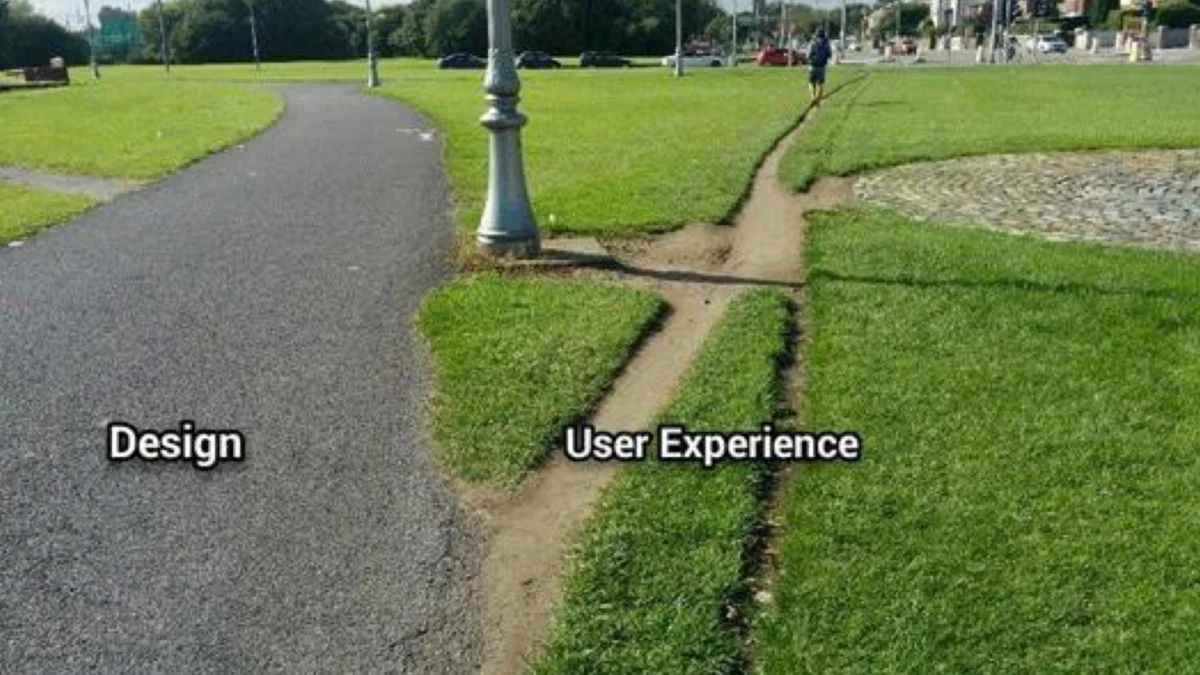
A desire path labeled User Experience shortcuts a paved walkway labeled Design, illustrating common UX design fails.

Not everything that goes wrong comes down to bad UX design. But there is one thing running through every example here: things are not working the way users intend them to. The path is paved one way, and people walk another.

The list of conditions for a good user experience is long. Every one you meet removes a reason for somebody to leave. So assume less and research more. Watch five real users attempt the journey that matters most to your business, and fix whatever makes three of them hesitate.

blue arrow to the left
Imaginary Cloud logo

The Four Questions UX Audit

When we review a product at Imaginary Cloud, we start with four questions, in this order. They are deliberately blunt, and the first two catch most design fails on their own.
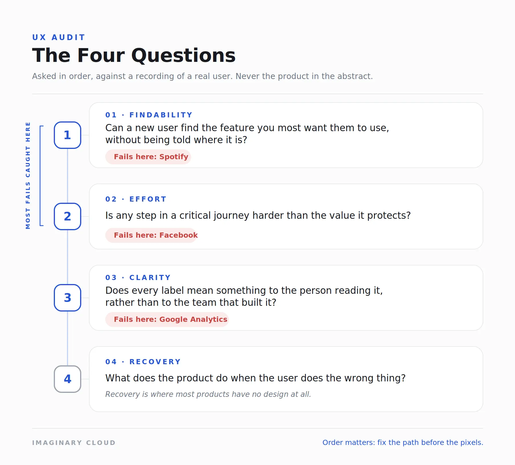
Digital interface mockup highlighting high end UX design fails during a website audit.
  1. Can a new user find the feature we most want them to use, without being told where it is? Spotify fails this one.
  2. Is any step in a critical journey harder than the value it protects? Facebook's privacy settings fail this one.
  3. Does every label mean something to the person reading it, rather than to the team that built it? Google Analytics fails this one.
  4. What does the product do when the user does the wrong thing? Recovery is where most products have no design at all.

We ask each question against a recording of a real user, never against the product in the abstract. That is why the answers tend to be uncomfortable.

blue arrow to the left
Imaginary Cloud logo

What to do once you have found one

A found fail is not a fixed one, and the order of the repair matters more than its size.

  • Confirm it is structural, not cosmetic. If three users in five hesitate at the same step, it is structural. If one does, it is a preference.
  • Fix the path before the pixels. Moving a feature to where people look for it beats restyling a button they never reach.
  • Change one thing at a time. Two simultaneous changes to a flow leave you unable to say which one worked.
  • Measure the step, not the session. Completion rate at the failing step moves first. Revenue moves later, and for many reasons.
  • Check it on a phone, and check it with a screen reader. Fails of this kind are usually worse on a small screen, and a navigation problem is usually an accessibility problem too.

Now, is every design fail an accident? No, of course not. Sometimes what looks like a mistake is a way of driving users towards a certain page or option. That is a dark pattern, and it is a business decision rather than a design error. People do not like being herded, and they do not react well once the reasoning behind those decisions comes out. The lack of clarity around Facebook privacy was a minor issue until it became a public one.

Most companies are making innocent mistakes rather than deliberate ones. Either way, the consequence of misjudging UX is the same: users get annoyed by a product that was supposed to be helping them, and sooner or later they take that annoyance somewhere else.

blue arrow to the left
Imaginary Cloud logo

FAQs

What are the most common UX design fails?

Burying a wanted feature under unpredictable navigation, making a critical setting harder to reach than it needs to be, using internal vocabulary in user-facing labels, and leaving no recovery path when somebody takes a wrong turn. All four appear in the examples above.

Why do big companies get UX wrong?

Because scale absorbs the cost. Features accumulate faster than the navigation that holds them, and the users who would otherwise leave are held in place by everything else the product does well. The fail survives because nothing in the numbers forces the fix.

How much does bad UX cost a business?

It shows up as abandoned journeys, support tickets, early churn and the price of a late redesign. Baymard Institute's aggregated studies put average cart abandonment at 70.22% (September 2025), much of it caused by checkout friction rather than price, and the widely cited 1:10:100 rule puts the cost of a post-launch fix at around a hundred times the cost of the same fix at design time.

What is the difference between a design fail and a dark pattern?

A design fail is unintended friction. A dark pattern is friction placed on purpose, to steer somebody towards an outcome that suits the business rather than the user. From the outside they look identical, which is why intent matters so much once you find one.

How do you find design fails in your own product?

Watch a new user attempt the journey you care about most, and do not help them. The point where they hesitate is the fail. The Four Questions UX Audit above turns that into something repeatable.

Is a UX audit worth it for a small product team?

That is where it pays best. A large company survives a design fail. A new product often does not. The earlier a structural problem turns up, the cheaper it is to unpick.

blue arrow to the left
Imaginary Cloud logo

Ready for a UX audit?

If any of the three fails above sounded familiar, it is worth an hour of somebody's attention now, before it becomes a quarter of your roadmap. We run the Four Questions UX Audit against your own product and finish with a prioritised list of what to fix and what it is costing you. Tell us about your product and we will take it from there.

blue arrow to the left
Imaginary Cloud logo
Sandro Cantante
Sandro Cantante

Content manager, text editor, and presenter of strategic ideas, along with being an avid fan of the cinematic arts and visual storytelling.

Read more posts by this author

People who read this post, also found these interesting:

Dropdown caret icon