Written by:


Last Published:
22 July 2026
•
There is a piece of research that ought to change how your board talks about design, and almost nobody in the C-suite has read it.
In 2019, four marketing academics published Brand Coolness in the Journal of Marketing: nine quantitative studies, ten characteristics that separate cool brands from ordinary ones. Every agency blog has since quoted the list. Almost none mention the finding underneath it.
The ten do not all apply at once. Brands become cool inside a small niche first, where they read as subcultural, rebellious, authentic and original. Some are later adopted by the mass market, at which point they read as popular and iconic instead.
Warren, Batra, Loureiro & Bagozzi, 2019
That is the whole selection rule. Which characteristics you amplify depends on where your product sits today, and chasing the mass-cool traits before you have earned the niche-cool ones is one of the more expensive mistakes a growth-stage company can make.
The foundational work is Caleb Warren and Margaret Campbell's What Makes Things Cool? How Autonomy Influences Perceived Coolness (Journal of Consumer Research, 2014). Their conclusion, across six studies:
Behaviours expressing autonomy increase perceived coolness, but only when that autonomy seems appropriate.
Four consequences follow, and the fourth is the one people get wrong.
Coolness is conferred, not claimed. It is an attribute an audience bestows. You cannot assert it in a brand manifesto. Every organisation that has ever written "we're the disruptive one" on a homepage has learned this the hard way.
Coolness is dynamic. What signals currency now will read as dated within a few years, and design systems built as fixed assets age badly. This is an argument for design as an operating capability, not a one-off project.
Coolness is not the same as good. You can ship an excellent product nobody talks about. Coolness is the distance between "this solves my problem" and "I prefer this and I've told three people."
Coolness is bounded. This is the finding that gets skipped. <cite>Autonomy reads as cool when the norm being broken is one people consider unnecessary or illegitimate, and when the deviation is small or occasional rather than large or perpetual.</cite> Break a rule your audience quietly resents and you look brave. Break a rule they actually value, or break every rule all the time, and you look unserious. There is a ceiling on rebellion, and most brands that fail at cool design fail by going through it.
The 2019 paper identifies ten: extraordinary, aesthetically appealing, energetic, high status, rebellious, original, authentic, subcultural, iconic and popular.
Here is the version worth keeping on a wall. They are not ten equal options. They cluster.
The arrow only runs one way, and it is conditional rather than automatic. Most brands that reach niche cool stay there, and a good number never intended to leave. A few travel back deliberately — Burberry spent years retreating from mass ubiquity to rebuild scarcity — but that is a strategic choice, not something the research describes, and it is expensive.
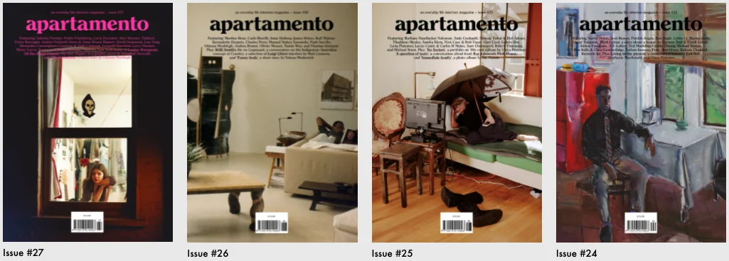
Authentic. The strongest single predictor in the research. Authenticity is not a tone of voice; it is the absence of a gap between what the product claims and what it does. Apartamento magazine built an international readership photographing people's actual flats, styling nothing, at a moment when every interiors title was doing the opposite.
Subcultural. Design rooted in a specific community earns credibility inside it that no broad-appeal design can buy. Work like Rinny Perkins's, grounded in Black feminism and queer womanhood and drawing on 1970s visual language, is legible in a way generic inclusivity never is.

Rebellious. David Carson's Ray Gun work in the 1990s is the standing example, including the interview he set entirely in Zapf Dingbats because he found it dull. Note the bounded-autonomy rule at work: he broke typographic convention inside a music magazine, where convention was fair game. That reputation later brought him Nike and MTV. It would not have worked on a pharmaceutical label.

Original. Genuine novelty, or a fresh angle on a familiar problem. It's Nice That has built an audience by curating almost exclusively for it.

Popular. Cool brands that survive the transition from niche to mainstream do it by continuing to move. Nike's design philosophy, "Better is Temporary", is a statement about never banking a win.

Iconic. Coca-Cola's red has carried meaning for over a century, largely independent of the product inside the can. Iconic status is the most durable moat on the list and the slowest to build.

High status. Prada, Louis Vuitton and the rest use design to signal exclusivity and justify price. Available to few, and dangerous to fake.

Extraordinary. Solving a hard problem in a way that exceeds what the category has trained people to expect. IKEA's research lab Space10 built its reputation here.

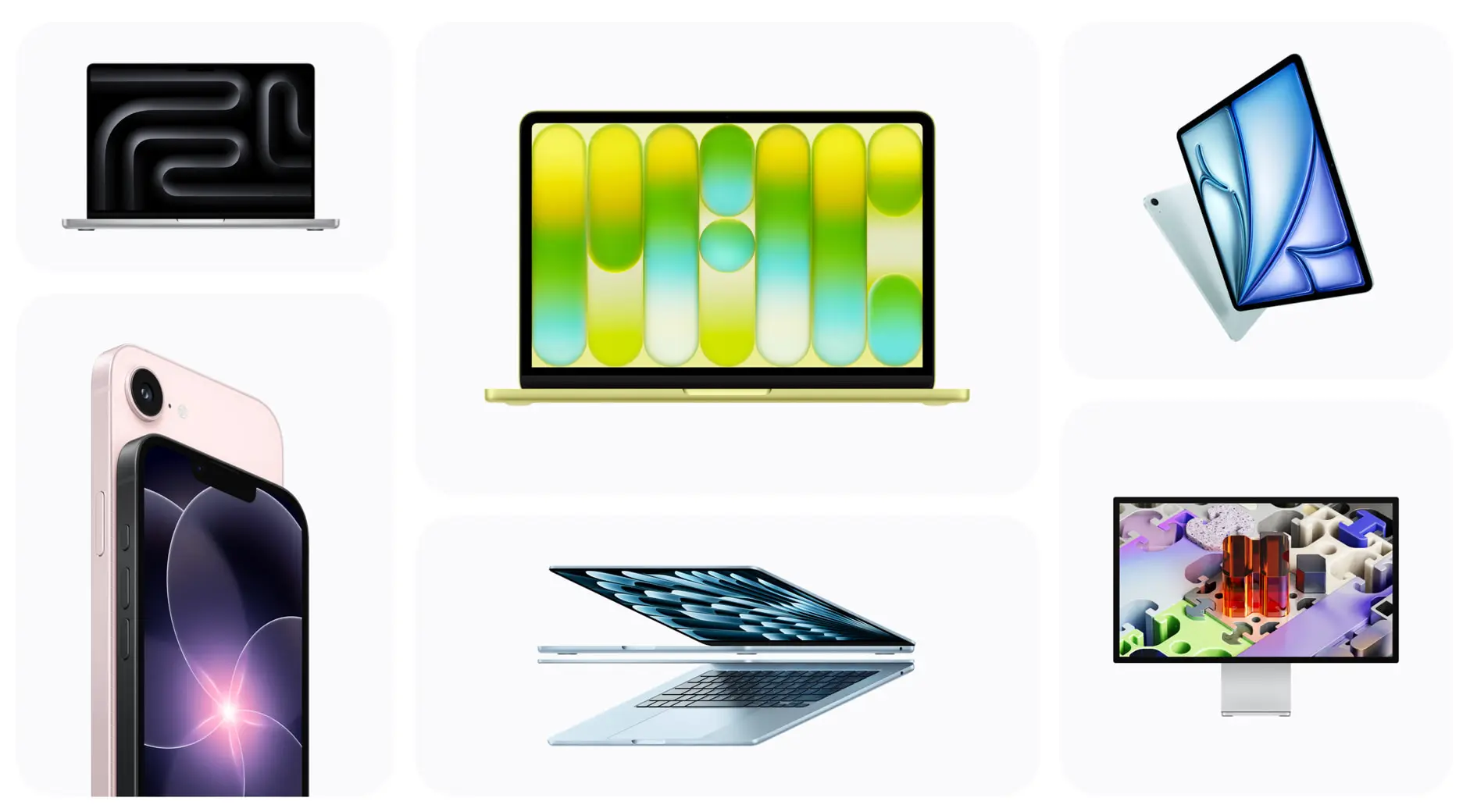
Aesthetically appealing. Visual excellence, but only where it serves function. Apple is the reference because the beauty and the usability argue for each other rather than competing.
Energetic. Communicating momentum and staying slightly ahead of what the market expects next.

The practical rule: if you are pre-scale, the four niche traits are where your money works hardest. Chasing "iconic" with a Series A budget produces expensive wallpaper. If you already have mass adoption, the niche traits are what stop you being read as generic incumbent, which is why Nike keeps hiring rebellious designers.
Design perception is not a marketing line item, and the research is unusually direct on this.
For product and growth leaders.
Brand coolness measurably influences consumer attitudes, satisfaction, intention to talk about the brand and willingness to pay for it.
Word of mouth is the mechanic that matters. Products people volunteer to their peers cost less to acquire customers for, and that shows up in blended CAC within two or three quarters.
For the CEO and CFO. Willingness to pay is the direct margin line. The indirect one is hiring: design-led companies fill senior engineering and product roles faster, from a stronger applicant pool, at less recruiter cost. And authentic positioning is genuinely hard to copy, which is the only kind of differentiation that resists commoditisation.
For go-to-market. In a crowded category where the feature matrices have converged, perception becomes the deciding variable for early adopters — precisely the segment that generates the reviews, the referrals and the case studies.
One honest caveat, because the gate demands it. The specific percentage uplifts you will see quoted around the internet for cool brands (15–25% price premiums, 20–30% higher word of mouth) do not come from this research and we have not been able to source them. We have removed them. The direction of the effect is well evidenced; the decimal points are not.
Most agencies will not write this section. It is also the fastest way to save yourself six figures.
When your audience wants to fit in, not stand out. Warren and Campbell found that consumers prefer cool brands specifically when they are motivated to differentiate themselves. If you sell payroll compliance software to risk-averse finance directors whose incentive is to make a defensible, unremarkable choice, coolness actively works against you. Conventional, competent and boring is the correct brief.
When the rule you would break is one your users value. Bounded autonomy again. In clinical or safety-critical interfaces, breaking convention costs lives and trust in that order.
When the product is not good yet. Coolness sits on top of function. Applied to a product with a retention problem, it accelerates churn by bringing more people in to be disappointed faster.
When you cannot sustain it. Coolness is dynamic, so a redesign is a subscription, not a purchase. If there is no budget for the second and third iterations, the first one will date in public.
When it is cosmetic. A visual refresh with no change to positioning, product decisions or content is the single most common way design budget is wasted. It buys a quarter of internal enthusiasm and nothing else.
This is the framework we run at Imaginary Cloud, built into our Product Design Process.
Step 1 — Locate yourself. Niche or mass? Be honest. Most companies that believe they are mass-market are niche products with an ambitious deck.
Step 2 — Score the ten. Rate your product against each characteristic, then rate your three closest competitors. You are looking for two things: where you already score well, and where the whole category scores identically. The second is the opportunity.
Step 3 — Pick two, three at the absolute most. The dilution problem is real. A design system trying to be rebellious and high status and popular reads as confused, because those traits pull the same decisions in opposite directions. Two traits, chosen against your stage and your competitive gap.
Step 4 — Push them into the system. Colour, typography, motion, copy, information density, empty states, error messages. Every decision either reinforces your two traits or dilutes them. Consistency across the whole surface is what separates a cool product from a product with a cool homepage.
Step 5 — Test the trait, not the taste. Do not ask users whether they like it. Ask them to describe the product in five words and count how often your chosen traits, or their synonyms, come back unprompted.
Read the full Lectus case study →

The situation. Lectus connects students with expert tutors. Tutoring marketplaces are a commodified category where every competitor claims quality and none can prove it. Imaginary Cloud was brought in across concept, strategy, design and build, working in Swift and Node.js under our Managed Project model.
The traits we chose. Extraordinary, because the actual proposition was access to top-tier tutors that had previously been the preserve of families with the right networks. Aesthetically appealing, because in a category where trust is the barrier, visual restraint reads as confidence.
The decision that mattered. We built two separate persona-based onboarding experiences rather than one shared flow. That is the choice worth interrogating, because a single unified onboarding is cheaper to build and easier to maintain, and it was on the table. We rejected it because the two personas' first-session goals share nothing. A student is trying to pick a tutor. A tutor is trying to connect with students, control their own hours and track earnings and performance. Forcing both through one funnel would have meant every screen serving one persona while mildly confusing the other — which is exactly how a premium proposition ends up feeling generic.
Everything downstream followed from that. Each flow surfaces only the features that get its persona to its own goal, and the interface stays quiet so the credentials do the talking.
What happened. The redesigned app is now used by more than 100 students and tutors in Cambridge, and has been introduced and launched in five further universities. Lectus rated the engagement 5.0 on Clutch.
The principle. When your value is extraordinary, aesthetic discipline is not a stylistic preference. Visual noise reads as compensation. If the expertise is real, the interface should get out of its way.
Read the full Frontfiles case study →

The situation. Frontfiles is an open network for independent journalists, media activists and witness citizens, built to remove intermediaries from the distribution of editorial images. Its economics are the argument: photographers keep 83% of the sale price of each image or story, with the remaining 17% going to maintenance, new tools, staff, external resources and community growth. That is, by a distance, the lowest platform take in the category.
The traits we chose. Rebellious and authentic — and unusually, these were named in the brief rather than reverse-engineered afterwards. Frontfiles came to us with strong, rich branding guidelines and an irreverent platform personality. The design problem was stated plainly: build a feature-dense interface that does not get lost inside that irreverence.
The decision that mattered. We ran the client's guidelines through two competing mood boards and adopted a hybrid, and the argument inside that process was about decoration. Contemporary web convention at the time wanted illustrated hero sections, gradient overlays and animated transitions. We took them out.
The reasoning: on a platform whose entire proposition is unmediated reporting, any pixel not serving the journalism can be read as spin. Restraint was not an aesthetic choice, it was an evidentiary one. Note that this is bounded rebellion in the Warren and Campbell sense — Frontfiles breaks the norm of platforms taking a large cut, which its users consider illegitimate, while being scrupulously conventional about readability and navigation, which they value.
We designed the whole thing in Figma with a dedicated design team embedded in the client's own processes.
What happened. The consolidated look and feel is drawing new creators onto the platform, and Frontfiles rated the engagement 5.0 on Clutch. The design became a proxy for the editorial values — which is what you want when you are competing against institutions with several hundred times your budget.
The principle. When rebellion and authenticity are your traits, restraint outperforms expression. Design that competitors will not copy because it is not currently fashionable is design that will still be working in five years.
Three layers, and you need all three.
Perception. Brand perception surveys and the unprompted five-word test above. Run it before the redesign so you have a baseline, because retrofitting one is impossible.
Behaviour. Referral and word-of-mouth rates, NPS verbatims mentioning design or feel, price sensitivity testing, and time-to-hire for senior design and engineering roles. These are the outcomes the 2019 research links to coolness, so they are the honest things to track.
Competitive drift. Watch whether competitors start borrowing your decisions. Imitation is a lagging indicator of coolness, and a fairly reliable one.
Consistent amplification of two or three of the ten researched coolness characteristics — most often authenticity, originality and extraordinary problem-solving — across every surface of the product. Apple pairs aesthetically appealing with extraordinary. Stripe pairs authentic with extraordinary. The pairing matters less than the consistency.
Ask a sample of target users to describe it in five words without prompting, and count how many of your intended traits appear. Then run the same exercise on your closest competitor. If the two word clouds look alike, you have a differentiation problem, not a design-quality problem.
Yes, and enterprise buyers are more susceptible to it than they admit. Figma, Linear and Stripe won preference partly on how they felt to use. For B2B the reliable pairing is extraordinary plus authentic — solve a genuinely hard problem, and reflect real workflows rather than marketing fictions.
Regulation limits expression, not positioning. Stripe and Wise are perceived as cool because transparency and low friction feel extraordinary next to bureaucratic incumbents. Be the most honest and frictionless option inside your constraints. Do not break rules your users depend on.
Targeted work has strong returns through willingness to pay, word of mouth and hiring. Cosmetic refreshes have close to none. The difference is whether the investment is aimed at chosen characteristics or at looking current.
When your buyers are motivated to fit in rather than stand out, when the product still has a retention problem, when the conventions you would break are ones your users value, or when there is no budget for iteration two.
Cool design is not a refresh, and it is not a mood board. It is a decision about which two researched characteristics you can credibly own, made against your competitive position and your stage, then executed with enough consistency that the market draws the conclusion for you.
If your product feels undifferentiated, the problem is usually not the feature set. It is that nothing in the experience tells anyone what kind of company built it.
Ready to assess your strategy?
Imaginary Cloud has applied the Cool Design Assessment across fintech, healthtech, consumer software and B2B SaaS. See our full case studies, or start a conversation about which characteristics your next product should own.
Marketing Intern with a particular interest in technology and research. In my free time, I play volleyball and spoil my dog as much as possible.
Alexandra Mendes is a Senior Growth Specialist at Imaginary Cloud with 3+ years of experience writing about software development, AI, and digital transformation. After completing a frontend development course, Alexandra picked up some hands-on coding skills and now works closely with technical teams. Passionate about how new technologies shape business and society, Alexandra enjoys turning complex topics into clear, helpful content for decision-makers.
People who read this post, also found these interesting: