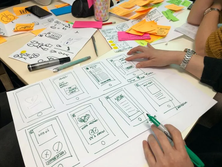
Most redesign conversations start in the wrong place. Someone opens a design tool, someone else says the product looks tired, and a budget gets spent on a symptom. Design planning is the work of deciding what a product should look like it is, and that is a commercial decision long before it is a visual one.
Here is the thing worth holding on to. Two interfaces can carry exactly the same information, work in exactly the same way, and still put a product at opposite ends of a market. So the question behind a redesign is not "what is broken?" It is "how far apart are the position we hold and the position we want?" That distance is the gap, and finding it is the job.
This one is for the person who signs off the work. We will look at how style sets positioning, how to find the gap, how to test a direction before anyone builds it, and what the change actually costs you in time and risk.
Design planning is the decision, taken before any screen is drawn, about which position a product's style should signal — and whether that position matches the one the business actually wants to hold. The two disciplines beneath it are familiar. User Experience (UX) and User Interface (UI) design are two of the most used product design concepts: UX designers focus on experience and set the mood, tone and communication style, while UI designers materialise that experience in a user interface. Both have been around for some time now and, through their combined efforts, digital products come to life.
Planning is what sits above the two. For each project there are several valid approaches rather than a single correct one, and keeping the interface simple and practical is one of the safest. A working interface, a clean experience, and users who get where they were going quickly.
Take the Tinker website as an example of a clean and functional design.
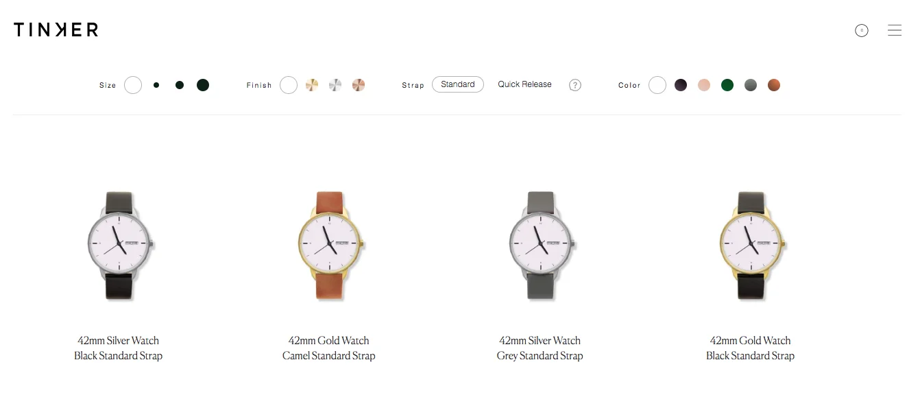
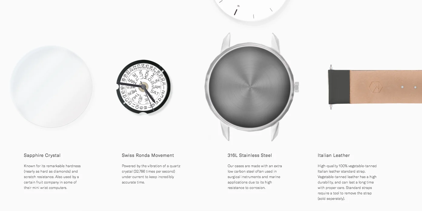
The product search page consists of a simple and intuitive search that lets the user find the desired product by matching different parameters. When on hover, it provides both the cost and the option to add the desired article to the basket. Clicking on any product will open a different page that contains a thorough description. Everything stands on a white background that deepens the website's clean experience.
Restraint like that reads as speed and reliability. Which is exactly right for a product whose promise is a fast purchase — and exactly right only for as long as that is the position the business wants to hold.
There are multiple ways of turning one set of information and requirements into a positive experience for users, and the choice between them is where positioning gets decided. Let's compare two, both easy to use, both organising the same information well.
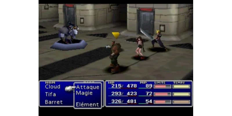
The Final Fantasy VII battle interface presents everything the player needs. Through the usage of menus, text, numbers and bars, all the important information is available in a simple and practical way. It is legible at a glance, and it proved durable: every main entry up to Final Fantasy XV in 2016 used a variation of the same menu structure.
Straightaway, Persona 5 seems to provide a completely different experience. It isn't. Its interface is built on the same information, only styled in a different way. The two differ in how you choose an option — by single-button actions rather than by selecting from a menu — and beyond that everything works the same way.
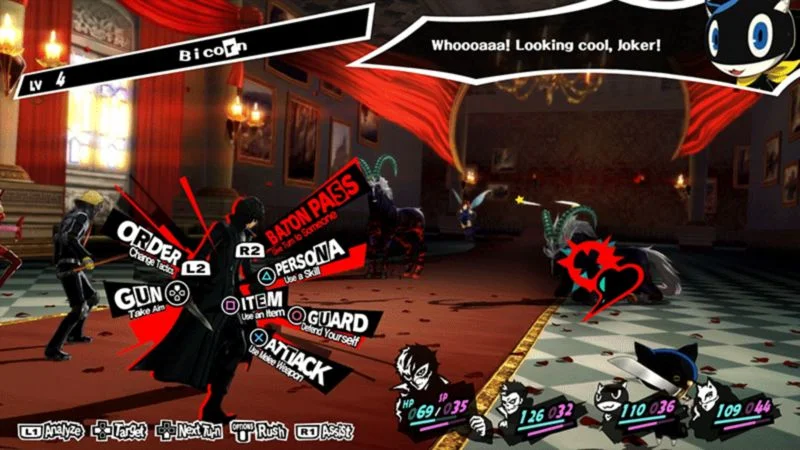
So which one is the correction of the other? Neither. Final Fantasy VII's menu has nothing wrong with it, and Persona 5's angled type and animation are not fixing a usability problem. The two are selling different products to different audiences using the same underlying information. If you want a more in-depth look at the UX and UI design of Persona 5.
Style changes the experience users have. It also carries a consequence well beyond the screen, because UX and UI design define the projected image of a product's communication style and its position in the market. Small at the level of a component. Rarely small at the level of the brand.
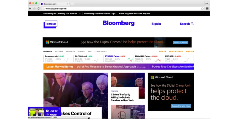
Bloomberg is a good example of boldness in its design, one we already explored in another context in a previous article. The example above shows the website before the 2018 redesign and, looking at it now, it seems as if there is nothing wrong with it. Sometimes the point is not to look better than before. It is to look different.
As John Micklethwait, Bloomberg's editor-in-chief, explained at the time, the redesign accompanied the launch of a digital subscription business and was built to make the reader's experience cleaner and more focused. Looking at both versions now, the main difference between them is the style. They went back to black and white and organised a few elements differently, while the interface itself is very much alike.
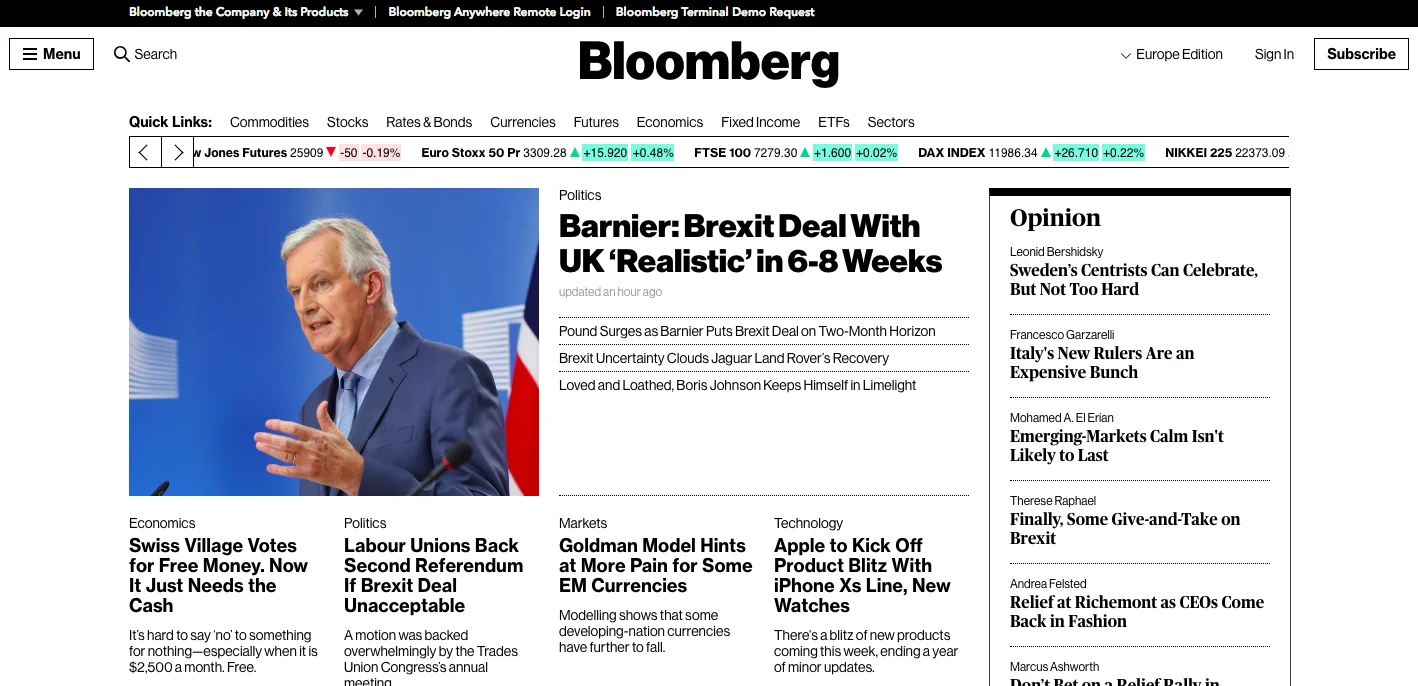
None of which is cosmetic. A reader can accomplish the same thing on both versions, so the difference sits entirely in what the company projects: sober and authoritative in one case, busier and more conventionally newsy in the other. For a subscription business selling information that is partly available elsewhere, how authoritative the product looks is part of what is being sold.
We see the same mechanism in client work. When Moloco needed its site to read as a world-class platform rather than a capable one, the fix was a Growth Audit and a restyle aimed squarely at that perception — the information barely moved; the authority it projected did.
The word missing from most conversations about restyling a product is planning. A change of style is a change to the thing your customers recognise, so treat it like a building survey rather than a coat of paint. You want to know what is load-bearing before anyone picks up a brush, and you want to know it in writing.
At Imaginary Cloud we run this as a positioning gap review: four stages, each with a written output, ending in a release plan rather than a set of screens. It is the same discipline behind our Product Design Process: when we rebuilt Environmental Intellect's interface to project a more technological, credible image, the work ran through four defined stages rather than jumping to visuals. The order matters less than one detail: the evidence stage comes before the drawing stage, and that is the step most redesigns skip.
Before anything is drawn, write down the position you hold, the position you want, and the evidence for the distance between them. Sales objections, support tickets, churn interviews, the language competitors use in their own marketing: all of them cost less than a redesign does. The output is one sentence naming the gap. If you cannot write that sentence, the project has no brief yet.
Look at how the current design performs for the people using it, not only at how it looks. Session recordings, task completion rates and a handful of moderated interviews (the substance of a UX audit) will tell you which of the two you have. They need different work, and confusing them is the most expensive mistake in this whole process. A restyle will not fix a broken flow. A usability fix will not change how a brand is perceived. When the problem really is usability, the payoff is direct: an audit-led redesign of Learninghubz lifted active users by 20% and mobile usage by more than 50% within three months of launch.
The output is a short finding that says which problem the budget is buying.
Style decisions can be tested before they are built, and cheaply. Put two directions in front of a sample of your target audience and ask what kind of company each one belongs to, what it would cost, and who it is for. Three methods cover most of it:
The output is a chosen direction with the reasons recorded. That record is what stops the decision being reopened every time a new stakeholder walks past a screen.
The risk in a restyle is that recognition and conversion dip while users relearn a familiar product. Four measures contain it:
A phased release adds time, and in our experience that is weeks rather than months. What it buys you is the option to stop. A single switch sells that option off. Measured against a proper baseline, a positioning-led restyle pays for itself: our own website relaunch, run off a Growth Audit and the same Product Design Process, lifted conversions by 5% within three months, and kept climbing.
Budget follows scope, and the honest range is wide. A focused restyle of a product's visual language is a matter of weeks. A full redesign that touches the design system (the shared library of components, colours and type rules the product is assembled from), along with the marketing site and the product itself, runs for months and pulls engineering time in behind it. Say the time-to-value out loud at the start, because a design change pays back through perception, and perception moves over quarters, not sprints.
Is there a best time to redesign? No, not in any general sense. Graphic design shows this more plainly than product design does. Twinings of London has kept essentially the same wordmark for well over two centuries, one of the oldest in continuous use, while Juventus Football Club replaced a crest it had used for decades with an abstract "J", unveiled in January 2017 and designed by Interbrand (and pared back further in 2020). Some products never change, others change almost every year, and both can be right.
That is what is interesting about every example in this article: not one of them is a repair job. There is no good or bad styling, only a style better or worse suited to a product's business goals. The decision belongs to strategic thinking, which is also part of product design, far more than it belongs to interfaces or experiences.
Google shows both versions of the decision inside one company. Chrome's adoption of Material You (Google's design language introduced with Android 12, in which colour and shape adapt to the user's own settings) kept the browsing experience close to what it replaced. It reads as a statement about which family the product belongs to, not as a fix. The integrated Gmail view, which Google announced on its Workspace Updates blog in early 2022, changed the interface and the experience considerably. Both deliberate. Very different bills.
The practical test is working out which of the two you are actually proposing:
| Refine the existing design | Rebrand | |
|---|---|---|
| When it applies | Positioning is right, execution is dated | Positioning itself has moved: new audience, price point or market |
| What changes | Visual language, components, hierarchy | Identity, name treatment, tone, and everything downstream of them |
| Typical scale | Weeks, design-led | Months, design and engineering together |
| Main risk | Inconsistency across surfaces during rollout | Loss of recognition among existing customers |
| Evidence needed | Usability findings and brand audit | Market evidence that the position has changed |
Equally good options can represent contrasting positions in an industry. So the best time to change is when the image your design projects no longer matches the position your business wants to hold. More often than not it does not take much to shift that impression. It is a question of adjusting the product's style against the business goals, with evidence that the gap is real.
When the image the design projects no longer matches the position the business wants to hold, or when research shows users failing at tasks. A redesign triggered by taste alone spends budget without a measurable target, so write down the gap you are closing before the work starts.
Both, and they are hard to pull apart. Style shapes what a user expects from a product before they touch it, and those expectations change how the same interface feels. Final Fantasy VII and Persona 5 are the extreme case: near-identical information, two entirely different experiences.
Refining is right when the positioning is correct and the execution is dated. Rebranding is right when the positioning itself has moved, through a new audience, a new price point or a new market. The second is more expensive and riskier, so it needs market evidence rather than a preference.
Loss of recognition, a temporary drop in conversion while users relearn the product, and engineering cost nobody scoped. All three are containable with a phased release, a measured baseline and an agreed rollback condition.
A focused restyle of the visual language runs in weeks. A full redesign covering the design system, the marketing site and the product runs in months and needs engineering capacity alongside design. The payback shows up in perception, which moves over quarters.
Cost tracks scope and the number of surfaces involved, not the number of screens. A visual refresh of one product is the cheap end. Anything that changes the design system, and therefore everything built from it, carries implementation cost in engineering that usually exceeds the design fee.
Yes, and arguably more. A considered interface reads as evidence that the company behind it is credible, and in a purchase where the buyer cannot inspect the engineering, design is one of the few signals they have.
Style is not decoration laid over a product. It is the product telling people what it is, before they have read a word of your copy. Get that sentence wrong and no amount of polish rescues it.
At Imaginary Cloud we design digital products around the position they are meant to hold, not only around the screens they need. If you are weighing up a restyle and you are not sure whether you have a positioning problem or a usability one, talk to our team and we will review what your current design is saying about you.

Content manager, text editor, and presenter of strategic ideas, along with being an avid fan of the cinematic arts and visual storytelling.
People who read this post, also found these interesting: